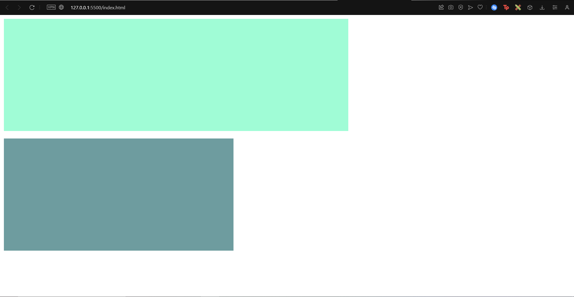
Basically, I’m trying to float two elements, <div> elements specifically, to the left, setting widths to 60% and 40% to match the 100% width of the website.
But the same problem always happens, the 40% <div>¬ just go below the 60% `. I don’t know if I am doing something wrong or anything else.
Here’s my code:
/* General Styles Preset */

* {
  box-sizing: border-box;
  margin: 0;
}


/* Boxes and containers styles */

div.boxcontainer {
  overflow: hidden;
  width: 100%;
}

.boxone {
  float: left;
  width: 60%;
  height: 300px;
  margin: 10px;
  background-color: aquamarine;
}

.boxtwo {
  float: left;
  width: 40%;
  height: 300px;
  margin: 10px;
  background-color: cadetblue;
}
<div class="container">
<div class="boxone"></div>
<div class="boxtwo"></div>
</div>What the code was supposed to do, was to place both divs from left to right, both with a 60/40 ratio to fill the 100% width of the container. Also the code put a margin of 10px on the 4 sides of the divs, to maintain a space between the page borders and between the divs.
But it turns out that every time I try to make what I described above happen, the "blocktwo" div is placed below the "blockone" div, as expected by the current HTML flow due to the fact that both are blocks. But in this case, even though I float them and set margins and sizes in percentages, the same thing happens.
What I’ve tried:
- Not setting margins, but that doesn’t give me the result I want.
- Using margins as percentages to add up to 100%, but that just creates uneven spaces between borders and the boxes.
- Looking for some answers on Youtube, AI (ChatGPT), and now Stack Overflow, but I haven’t found solutions.
Result of the code in this post:
I want both blocks just to be side by side, in the correct proportion and with margins, I mean, spaces between.
Now, I know there are more simpler and effective ways to do this, such as CSS Flexbox or CSS Grid, but for the purposes of the course I am taking, I want to be able to solve this problem I have. I hope I was able to explain well the problem, the results and everything. Thank you!


4
Answers
As you’ve noted, Grid layout makes this super easy. But if you’re determined to use floats, it’s the old "keep your cake and eat it too" situation. 40% + 60% = 100%, so you can’t add any margins into that. You just have to change those widths. You could do something like this:
check the result here
The error caused by the margins that you added for each div.
And be careful: you don’t have a class called .boxcontainer
if you want 10vw margin for example then make one box 35vw and the other 55vw