skip to Main Content

I have a fluid layout composed by div having the same width but different height.

My goal (when I resize the screen) is to force any div to be aligned on left side.

With a (hopefully) clear example:

.container {
  border:1px solid silver;
  float:left;
  margin:5px;
  border-radius:10px;
  text-align:center;
}
<div class='container' style='width:100px; height:120px;'>1</div>
<div class='container' style='width:100px; height:100px;'>2</div>
<div class='container' style='width:100px; height:130px;'>3</div>
<div class='container' style='width:100px; height:90px;'>4</div>
<div class='container' style='width:100px; height:100px;'>5</div>
<div class='container' style='width:100px; height:105px;'>6</div>
<div class='container' style='width:100px; height:95px;'>7</div>
<div class='container' style='width:100px; height:80px;'>8</div>
<div class='container' style='width:100px; height:75px;'>9</div>
<div class='container' style='width:100px; height:140px;'>10</div>

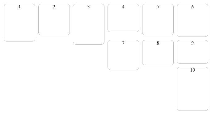
With default screen size I obtain this:

enter image description here

but my goal is that DIV #7, #8 and #9 would be under div #1, #2, #3

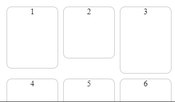
Or with a stretched screen size I would have something like this:

enter image description here

but my goal is to avoid empty space between div #1 & #4 or #2 & #5.

Which CSS attribute I should use to align div vertically despite the dimension of above one?
Do I have to use flexbox instead?

2

Answers


  1. I think using css grid would be the easiest way to achieve what you’re wanting, something like this should do what I think you’re asking:

    .grid {
      display: grid;
      grid-template-columns: repeat(auto-fill, 100px);
      gap: 5px;
      justify-items: stretch;
    }
    
    .container {
      border:1px solid silver;
      border-radius:10px;
      text-align:center;
    }
    <div class="grid">
      <div class='container' style='min-height:120px;'>1</div>
      <div class='container' style='min-height:100px;'>2</div>
      <div class='container' style='min-height:130px;'>3</div>
      <div class='container' style='min-height:90px;'>4</div>
      <div class='container' style='min-height:100px;'>5</div>
      <div class='container' style='min-height:105px;'>6</div>
      <div class='container' style='min-height:95px;'>7</div>
      <div class='container' style='min-height:80px;'>8</div>
      <div class='container' style='min-height:75px;'>9</div>
      <div class='container' style='min-height:140px;'>10</div>
    </div>
    Login or Signup to reply.
  2. It can be easily achieved using flexbox

    #mainContainer{
        display: flex;
        flex-wrap: wrap;
         flex-direction: row;      
        align-items: stretch; 
    }
    
    .container {
      border:1px solid silver;
      float:left;
      margin:5px;
      border-radius:10px;
      text-align:center;
    }
    <!DOCTYPE html>
    <html>
    <body>
    
    <div id="mainContainer">
    <div class='container' style='width:100px; height:120px;'>1</div>
    <div class='container' style='width:100px; height:100px;'>2</div>
    <div class='container' style='width:100px; height:130px;'>3</div>
    <div class='container' style='width:100px; height:90px;'>4</div>
    <div class='container' style='width:100px; height:100px;'>5</div>
    <div class='container' style='width:100px; height:105px;'>6</div>
    <div class='container' style='width:100px; height:95px;'>7</div>
    <div class='container' style='width:100px; height:80px;'>8</div>
    <div class='container' style='width:100px; height:75px;'>9</div>
    <div class='container' style='width:100px; height:140px;'>10</div>
    </div>
    
    </body>
    </html>
    Login or Signup to reply.
Please signup or login to give your own answer.
Back To Top
Search