


I have been trying to make footer take 100% of the page, and as Chrome Devtools says, it really took full width, but one side is missing.
Photo: 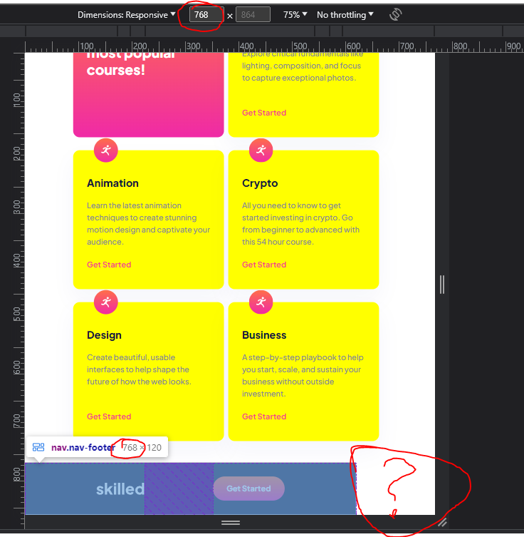
Here’s also some HTML and CSS
* {
    box-sizing: border-box;
    margin: 0;
    padding: 0;
    font-family: var(--jakarta);
}

html, body
{
    -ms-overflow-style: none; /* for Internet Explorer, Edge */
    scrollbar-width: none;
    overflow-y: scroll;
    height: 100%;
    padding: 0px;
}

body {
    overflow: visible;
}

body::-webkit-scrollbar{
    display: none;
}

.main {
    margin: 0px 165px 50px 165px;
}

footer {
    width: 100%;
}

footer .nav-footer {
    width: 100%;
    height: 120px;
    display: flex;
    justify-content: space-between;
    align-items: center;
    background: var(--blueish);
}

footer .nav-footer img {
    margin-left: 165px;
}

footer .nav-footer button {
    margin-right: 165px;
}
<footer>
<nav class="nav-footer">
<img src="assets/images/logo-light.svg" alt="e-learning Logo">
<button class="btn btn-get-started-head-section"><a href="https://google.com" target="_blank">Get Started</a></button>
</nav>
</footer>On bigger resolutions it’s looking okay, but as soon as I start to go towards lower page width, footer starts missing more and more.
I have tried without setting width, with moving footer outside of main section element(that’s actually right now).
Mi section class="main" element has left and right margin 165px so content needs to be 165px away from edges.
footer tag is outside of section.main and this shouldn’t be happening.
Devtools says footer tag nor .nav-footer have any margins or paddings
Thank you!
3
Answers
Try to set
I think you are givin margin to main element and this is broken your code page. Try to out this margin in main element and run your code. Or show me all the code from this page.
I guess the problem is that your other contents are overflowing , You have given margin 165px right and left for main , try removing that , as I guess your footer looks fine , the problem is other elements are going out of zone because of that your footer is looking like this , try to inspect the main element as it is overflowing , try giving it a fixed width for mobile or tablets , like max-width:100vw or something , footer is not the issue in this I guess.