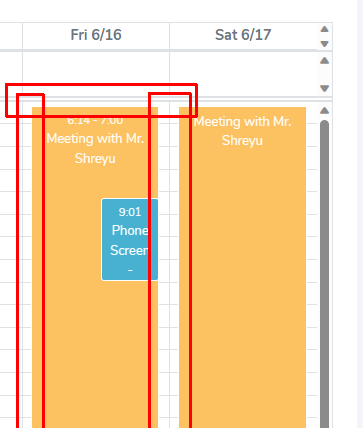
I need to remove the padding from an event when the calendar is in ‘timegridview’. My users are clicking in the empty space created, allowing them to get around a time slot that should be blocked.
I have it set so that on event click, it shows the event details.
For example, if I have an event from 11am to noon blocked for ‘Lunch’, users are clicking in the empty space which then brings up the scheduling dialog.
I’ve tried this CSS snippet which takes care of the spacing on the left and right, but I can’t top/bottom.
.fc-timegrid-event-harness-inset {
        left: -8% !important;
        right: -8% !important;

    }


2
Answers
I've isolated the responsible CSS. Overriding .fc-event adjusts the padding
Default:
Override:
Did you try
Or setting up width and height with calc. For example: