skip to Main Content

I am new in web development and still learning new things. Sorry for any mistake. Please help me out in this problem.
There is one grid row named as header and in that there are four columns. In the first column i need to display logo so i am trying it and use position relative because i need to give top. If i use top logo get hide instead of row height increases. If i use margin-top it would work fine but with top it create problem. Please tell me why is this creating problem with top and row height is not auto adjusting. I want that when i use top then also row height get auto adjusted. Code is attached below:

Four columns int grid-template are used by taking care of further need as this is starting of page and later i need four columns as per the page need.

index.html

<!DOCTYPE html>
<html lang="en">
  <head>
    <meta charset="UTF-8" />
    <meta name="viewport" content="width=device-width, initial-scale=1.0" />
    <title>Grid Test</title>
    <link rel="stylesheet" href="styles.css" />
  </head>
  <body>
    <div class="wrapper">
      <header>
        <div class="sz logo">
            <img src="logo.png" alt="Logo" />
        </div>
        <nav class="sz">
          <li>Team</li>
          <li>About Us</li>
          <li>Courses</li>
        </nav>
        <div class="sz btn">
          Start a project
        </div>
      </header>
      <main>hi lorem1000
      </main>
      <footer>hiii</footer>
    </div>
  </body>
</html>

styles.css

*{
    margin: 0;
    padding: 0;
    box-sizing: border-box;
  }
  .wrapper
  {
    display: grid;
    grid-template-areas: 
    "hd hd hd hd"
    "main main main main"
    "ft ft ft ft";
  }
  header {
    grid-area: hd;
    display: grid;
    grid-template-columns: repeat(4,1fr);
    grid-template-rows: auto;
    grid-gap: 10px;
    grid-template-areas: 
    "logo nav nav prjct";
    background-color: aqua;
  }

  .logo {
    grid-area: logo;
    overflow: hidden;
    background-color: hotpink;
  }
  img {
    position: relative;
    height: 82px;
    left: 117px;
    top: 53px;
    /* margin-top: 53px; */
    height: 82px;
  
  }
  nav {
    grid-area: nav;
    background-color:lemonchiffon;

  }
  li{
    list-style: none;
    text-decoration: none;
    cursor: pointer;
  }
  .btn
  {
    grid-area: prjct;
    background-color: lightcoral;
    font-size: 16px;
    font-weight: 500;
  }
 
  
  main{
    grid-area: main;
    background-color: bisque;
  }
  footer{
    grid-area: ft;
    background-color: antiquewhite;
  }

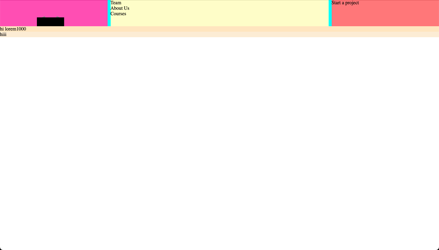
Output with top:53px

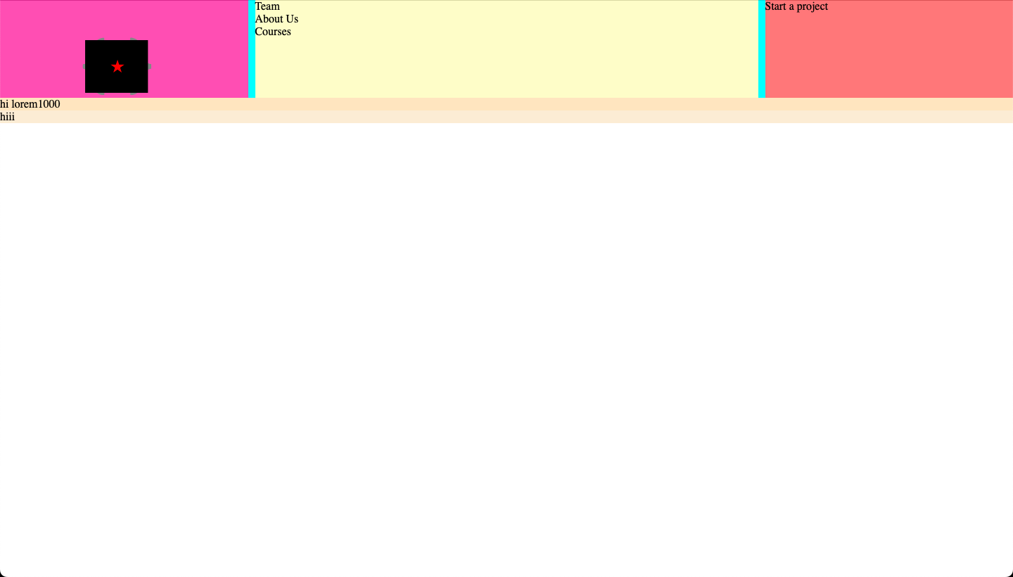
Output with margin-top:53px

2

Answers


  1. You can add padding: 53px 0 0 117px to the logo class (parent of image).

    but it’s better to handle image position with flex display in logo class.

    * {
      margin: 0;
      padding: 0;
      box-sizing: border-box;
    }
    
    .wrapper {
      display: grid;
      grid-template-areas: "hd hd hd hd" "main main main main" "ft ft ft ft";
    }
    
    header {
      grid-area: hd;
      display: grid;
      grid-template-columns: repeat(4, 1fr);
      grid-template-rows: auto;
      grid-gap: 10px;
      grid-template-areas: "logo nav nav prjct";
      background-color: aqua;
    }
    
    .logo {
      grid-area: logo;
      overflow: hidden;
      background-color: hotpink;
      padding: 53px 0 0 117px;
    }
    
    img {
      height: 82px;
    }
    
    nav {
      grid-area: nav;
      background-color: lemonchiffon;
    }
    
    li {
      list-style: none;
      text-decoration: none;
      cursor: pointer;
    }
    
    .btn {
      grid-area: prjct;
      background-color: lightcoral;
      font-size: 16px;
      font-weight: 500;
    }
    
    main {
      grid-area: main;
      background-color: bisque;
    }
    
    footer {
      grid-area: ft;
      background-color: antiquewhite;
    }
    <!DOCTYPE html>
    <html lang="en">
    
    <head>
      <meta charset="UTF-8" />
      <meta name="viewport" content="width=device-width, initial-scale=1.0" />
      <title>Grid Test</title>
      <link rel="stylesheet" href="styles.css" />
    </head>
    
    <body>
      <div class="wrapper">
        <header>
          <div class="sz logo">
            <img src="https://picsum.photos/200/300" alt="Logo" />
          </div>
          <nav class="sz">
            <li>Team</li>
            <li>About Us</li>
            <li>Courses</li>
          </nav>
          <div class="sz btn">
            Start a project
          </div>
        </header>
        <main>hi lorem1000
        </main>
        <footer>hiii</footer>
      </div>
    </body>
    
    </html>
    Login or Signup to reply.
  2. You are over complicated the grid for a small page structure.

    You have 3 rows: header, main, footer
    in header you have 3 cols (not 4)

    In your code you are using template areas, it’s often described as easier and more understandable, it’s not always.

    You can do your structure withe 3 cols, 3 rows, and span 3 cols for main and footer.

    Or you can defined outer grid with 3 rows, 1 col and inside header defin another grid with 3 cols and 1 row.

    * {
      margin: 0;
      padding: 0;
      box-sizing: border-box;
    }
    
    .wrapper {
      display: grid;
      grid-template-columns: 1fr;
      grid-template-rows: auto 1fr 10%;
      width: 100%;
      height: 100%;
      min-height: 100vh;
    }
    
    header {
      display: grid;
      grid-template-columns: 10% 1fr 10%;
      grid-template-rows: 1fr;
      background-color: aqua;
      column-gap: 10px;
    }
    
    header>* {
      padding: 10px;
    }
    
    header .logo {
      overflow: hidden;
      background-color: hotpink;
      align-self: center;
      justify-self: center;
    }
    
    nav {
      background-color: lemonchiffon;
      align-self: center;
    }
    
    nav ul li {
      display: inline;
      list-style: none;
      text-decoration: none;
      cursor: pointer;
    }
    
    .btn {
      background-color: lightcoral;
      font-size: 16px;
      font-weight: 500;
      align-self: center;
      justify-self: center;
    }
    
    main {
      background-color: bisque;
      padding: 10px;
    }
    
    footer {
      background-color: antiquewhite;
      padding: 10px;
    }
    <div class="wrapper">
      <header>
        <div class="sz logo">
          <img src="https://picsum.photos/64/48" alt="Logo" />
        </div>
        <nav class="sz">
          <ul>
            <li>Team</li>
            <li>About Us</li>
            <li>Courses</li>
          </ul>
        </nav>
        <div class="sz btn">
          Start a project
        </div>
      </header>
      <main>hi lorem1000</main>
      <footer>hiii</footer>
    </div>
    Login or Signup to reply.
Please signup or login to give your own answer.
Back To Top
Search