skip to Main Content

Is it possible to create a semi circle like the following with css?

semi circle

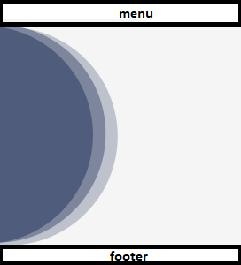
If yes, can someone explain me how to do it or where can I find some tutorials to learn?
My Menu and Footer are already in place. I just want to know how to draw semi circles similar to that ones and, the application can run in different screen sizes and the image of the semi circles should adapt to the screen size

<template>
    <v-container fluid class="semi-circle">
        
    </v-container>
</template>
<style>
* {
 margin: 0;
 padding: 0;
 box-sizing: border-box;
}

.semi-circle {
  width: 50%;
  height: 100%;
  background: #505c7b;
  border-radius: 0 100% 100% 0;
  box-shadow: inset -3.5rem 1px 0 #7d869c, 
                    3.5rem 1px 0 #bec2cd;
}


</style>

and my result:

enter image description here

3

Answers


  1. * {
     margin: 0;
     padding: 0;
     box-sizing: border-box;
    }
    
    .semi-circle {
      width: 10rem;
      height: 20rem;
      background: #505c7b;
      border-radius: 0 10rem 10rem 0;
      box-shadow: inset -1.5rem 1px 0 #7d869c, 
                        1.5rem 1px 0 #bec2cd;
    }
    <div class="semi-circle"></div>
    Login or Signup to reply.
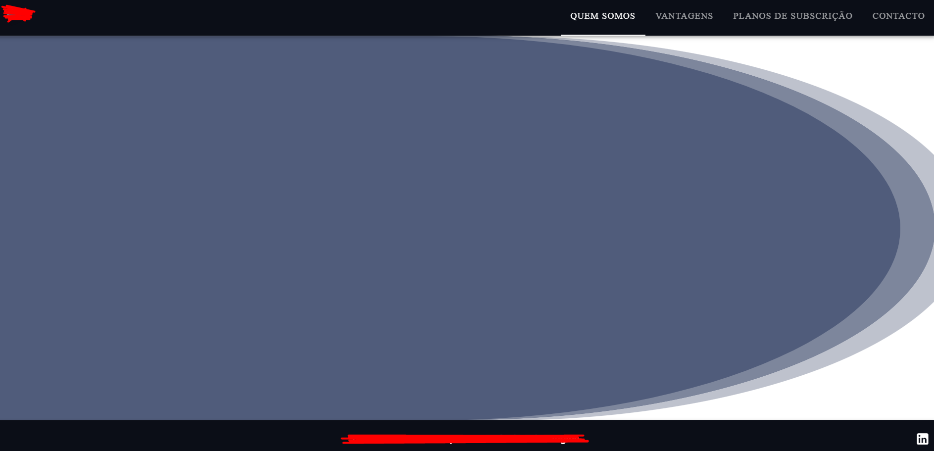
  2. To create a semi-circle that is rotated to the right, you can use the transform property in CSS to rotate the element. Here’s an example of how to create a rotated semi-circle:

    .rotated-semi-circle {
      width: 100px; /* Adjust the width as needed */
      height: 50px; /* Half of the width to create a semi-circle */
      background-color: #3498db; /* Adjust the color as needed */
      border-radius: 0 0 50px 50px; /* Border radius to create the semi-circle shape */
      transform: rotate(270deg); /* Rotate the semi-circle to the right by 45 degrees */
      transform-origin: bottom; /* Set the rotation origin */
    }
    <div class="rotated-semi-circle"></div>
    Login or Signup to reply.
  3. This should work, I’ve tested it, and I’ve also commented on the lines that I’ve changed. (3 lines)

    Hope it helps you!

    html, body {
      height:100%;
      margin:0;
    }
    
    .semi-circle {
      aspect-ratio: 1/1; /* 1:1 aspect-ratio, so the height we specified in the next line and width,                               becomes the same */
      height: 100vh; /* 100vh means the entire height of the viewport (viewport means the area which can be                     "viewed" */
      transform: translateX(-50%); /* using translateX we can move the circle, in the "X" axis (that is, in                                   the left-right direction), -50% (negative because we moving it to the                                   left) of its size, so half the circle gets moven out of the screen */ 
      background: #505c7b;
      border-radius: 50%;
      box-shadow: inset -3.5rem 1px 0 #7d869c, 
                        3.5rem 1px 0 #bec2cd;
    }
    <div class="semi-circle"></div>
    Login or Signup to reply.
Please signup or login to give your own answer.
Back To Top
Search