skip to Main Content

I’m trying to create component similar to image.enter image description here

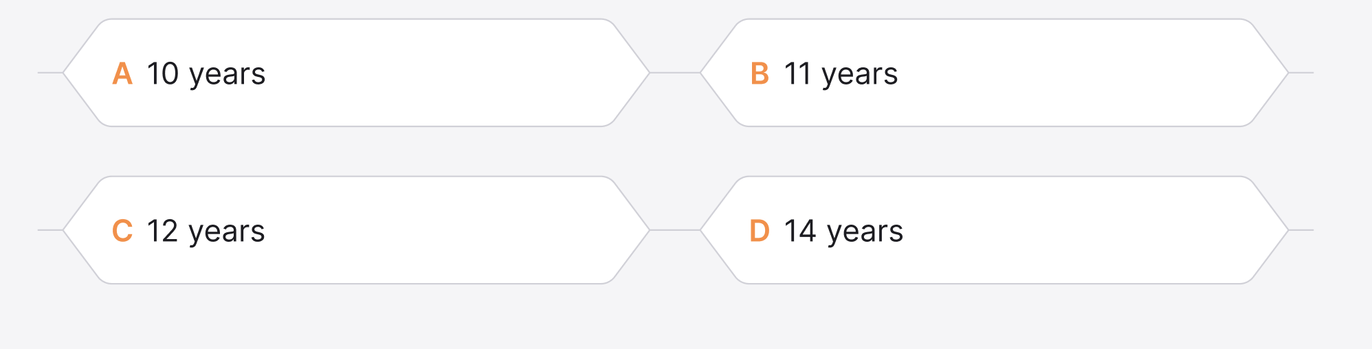
But I can’t find the way how can I can style the button and this block in css.
What I have now.

.button {
    position: relative;
    display: block;
    background: transparent;
    width: 390px;
    height: 72px;
    line-height: 80px;
    font-size: 20px;
    text-decoration: none;
    color: #1C1C21;
    margin: 40px auto;
    font-family: Helvetica, Arial, sans-serif;
    box-sizing: border-box;
}
.button:before,
.button:after {
    position: absolute;
    content: '';
    width: 390px;
    left: 0;
    height: 34px;
    z-index: 0;
}

.button:before {
    transform: perspective(15px) rotateX(3deg);
}
.button:after {
    top: 40px;
    transform: perspective(15px) rotateX(-3deg);
}

/* Button Border Style */

.button.border:before,
.button.border:after {
    border: 1px solid #D0D0D8;
}
.button.border:before {
    border-bottom: none; /* to prevent the border-line showing up in the middle of the shape */
}
.button.border:after {
    border-top: none; /* to prevent the border-line showing up in the middle of the shape */
}

.button-wrapper {
    display: flex;
    flex-wrap: wrap;
}
<div class="button-wrapper">
<a href="#" class="button ribbon-outset border">Click me! </a>
</div>

But it’s not similar to what I want.
How can I do this element button and the how I can display them like on image and for mobile devices to?

3

Answers


  1. It seems like it has a specific width and height on all buttons, so you can just make it as a background image.

    Login or Signup to reply.
  2. I agree with @FrancisAlbores, background images are the way to go for this. If your buttons are a fixed size that’s easy, but if you need them to be flexible width you can use a stack of three images, one each for the left and right sides, on top of a repeating centre section.

    diagram of arrangement of suggested background images

    .button-wrapper {
      display: flex;
      flex-wrap: wrap;
      gap: 20px 0;
    }
    
    .button-wrapper a {
      display: flex;
      align-items: center;
      color: inherit;
      text-decoration: none;
      height: 40px;
      padding: 0 30px;
      background-image: url(https://donald.au/bugs/so-77147160/button-left.svg), url(https://donald.au/bugs/so-77147160/button-right.svg), url(https://donald.au/bugs/so-77147160/button.svg);
      background-repeat: no-repeat, no-repeat, repeat-x;
      background-position: 0%, 100%, 50%;
    }
    <div class="button-wrapper">
      <a href="#">Click me!</a>
      <a href="#">Click me!</a>
      <a href="#">Click me!</a>
      <a href="#">Click me many times!</a>
    </div>
    Login or Signup to reply.
  3. Just an idea would need to refining and playing around with to get right but you could also try using sudo elements to accomplish this.

    .hex-btn {
        position: relative;
        
        display: inline-block;
        height: 40px;
        width: 150px;
        
        background-color: red;
        
        border-radius: 5px;
        
        text-align: center;
        line-height: 40px;
    }
    
    
    .hex-btn::after {
        content: "";
        
        position: absolute;
        top: 6px;
        left: -8%;
        height: 28px;
        width: 28px;
        
        background-color: red;
        
        border-radius: 3px;
        
        transform: rotate(45deg);
    } 
    
    
    .hex-btn::before {
        content: "";
        
        position: absolute;
        top: 6px;
        right: -8%;
        
        height: 28px;
        width: 28px;
        
        background-color: red;
        
        border-radius: 3px;
        
        transform: rotate(45deg);
    } 
    
    <div class="hex-btn">Hex BTN</div>
    

    enter image description here

    Login or Signup to reply.
Please signup or login to give your own answer.
Back To Top
Search