skip to Main Content

There are many solutions on the Internet, but all of them are either crutches or do not work correctly. Perhaps there is a way to stretch the element in width and adjust the height when rotating more correct in 2023?

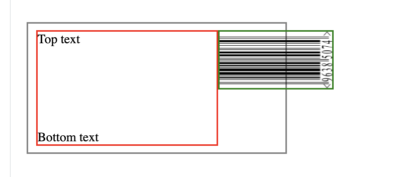
Below is the code and the problem that occurs. You can see that the block with the image extends beyond the wrapper and is not stretched wide enough.

enter image description here

.wrapper {
  border: 2px solid grey;
  display: flex;
  align-items: center;
  padding: 10px;
  height: 140px;
  width: 300px;
}


.left {
  flex-grow: 1;
  height: 100%;
  display: flex;
  justify-content: space-between;
  flex-direction: column;
  border: 2px solid red;
}

.imgwrapper {
  border: 2px solid green;
  width: 70px;
  height: 100%;
  transform-origin: top left;
  transform: rotate(-90deg) translate(-100%);
}

img {
  width: 100%;
  height: 100%;
}
<div class=wrapper>
  <div class="left">
    <div class="lefttop">Top text</div>
    <div class="leftbottom">Bottom text</div>
  </div>
  <div class="imgwrapper">
    <img src="https://upload.wikimedia.org/wikipedia/commons/thumb/f/f1/EAN8.svg/1200px-EAN8.svg.png" alt="">
  </div>
</div>

Expected result:
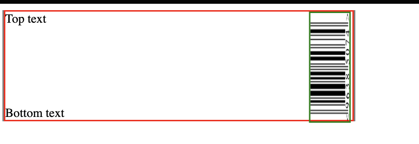
It should be something like this ( but of course wrapper width and height can be different ):
enter image description here

Update:
Since I generated this barcode by my own in real app, I suppose it’s
better to add numbers as another component with absolute, in order to save quality

3

Answers


  1. You can try the below code

    .wrapper {
      border: 2px solid grey;
      display: flex;
      align-items: center;
      padding: 10px;
      height: 140px;
      width: 300px;
    }
    
    
    .left {
      flex-grow: 0.5;
      height: 100%;
      display: flex;
      justify-content: space-between;
      flex-direction: column;
      border: 2px solid red;
    }
    
    .imgwrapper {
      border: 2px solid green;
      width: auto;
      height: 100%;
      transform-origin: top left;
      transform: rotate(-90deg) translate(-100%);
    }
    
    img {
      width: 100%;
      height: 100%;
    }
    <div class=wrapper>
      <div class="left">
        <div class="lefttop">Top text</div>
        <div class="leftbottom">Bottom text</div>
      </div>
      <div class="imgwrapper">
        <img src="https://upload.wikimedia.org/wikipedia/commons/thumb/f/f1/EAN8.svg/1200px-EAN8.svg.png" alt="">
      </div>
    </div>
    Login or Signup to reply.
  2. CSS transforms don’t introduce layout shifts – actually a good concept.

    As a workaround you can insert your image in an inlined <svg>.

    .wrapper {
      border: 2px solid grey;
      display: flex;
      align-items: center;
      padding: 10px;
      height: 140px;
      width: 300px;
    }
    
    .left {
      flex-grow: 1;
      height: 100%;
      display: flex;
      justify-content: space-between;
      flex-direction: column;
      border: 2px solid red;
    }
    
    .imgwrapper {
      width: 70px;
      height: 100%;
      transform-origin: top left;
    }
    <div class=wrapper>
      <div class="left">
        <div class="lefttop">Top text</div>
        <div class="leftbottom">Bottom text</div>
      </div>
      <div class="imgwrapper">
        <svg width="100%" height="100%" viewBox="0 0 100 100" preserveAspectRatio="none">
          <title>EAN</title>
           <image preserveAspectRatio="none" transform="rotate(-90)" transform-origin="50% 50%"  href="https://upload.wikimedia.org/wikipedia/commons/6/6d/Hitman_barcode.svg" width="100" height="100" />
        </svg>
      </div>
    </div>

    Basically we’re creating a svg with a square (1/1) aspect ratio and rotate the <image> element with svg transforms.

    By setting a viewBox and preserveAspectRatio="none" (both for the parent svg and the image element) we can now squeeze the svg to fit the outer HTML div.

    Login or Signup to reply.
  3. You can do it with an extra wrapper, forcing the image to be square, and clipping the overflow. It does feel like a bit hack though. I’m sure there must be a better way but this may work for you:
    (Edit: There is a better way, see Herrstrietzel’s answer)

    .wrapper {
      border: 2px solid grey;
      display: flex;  
      flex-direction: row;
      align-items: stretch;
      padding: 10px;
      min-height: 140px;
      width: 300px;
    }
    
    .left {
      flex-grow: 1;
      display: flex;
      justify-content: space-between;
      flex-direction: column;
      border: 2px solid red;      
    }
    
    .right {
      border: 2px solid green;
      display: flex;
      width:70px;
      min-width:70px;
      flex-basis:70px;
      overflow:hidden;
    }
    
    .imgwrapper {
      aspect-ratio: 1;
    }
    
    img {
      width: 100%;
      height:100%;
      transform: rotate(-90deg) translateY(70px);
      transform-origin:bottom left;
      object-fit: fill;
    }
    <div class=wrapper>
      <div class="left">
        <div class="lefttop" contenteditable>Top text<br/>
        [This is contenteditable for the demo. You can type some more text in here to see it grow]</div>
        <div class="leftbottom" contenteditable>Bottom text</div>
      </div>
      <div class="right">
        <div class="imgwrapper">
          <img src="https://upload.wikimedia.org/wikipedia/commons/thumb/f/f1/EAN8.svg/1200px-EAN8.svg.png" alt="">
        </div>
      </div>
    </div>
    Login or Signup to reply.
Please signup or login to give your own answer.
Back To Top
Search