skip to Main Content

In the below HTML Code (I simulated my original code by my question),

"helloworld" text is top of the "helloworld2" text
Actual Image

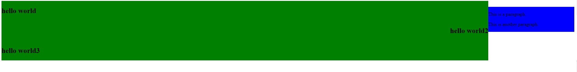
I am trying to "helloworld" is next to "helloworld2" like this :

Expected Image

Friendly reminder, Each text (helloworld,2,3) should inside their own div.
Each text have own div

In addition to that, I don’t want to use JS to fix this issue because of the code complexity increasing. I just want to fix it with CSS or HTML changing.

I tried z-index and display keywords and other structures to fix this issue but I couldn’t fix it. How can I achieve it?

.container {
  margin: 0;
}

.leftSide {
  float: left;
  width: 85%;
  overflow: hidden;
  background-color: green;
}

.rightSide {
  margin-top: 20px;
  float: left;
  width: 15%;
  background-color: blue;
}
<div class="container">
  <div class="leftSide">
    <div style="float:left; width:100%;  ">
      <h2>hello world</h2>
    </div>
    <div>
      <div style="float:left; width:100%;  ">
        <h2 style="float:right">hello world2</h2>
      </div>
      <div style="float:left;  width:100%;  ">
        <h2>hello world3</h2>
      </div>
    </div>
  </div>
  <div class="rightSide">
    <p>This is a paragraph.</p>
    <p>This is another paragraph.</p>
  </div>
</div>

3

Answers


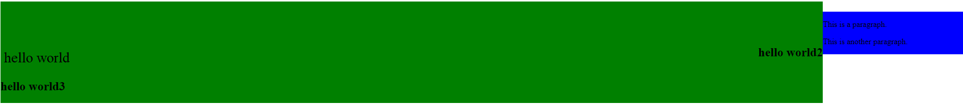
  1. You can make these elements to occupy same line when they have e.g. 50% of width, so they will be displayed one after another.

    But this will display "hello world 2" next to "hello world", not other way around. Maybe add top padding/margin if needed
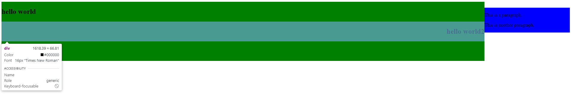
    .container {
      margin: 0;
    }
    
    .leftSide {
      float: left;
      width: 85%;
      overflow: hidden;
      background-color: green;
    }
    
    .rightSide {
      margin-top: 20px;
      float: left;
      width: 15%;
      background-color: blue;
    }
    
    [class*="col-"] {
       float: left;
    }
    
    .col-50 {
      width: 50%;
    }
    
    .col-100 {
      width: 100%;
    }
    
    * {
      box-sizing: border-box;
    }
    <div class="container">
      <div class="leftSide">
        <div class="col-50">
          <h2>hello world</h2>
        </div>
        <div>
          <div class="col-50">
            <h2 style="float:right">hello world2</h2>
          </div>
          <div class="col-100">
            <h2>hello world3</h2>
          </div>
        </div>
      </div>
      <div class="rightSide">
        <p>This is a paragraph.</p>
        <p>This is another paragraph.</p>
      </div>
    </div>
    Login or Signup to reply.
  2. Since you want both hello world and hello world2 be at the same line you can put them in a single div and display:flex them like so:

    .container {
      margin: 0;
    }
    
    .leftSide {
      float: left;
      width: 85%;
      overflow: hidden;
      background-color: green;
    }
    
    .rightSide {
      margin-top: 20px;
      float: left;
      width: 15%;
      background-color: blue;
    }
    <div class="container">
      <div class="leftSide">
       <div style="display:flex;">
        <div style="width:100%">
          <h2>hello world</h2>
        </div>
          <div style="width:100%">
            <h2 style="float:right">hello world2</h2>
          </div>     
       </div>
          <div style="float:left;  width:100%;  ">
            <h2>hello world3</h2>
          </div>
      </div>
      <div class="rightSide">
        <p>This is a paragraph.</p>
        <p>This is another paragraph.</p>
      </div>
    </div>
    Login or Signup to reply.
  3. Experiment with flexes like:

    .container {
      margin: 0;
    }
    
    .row {
      display: flex;
    }
    .leftSide {
      width: 85%;
      height: auto;
      overflow: hidden;
      background-color: green;
    }
    
    .rightSide {
      margin-top: 20px;
      width: 10%;
      background-color: blue;
    }
    <div class="container">
      <div class="row">
        <div class="leftSide">
          <h2>hello world</h2>
        </div>
        <div class="rightSide">
          <p>This is a paragraph.</p>
          <p>This is another paragraph.</p>
        </div>
      </div>
      <div class="row">
        <div class="leftSide">
          <h2>hello world</h2>
        </div>
      </div>
      <div class="row">
        <div class="leftSide">
          <h2>hello world</h2>
        </div>
      </div>
      <div class="row">
        <div class="leftSide">
          <h2>hello world</h2>
        </div>
      </div>
    </div>
    Login or Signup to reply.
Please signup or login to give your own answer.
Back To Top
Search