


I’m having a problem aligning the text with the icon, because the our-numbers-value class has a larger font-size than the our-numbers-text class, so the div ends up growing and the image is aligned with the div.
I used align-items-center in the div with the texts, but when I did that, for some reason, my last text breaks incorrectly, giving me a very unpleasant look.
 .numbers-image {
     width: 30px;
     height: 30px;
     margin-right: 15px;
}
 .flex-align-center {
     display: flex;
     align-items: center;
}
 .text-nowrap {
     white-space: nowrap;
}
 .our-numbers-text {
     color: #061c3d;
     font-weight: 700;
     font-size: 32px;
}
 .our-numbers-value {
     color: #061c3d;
     font-weight: 700;
     font-size: 52px;
}
<div class="flex-align-center">
<div>
<img class="numbers-image" src="./assets/svg/paid.svg" alt="" />
</div>
<div class="flex-align-center">
<span class="our-numbers-text text-nowrap">More then</span>
<span class="our-numbers-value">0</span>
<span class="our-numbers-text">
million in sales of air conditioning equipment.
</span>
</div>
</div>current result:
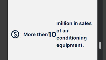
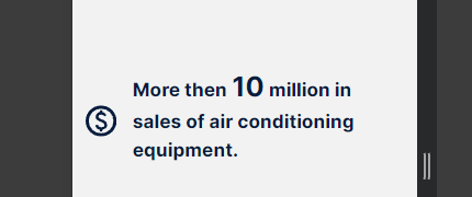
what I expect:
2
Answers
CSS
HTML
Try to remove the class
flex-align-centerfrom the div that is inside the other div with the same class. It should look like this:This way you have two div items inside a flexbox container.