skip to Main Content

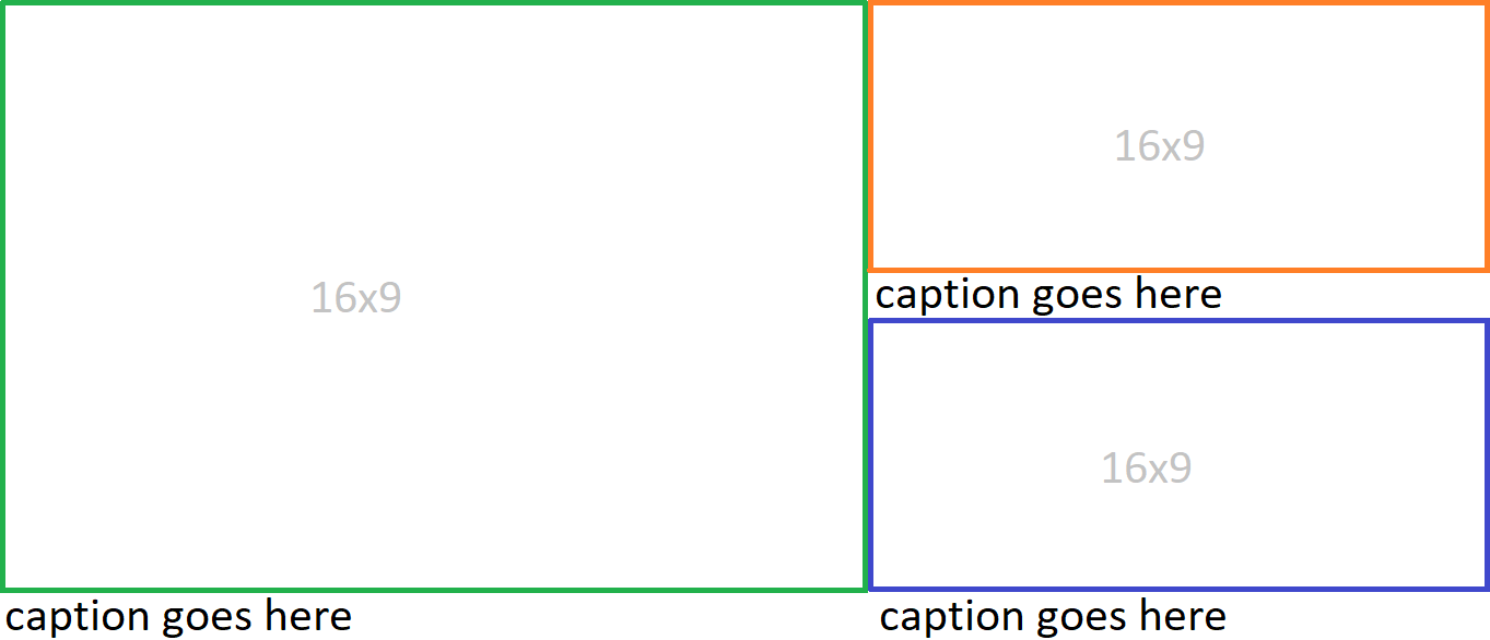
enter image description here

I’m trying to create the above layout with CSS, but can’t quite figure it out. Each 16×9 rectangle is an image. The layout needs to be responsive. Any overflow on the captions will be hidden, so they’ll always be 1 line.

https://9elements.com/blog/building-a-combined-css-aspect-ratio-grid/ got me most of the way there, however the addition of the captions seems to screw the math up, and I can’t figure out how to adjust for it.

EDIT: The below snippet is what I tried, but obviously it’s not correct. Because the column on the right has 2 captions and the left hand box has 1 caption, the aspect ratio of 48/18 is no longer correct. I think if I used a padding hack instead of aspect-ratio I could use calc to somehow account for the addition of the captions? But I don’t understand the math well enough to even know where to begin with that.

.row {
    aspect-ratio: 48/18;
    display: flex;
    max-width: 50rem;
    gap: 1rem;
}

.column {
    aspect-ratio: 16/18;
    display: flex;
    flex-direction: column;
    gap: 1rem;
}

.item {
    height: 100%;
    display: flex;
    flex-direction: column;
}

.img {
    aspect-ratio: 16/9;
    height: 100%;
}
<div class="row">
  <div class="item">
    <img src="https://via.placeholder.com/1920x1080/eee?text=16:9" class="img" />
    caption goes here
  </div>

  <div class="column">
    <div class="item">
      <img src="https://via.placeholder.com/1920x1080/eee?text=16:9" class="img" />
      caption goes here
    </div>

    <div class="item">
      <img src="https://via.placeholder.com/1920x1080/eee?text=16:9" class="img" />
      caption goes here
    </div>
  </div>
</div>

3

Answers


  1. You can do it using CSS Grid as below

    .grid-container {
      display: grid;
      grid-template-columns: 2fr 1fr;
      grid-gap: 10px;
    }
    
    .left-box {
      grid-column: 1;
      grid-row: 1 / span 2;
      position: relative;
      overflow: hidden;
    }
    
    .left-box img {
      width: 100%;
      height:auto;
      display: block;
      object-fit: cover;
    }
    
    .left-box .caption {
      position: absolute;
      bottom: 0;
      left: 0;
      width: 100%;
      background-color: rgba(0, 0, 0, 0.8);
      color: #fff;
      padding: 10px;
      line-height: 1.2;
      overflow: hidden;
      white-space: nowrap;
      text-overflow: ellipsis;
    }
    
    .right-box {
      grid-column: 2;
      grid-row: 1 / span 2;
      display: grid;
      grid-template-rows: 1fr 1fr;
      grid-gap: 10px;
    }
    
    .right-box-item {
      position: relative;
      overflow: hidden;
    }
    
    .right-box-item:before {
      content: "";
      display: block;
      padding-top: 56.25%
    }
    
    .right-box-item img {
      position: absolute;
      top: 0;
      left: 0;
      width: 100%;
      height: 100%;
      object-fit: cover;
    }
    
    .caption {
      position: absolute;
      bottom: 0;
      left: 0;
      width: 100%;
      background-color: rgba(0, 0, 0, 0.8);
      color: #fff;
      padding: 10px;
      line-height: 1.2;
      overflow: hidden;
      white-space: nowrap;
      text-overflow: ellipsis;
    }
    <body>
      <div class="grid-container">
        <div class="left-box">
          <img src="https://via.placeholder.com/1920x1080/eee?text=16:9" alt="Left Image">
          <div class="caption">Caption for the left image</div>
        </div>
        <div class="right-box">
          <div class="right-box-item">
            <img src="https://via.placeholder.com/1920x1080/eee?text=16:9" alt="Top Image">
            <div class="caption">Caption for the top image</div>
          </div>
          <div class="right-box-item">
            <img src="https://via.placeholder.com/1920x1080/eee?text=16:9" alt="Bottom Image">
            <div class="caption">Caption for the bottom image</div>
          </div>
        </div>
      </div>
    </body>
    Login or Signup to reply.
  2. You can try with ‘table’ element if you can use. It may help much, I guess.
    The code would be like below;

    <table>
    <tbody>
      <tr>
        <td rowspan="2">
          <img src='img1'/>
          <p>caption 1</p>
        </td>
      </tr>
      <tr>
        <td>
          <img src='img2'/>
          <p>caption 2</p>
        </td>
        <td>
          <img src='img3'/>
          <p>caption 3</p>
        </td>
      </tr>
    </tbody>
    </table>
    
    Login or Signup to reply.
  3. This needs a little bit of algebra to find the widths of the larger image and the smaller ones.

    The calculation depends on knowing 3 things: the overall width you want, this is called –w in the snippet, the height you want the caption spaces to be. This is called –c in the snippet and the gap between grid figures, –g.

    Start by noticing the obvious:
    w = w1 + w2 where w1, w2 are the widths of the bigger and smaller images respectively. [You can adjust further for border widths and/or gaps if you want]

    And then noticing that the height of the bigger image is 2*height of a smaller image + caption height:

    w19/16 = (2(w2*9/16)) + c

    So we’ve got two simultaneous equations from which we can work out that:

    w1 = (w + (c * 8 / 9)) * 2 /3

    w2 = (w / 3) – (c * 16 / 27)

    From these we can set up a CSS grid as in this snippet:

    * {
      margin: 0;
      box-sizing: border-box;
    }
    
    .row {
      --w: min(50rem, 100vw);
      /* the width of the two columns */
      --c: 1.2em;
      /* the height of a caption element */
      --g: 1rem;
      /* the gap */
      width: calc(var(--w) + var(--g));
      display: grid;
      grid-column-gap: var(--g);
      grid-template-columns: calc((var(--w) + (var(--c) * 8 / 9)) * 2 / 3) calc((var(--w) / 3) - (var(--c) * 16 / 27));
      grid-template-rows: calc(((var(--w) / 3) - (var(--c) * 16 / 27)) * 9 /16) var(--c) calc(((var(--w) / 3) - (var(--c) * 16 / 27)) * 9 /16) var(--c);
    }
    
    .row>figure {
      display: contents;
    }
    
    .row> :nth-child(1) img {
      grid-column: 1 / span 1;
      grid-row: 1 / span 3;
    }
    
    .row> :nth-child(1) figcaption {
      grid-column: 1 / span 1;
      grid-row: 4 / span 1;
    }
    
    .row>nth-child(2) img {
      grid-column: 2 / span 1;
      grid-row: 1 / span 1;
    }
    
    .row>nth-child(2) figcaption {
      grid-column: 2 / span 1;
      grid-row: 2 / span 1;
    }
    
    .row> :nth-child(3) img {
      grid-column: 2 / span 1;
      grid-row: 3 / span 1;
    }
    
    .row> :nth-child(3) figcaption {
      grid-column: 2 / span 1;
      grid-row: 4 / span 1;
    }
    
    .img {
      aspect-ratio: 16/9;
      width: 100%;
      object-fit: cover;
    }
    <head>
      <meta name="viewport" content="width=device-width, initial-scale=1" />
    </head>
    
    <body>
      <div class="row">
        <figure class="item">
          <img src="https://via.placeholder.com/1920x1080/eee?text=16:9" class="img" />
          <figcaption>caption goes here</figcaption>
        </figure>
        <figure class="item">
          <img src="https://via.placeholder.com/1920x1080/eee?text=16:9" class="img" />
          <figcaption>caption goes here</figcaption>
        </figure>
        <figure class="item">
          <img src="https://via.placeholder.com/1920x1080/eee?text=16:9" class="img" />
          <figcaption>caption goes here</figcaption>
        </figure>
      </div>
    </body>

    Note: I changed the HTML to replace the item divs with a figure element containing an img and a figcaption as that seemed more logical.

    Login or Signup to reply.
Please signup or login to give your own answer.
Back To Top
Search