


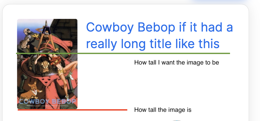
I am trying to make a simple flexbox that contains an image and a short paragraph of text, using next/image in next.js. In order to make it responsive, the text will wrap if the screen is too small, which varies the height of the flexbox. I’m trying to make the image fill the height of the flexbox while keeping its aspect ratio, but not stretch it so that the flexbox (and the image itself) becomes taller than the text.
I tried messing around with the fill, height, and width properties, and tried to recreate a minimal version of the problem in codesandbox. So far this is the closest I can get to what I want, but I want the image to be placed alongside the text, not overlapping it.
How can I accomplish this?
2
Answers
Without statically setting width and height properties I managed to get it work wrapping the Image in a relative container, keeping the
fillandobjectFitproperties (used a div wrapper because fill or objectfit were applying aposition: absoluteto image).This seems to be your desired result.
If you want to have a specific height for the image: