


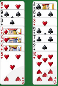
The goal is to have stacks of playing cards stacked vertically, a solitaire stack is a good mental image (little bit of the previous card poking out the top with the bottom most card fully visible)
I am using instead of for the .cards but they seem to match the snipper behaviour 1-1 from what i’ve seen.
For horizontal stacking i copied the top answer to this question: Make flex items overlap
.cards {
  display: flex;
  align-content: center;
  max-width: 35em;
}

.cardWrapper {
  /*overflow: hidden;*/  /*using width shows better overlap*/
  min-width: 3.5em;
}

.cardWrapper:last-child, .cardWrapper:hover {
    /*overflow: visible;*/
    min-width: 10.5em; /*full width + 2*padding */
}

.card {
    width: 10em;
    min-width: 10em;
    height: 6em;
    border-radius: 0.5em;
    border: solid #666 1px;
    background-color: #ccc;
    padding: 0.25em;

    display: flex;
    flex-direction: column;
    justify-content: center;
    align-items: center;
}
<div class="cards">
<div class="cardWrapper">
<div class="card">card 1 blah blah blah</div>
</div>
<div class="cardWrapper">
<div class="card">card 2 blah blah blah</div>
</div>
<div class="cardWrapper">
<div class="card">card 3 blah blah blah</div>
</div>
<div class="cardWrapper">
<div class="card">card 4 blah blah blah</div>
</div>
<div class="cardWrapper">
<div class="card">card 5 blah blah blah</div>
</div>
</div>This is great now i just need to convert it to a vertical stack.
Here is what i tried:
In ‘flex’ the default major axis is horizontal, so I hoped specifying column would sort everything out but alas.
Expected Result: neat stacking
actual Result: full Height cards in a column
Other things i have tried
- maybe the wrappers need to be columns aswell -> add in display: flex; flex-direction: column; justify-content: center; align-items: center; -> this only moves the column to centre of screen.
- since "flex-direction: column;" was specified for .card in original maybe revert it to default of row-> no change as far as i can tell.
.cards {
  display: flex;
  flex-direction: column; /*change main axis to vertical, but now no stacking*/
  align-content: center;
  max-width: 35em;
}

.cardWrapper {
  /*overflow: hidden;*/  /*using width shows better overlap*/
  min-height: 2em;
}

.cardWrapper:last-child, .cardWrapper:hover {
    /*overflow: visible;*/
    min-height: 6.5em; /* full height + 2*padding*/
}

.card {
    width: 10em;
    min-width: 10em;
    height: 6em;
    border-radius: 0.5em;
    border: solid #666 1px;
    background-color: #ccc;
    padding: 0.25em;

    display: flex;
    flex-direction: column;
    justify-content: center;
    align-items: center;
}
<div class="cards">
<div class="cardWrapper">
<div class="card">card 1 blah blah blah</div>
</div>
<div class="cardWrapper">
<div class="card">card 2 blah blah blah</div>
</div>
<div class="cardWrapper">
<div class="card">card 3 blah blah blah</div>
</div>
<div class="cardWrapper">
<div class="card">card 4 blah blah blah</div>
</div>
<div class="cardWrapper">
<div class="card">card 5 blah blah blah</div>
</div>
</div>
2
Answers
You almost figured it out. You change the
min-widthtomin-heightbut forgot to changemax-widthtomax-height. Just change that and it work with your current code.You should set max-height of card and change the style as below.