skip to Main Content

I have a flex container with flex direction set to row with 3 items. I need all 3 items in a single row, with the first and last items to the far left and right side respectively, and the middle 2nd item to be centered. The problem I am getting is the button (3rd item) is stretching super wide and filling the entire width in its respective space. Any help hugely appreciated here.

.parent {
  display: flex;
  flex-direction: row;
}

.left, .right {
  flex: 1;
}
<div class="parent">
  <div class="left">Left</div>
  <div class="center">Center</div>
  <button class="right"></div>
</div>

Current: enter image description here
Desired: enter image description here

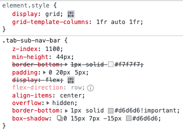
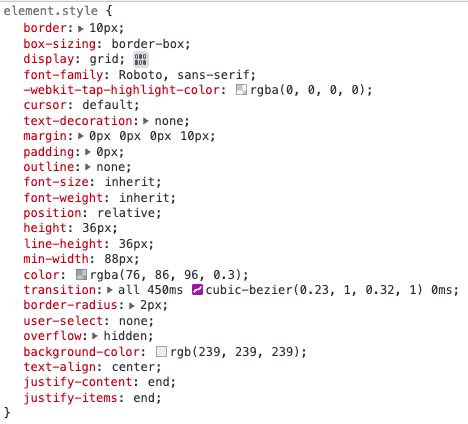
What I’ve Tried Now:

Main Parent Div:

enter image description here

Button Div:

enter image description here

Button text is now properly located to the right side but the left padding on the button still extends out all the way.

4

Answers


  1. You can wrap the <button> in a <div class="right"> and use justify-content: end on that:

    .parent {
      display: flex;
    }
    
    .left, .right {
      flex: 1;
    }
    
    .right {
      display: flex;
      justify-content: end;
    }
    <div class="parent">
      <div class="left">Left</div>
      <div class="center">Center</div>
      <div class="right">
        <button>RightFoobarLoremIpsum</button>
      </div>
    </div>

    …or use display: grid and set justify-self: end for .right:

    .parent {
      display: grid;
      grid-template-columns: 1fr auto 1fr;
    }
    
    .right {
      justify-self: end;
    }
    <div class="parent">
      <div class="left">Left</div>
      <div class="center">Center</div>
      <button class="right">RightFoobarLoremIpsum</button>
    </div>
    Login or Signup to reply.
  2. For starters, your markup is invalid. <button> should be lowercase and should have a closing </button>, not a closing </div>. Once you correct that…

    You can control the spacing of elements with justify-content. Also, get rid of the flex: 1; rule as that’s explicitly telling the element to grow.

    For example:

    .parent {
      display: flex;
      flex-direction: row;
      justify-content: space-between;
    }
    <div class="parent">
      <div class="left">Left</div>
      <div class="center">Center</div>
      <button class="right"></button>
    </div>
    Login or Signup to reply.
  3. Put the button inside of <div class="right">

    .parent {
      display: flex;
      flex-direction: row;
    }
    
    .left {
      flex: 1;
      text-align: left;
    }
    
    
    .right {
      flex: 1;
      text-align: right;
    }
    
    .btn {
      padding: 0 10px;
    }
    <div class="parent">
      <div class="left">Left</div>
      <div class="center">Center</div>
      <div class="right"><button class="btn">test</button></div>
    </div>
    Login or Signup to reply.
  4. You are setting flex: 1 on the two side items. Specified like that, it sets flex-grow: 1 and flex-basis: 0: you are telling the two side items to grow, and not the center one.

    You can either make none grow and distribute the items evenly, or make the center one grow and not the side ones.

    Distribute:

    .parent {
      display: flex;
      flex-direction: row;
      justify-content: space-between;
    }
    
    .parent > * {
      outline: 1px solid red;
    }
    <div class="parent">
      <div class="left">Left</div>
      <div class="center">Center</div>
      <button class="right">Right</div>
    </div>

    Grow:

    .parent {
      display: flex;
      flex-direction: row;
    }
    
    .parent > * {
      outline: 1px solid red;
    }
    
    .center {
      flex-grow: 1;
      text-align: center;
    }
    <div class="parent">
      <div class="left">Left</div>
      <div class="center">Center</div>
      <button class="right">Right</div>
    </div>

    Also, your button markup is invalid: you are closing it with a </div> tag.

    Login or Signup to reply.
Please signup or login to give your own answer.
Back To Top
Search