skip to Main Content

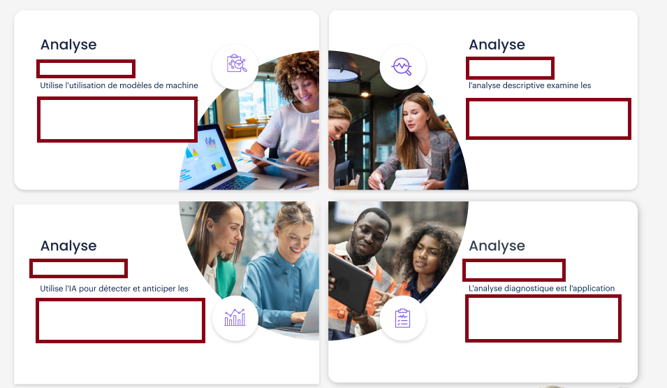
I was trying to make this specific design in CSS but I couldn’t figure out a way to do it .

enter image description here

The code I tried didn’t give me the result and I don’t know what I’m doing wrong .

The images I got are already rounded corners so I just need to place them in the corners of rectangles so I can add some text later on.

.container {
  display: flex;
  background-color: red;
}

.rectangle {
  position: relative;
  flex-basis: calc(50% - 20px);
  height: 150px;
  margin: 10px;
  background-color: blue;
}

.rectangle img {
  width: 100%;
  height: 100%;
  object-fit: cover;
}

.rectangle:nth-child(1) img {
  position: absolute;
  bottom: 0;
  right: 0;
}

.rectangle:nth-child(2) img {
  position: absolute;
  bottom: 0;
  left: 0;
}

.rectangle:nth-child(3) img {
  position: absolute;
  top: 0;
  right: 0;
}

.rectangle:nth-child(4) img {
  position: absolute;
  top: 0;
  left: 0;
}
<div class="container">
  <div class="row">
    <div class="rectangle">
      <img src="image1.jpg" alt="Image 1">
    </div>
    <div class="rectangle">
      <img src="image2.jpg" alt="Image 2">
    </div>
  </div>
  <div class="row">
    <div class="rectangle">
      <img src="image3.jpg" alt="Image 3">
    </div>
    <div class="rectangle">
      <img src="image4.jpg" alt="Image 4">
    </div>
  </div>
</div>

2

Answers


  1. You could use these css properties:

    border-top-left-radius: 100%; /* for the top left image */
    border-top-right-radius: 100%; /* for the top right image */
    border-bottom-right-radius: 100%; /*for the bottom right image */
    border-bottom-left-radius: 100%; /* for the bottom left image*/
    
    Login or Signup to reply.
  2. Reasons why you are not getting the intended result:

    • <div class="container"> uses flexbox so the two child <div class="row"> are positioned horizontally side-by-side. <div class="rectangle"> is block level and is positioned vertically above/below each other. Therefore, what you intended to be rows are actually columns.

    • Your :nth-child(3) and :nth-child(4) selectors don’t match anything because there are only two <div class="rectangle"> child elements of each <div class="row"> (you could have used :nth-of-type())

    • .rectangle {flex-basis: calc(50% - 20px)} has no effect because <div class="row"> is not a flex container

    • After removing the <div class="row"> containers, another apparent issue is the images cover the entire div due to these declarations that should be removed:

    .rectangle img {
      width: 100%;
      height: 100%;
      object-fit: cover;
    }
    

    After making those corrections, we finally get the desired result:

    .container {
      display: flex;
      flex-wrap: wrap;
      background-color: red;
    }
    
    .rectangle {
      position: relative;
      flex-basis: calc(50% - 20px);
      height: 150px;
      margin: 10px;
      background-color: blue;
    }
    
    .rectangle img {
      position: absolute;
    }
    
    .rectangle:nth-child(1) img {
      bottom: 0;
      right: 0;
    }
    
    .rectangle:nth-child(2) img {
      bottom: 0;
      left: 0;
    }
    
    .rectangle:nth-child(3) img {
      top: 0;
      right: 0;
    }
    
    .rectangle:nth-child(4) img {
      top: 0;
      left: 0;
    }
    <div class="container">
      <div class="rectangle">
        <img src="//picsum.photos/100?1" alt="Image 1">
      </div>
      <div class="rectangle">
        <img src="//picsum.photos/100?2" alt="Image 2">
      </div>
      <div class="rectangle">
        <img src="//picsum.photos/100?3" alt="Image 3">
      </div>
      <div class="rectangle">
        <img src="//picsum.photos/100?4" alt="Image 4">
      </div>
    </div>

    However, now you’ll discover that the images are placed on top of other content. The images should be used as the background image for this effect.

    To fix the double margin around the flex items, declare gap and padding on the container and adjust the flex-basis calculation.

    .container {
      display: flex;
      flex-wrap: wrap;
      gap: 10px;
      padding: 10px;
      background-color: red;
    }
    
    .rectangle {
      flex-basis: calc(50% - 5px);
      height: 150px;
      background-color: blue;
      background-repeat: no-repeat;
    }
    
    .rectangle:nth-child(1) {
      background-image: url(//picsum.photos/100?1);
      background-position: bottom 0 right 0;
    }
    
    .rectangle:nth-child(2) {
      background-image: url(//picsum.photos/100?2);
      background-position: bottom 0 left 0;
    }
    
    .rectangle:nth-child(3) {
      background-image: url(//picsum.photos/100?3);
      background-position: top 0 right 0;
    }
    
    .rectangle:nth-child(4) {
      background-image: url(//picsum.photos/100?4);
      background-position: top 0 left 0;
    }
    <div class="container">
      <div class="rectangle"></div>
      <div class="rectangle"></div>
      <div class="rectangle"></div>
      <div class="rectangle"></div>
    </div>
    Login or Signup to reply.
Please signup or login to give your own answer.
Back To Top
Search