


Sorry for my not perfect english.
Actually I have this HTML/CSS project. Actually the main div is going to expand when the table height increases, but I want the .main div stops to mantain the "header main footer" structure untouched and with the same viewport height.
Despite the "max-height: 100vh" on body the viewport is going to increase his height.
HTML:
<head>
    <meta charset="UTF-8">
    <meta name="viewport" content="width=device-width, initial-scale=1.0">
    <title>Prova stupida</title>
    <link rel="stylesheet" href="style.css">
</head>

<body>

    <header>
        Header
    </header>

    <div class="main">
        <div class="tableContainer">
            <table cellspacing="0">
                <thead>
                    <tr><th>Ciao</th><th>come</th><th>va</th><th>?</th></tr>
                </thead>
                <tbody>
                    <!-- Other tables value omitted for brevity -->
                    <tr><td>Bene</td><td>grazie</td><td>a te</td><td>?</td></tr>
                </tbody>
            </table>
        </div>
    </div>

    <footer>
        Footer
    </footer>

</body>

</html>
CSS:
* {
    margin: 0;
    padding: 0;
}

body {
    display: flex;
    flex-direction: column;
    max-height: 100vh;
}

header, footer {
    background-color: #35393C;
    padding: 20px;
    text-transform: uppercase;
    color: white;
    font-size: 24px;
}

.main {
    background-color: #42858C;
    flex-grow: 1;
    padding: 20px;
}

table {
    font-size: large;
}

table td {
    background-color: #397367;
    border: 1px solid black;
    padding: 10px 5px;
}

table th {
    background-color: #5DA399;
    padding: 10px 5px;
}
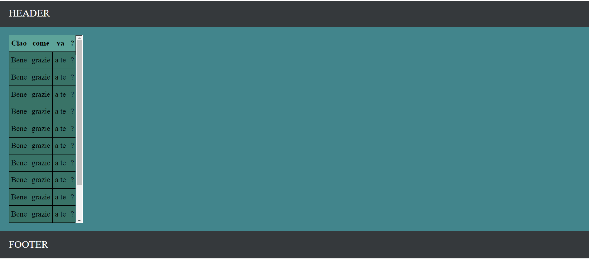
How I want it to be seen, with the scrollable .tableContainer div
Thanks you all
3
Answers
You can add this css to your tableContainer :
I’ve put 200px but you can choose the height you want, it will be always at this size, no matter the size of the content.
The width property will place the scrollbar right next to the content.
This will give you exactly what you wanted:
We need to give the "table container" a height but we can’t give a fixed height. So I calculated the constant height (header + footer + padding*2 of the main container = 174px) and subtracted it from the viewport height and assigned the remaining height to the "table container".
apply some height and overflow-y: auto to a .tableContainer
.tableContainer{ overflow-y: auto; height: calc(100vh - here apply height of header+footer) }