skip to Main Content

enter image description here

So I was trying to replicate this grid with grid-auto-flow: column; but I wasn’t able to achieve it.

Issue #1: Container should be horizontal scrollable since it can have many more options
Issue #2: Since I was using grid each column has taking the longest item and instead of grouping all the elements on the image they were separated
note: should only contain two rows

So far I was only able to achieve this example:

enter image description here

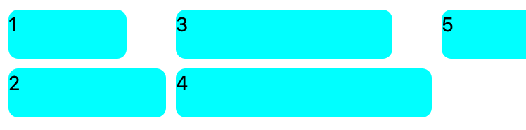
but since each column is taking a specific width it is leaving some space between 1 & 3 and 3 & 5

this is the code:

.grid {
  display: grid;
  grid-auto-flow: column;
  grid-template-rows: repeat(2, auto);
  grid-template-columns: repeat(auto-fill, minmax(auto, 1fr));
  gap: 8px;
}
.module {
  height: 40px;
  border-radius: 8px;
  background-color: aqua;
}
<div class="grid">
  <div style="width: 96px;" class="module">1</div>
  <div style="width: 128px;" class="module">2</div>
  <div style="width: 176px;" class="module">3</div>
  <div style="width: 208px;" class="module">4</div>
  <div style="width: 176px;" class="module">5</div>
</div>

3

Answers


  1. Consider letting the items wrap naturally within a CSS Flexbox container (shown in red in the example below).

    .details {
      font-family: sans-serif;
      display: flex;
      flex-wrap: wrap;
      width: 500px;
      background: red;
      gap: 0.5rem;
      padding: 0.5rem;
    }
    .detail {
      display: flex;
      gap: 0.5rem;
      padding: 0.5rem;
      background: white;
      border-radius: 0.25rem;
    }
    .detail dd {
      display: flex;
      flex-direction: column;
      margin: 0;
    }
    <dl class="details">
      <div class="detail">
        <dt><img alt="Reviews" src="https://placekitten.com/36/36" width="36" height="36"/></dt>
        <dd><strong>5 star average</strong> from over 34 reviews</dd>
      </div>
      <div class="detail">
        <dt><img alt="Order Requirements" src="https://placekitten.com/36/36" width="36" height="36"/></dt>
        <dd><strong>$6.00</strong> minimum order</dd>
      </div>
      <div class="detail">
        <dt><img alt="Location" src="https://placekitten.com/36/36" width="36" height="36"/></dt>
        <dd><strong>Richmond</strong> county</dd>
      </div>
      <div class="detail">
        <dt><img alt="Prep Time" src="https://placekitten.com/36/36" width="36" height="36"/></dt>
        <dd><strong>20 min</strong> preparation</dd>
      </div>
      <div class="detail">
        <dt><img alt="Flexibility" src="https://placekitten.com/36/36" width="36" height="36"/></dt>
        <dd><strong>Orders up to 1 day</strong> in advance</dd>
      </div>
    </dl>
    Login or Signup to reply.
  2. Just change to flex and remove some things in the CSS. I will leave the content style out of this since it is not about that here.

    .my-container {
      display: flex;
      flex-flow: row wrap;
      gap: 8px;
    }
    .module {
      height: 40px;
      border-radius: 8px;
      background-color: aqua;
    }
    <div class="my-container">
      <div style="width: 96px;" class="module">1</div>
      <div style="width: 128px;" class="module">2</div>
      <div style="width: 176px;" class="module">3 i AM BIGGER</div>
      <div style="width: 208px;" class="module">4</div>
      <div style="width: 176px;" class="module">5</div>
    </div>
    Login or Signup to reply.
  3. I appreciate this answer may be a little controversial, but I welcome any feedback/issues.

    This fixes the issues of:

    1. Only two rows
    2. Scrolling horizontally
    3. Being in a brick layout

    This does NOT solve the issue of the item ordering, which may or may not be a deal breaker.

    * {
      box-sizing: border-box;
    }
    
    .container {
      width: 300px;
      height: 120px;
      overflow-x: auto;
    }
    
    .grid {
      columns: 2;
      column-gap: 0;
      writing-mode: vertical-lr;
    }
    
    .grid div {
      height: 40px;
      border-radius: 8px;
      background-color: #CCC;
      display: inline-flex;
      padding: 10px 15px;
      writing-mode: initial;
      margin-right: 10px;
      margin-bottom: 10px;
    }
    <div class="container">
      <div class="grid">
        <div>1. lorem</div>
        <div>2. ipsum</div>
        <div>3. dolor sit</div>
        <div>4. sit ips</div>
        <div>5. amet</div>
        <div>6. lorem</div>
        <div>7. ipsum</div>
        <div>8. dolor sit</div>
        <div>9. sit ips</div>
        <div>10. amet</div>
        <div>11. lorem</div>
        <div>12. ipsum</div>
        <div>13. dolor sit</div>
        <div>14. sit ips</div>
        <div>15. amet</div>
        <div>16. lorem</div>
        <div>17. ipsum</div>
        <div>18. dolor sit</div>
        <div>19. sit ips</div>
        <div>20. amet</div>
      </div>
    </div>
    Login or Signup to reply.
Please signup or login to give your own answer.
Back To Top
Search