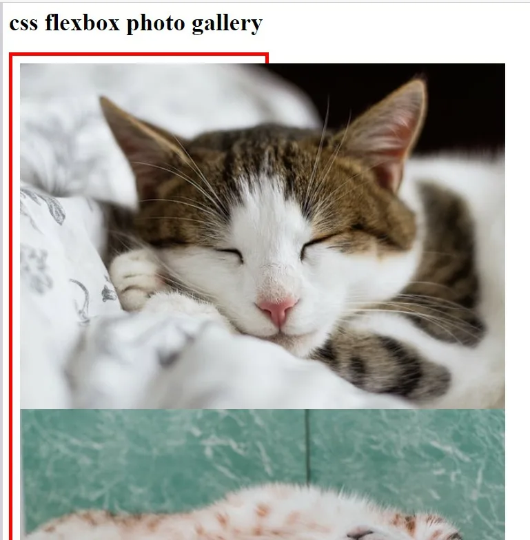
I am following the FreeCodeCamp curriculum for responsive web design. I am on the module "Learn CSS Flexbox by Building a Photo Gallery" step 9. We are learning about the border-box box-sizing property. MDN has the following description for that property:
"border-box tells the browser to account for any border and padding in the values you specify for an element’s width and height. If you set an element’s width to 100 pixels, that 100 pixels will include any border or padding you added,** and the content box will shrink to absorb that extra width**."
I wanted to test my knowledge and set border-box only on the .gallery element, and remove any styling on the elements. My understanding is that the elements contained in the .gallery container should shrink to fit inside of .gallery (since the elements are contained within the "content box" of the .gallery container). However it does not – it overflows. Below is the html and css, the html is unchanged (from the start of the lesson) but I did mess around with the css, again to test my knowledge:
<!DOCTYPE html>
<html lang="en">
  <head>
    <meta charset="utf-8">
    <meta name="viewport" content="width=device-width, initial-scale=1.0">
    <title>Photo Gallery</title>
    <link rel="stylesheet" href="./styles.css">
  </head>
  <body>
    <header class="header">
      <h1>css flexbox photo gallery</h1>
    </header>
    <div class="gallery">
      <img src="https://cdn.freecodecamp.org/curriculum/css-photo-gallery/1.jpg">
      <img src="https://cdn.freecodecamp.org/curriculum/css-photo-gallery/2.jpg">
      <img src="https://cdn.freecodecamp.org/curriculum/css-photo-gallery/3.jpg">
      <img src="https://cdn.freecodecamp.org/curriculum/css-photo-gallery/4.jpg">
      <img src="https://cdn.freecodecamp.org/curriculum/css-photo-gallery/5.jpg">
      <img src="https://cdn.freecodecamp.org/curriculum/css-photo-gallery/6.jpg">
      <img src="https://cdn.freecodecamp.org/curriculum/css-photo-gallery/7.jpg">
      <img src="https://cdn.freecodecamp.org/curriculum/css-photo-gallery/8.jpg">
      <img src="https://cdn.freecodecamp.org/curriculum/css-photo-gallery/9.jpg">
    </div>
  </body>
</html>
.gallery {
  border: 5px solid red;
  width: 50%;
  box-sizing: border-box;
  padding: 10px;

}
Is MDN wrong, and it is not the case that the content of the element (on which border-box is applied) shrinks to accommodate border and padding in the element’s width and height? Or is there some knowledge I am missing/misunderstanding?
Thanks in advance.


2
Answers
You have to set the image width, otherwise it will take the real image size.
This will set the width for all the images. If you need to set it for specific images, you could add a class (for multiple images) or id (for a single image) to the img tag from your HTML file.
when you mention ‘box-sizing: border-box;’ in css, Both border and padding are included in the div width you mentioned.For instance, if you mention width of the div as 300px and 10px padding and 3px border, The total width of the content also will be only 300px in which border and padding width are included.
If you don’t mention ‘box-sizing: border-box;’ in css, Both border and padding are considered as as the width(or size) apart from the div width. For instance, if you mention width of the div as 300px and 10px padding and 3px border, The total width of the content will become 326px(10px+3px both the sides)
Here image width has overflown because you haven’t mentioned image width. So it has taken the original width of the image. If the screen size is bigger, the image will set inside the div which is 50%. So you should mention in each image tag as follows:
By mentioning 100% width for img tag, It takes 100% width of its parent element(i.e class gallery). Though the parent element is 50% of its parent parent element(i.e body), since the img width is 100% it occupies the full width of its parent element(i.e class gallery)
Another chance for wrong understanding is, if someone has told that the content will shrink accordingly if you mention border box, it is applicable for text for which there is no default width. Whereas for image, since All the images will have its own size by default, you need to mention width. Also, you can’t say that image size has not shrunk. Because when you mention 100% image width, it doesn’t take 100% of the div width. After leaving off the padding width and border width, the rest of the width is considered as 100%. (If it were 90%, 90% of the width of the space leaving off the border and padding width) In this way image is also auto-shrunk.