


I have a problem when less div(card-div) in the main div, the gap between lines keeps expanding. When there’s more div(card-div) the gap is closer. I tried to fix it, but it didn’t work at all.
thank you in advance.
forgive me with my css, I just tried and put stuffs there.
just need someone to help fixing this
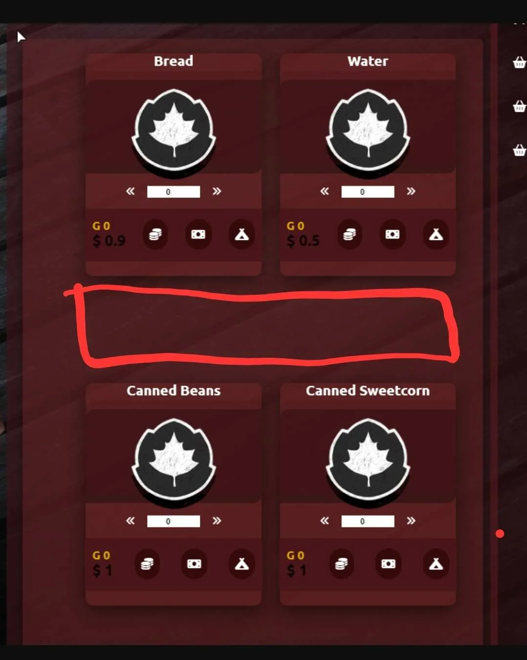
as you can see from the pic 1 there s a gap in the red line when less card-div
pic 1 << pic here
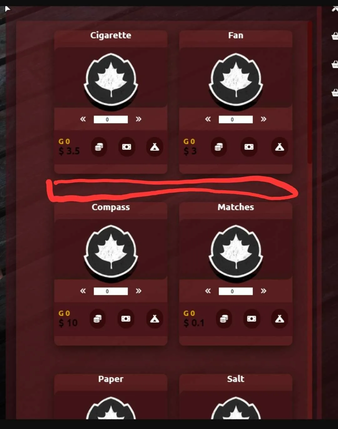
this is a pic 2 when I added more card-div, gap is closer
pic 2 << pic here
html code is in js part, it is increase card-div by itself from the config
.containers {
     position: relative;
     overflow: auto;
     width: 94%;
     height: 55em;
     left: 3%;
     padding: 20px;
     display: grid;
     grid-template-columns: 2fr 1fr;
     grid-gap: 60px 25px;
     margin-top: 10px;
}
 .containers{
     display: flex;
     overflow: auto;
     flex-wrap: wrap;
     justify-content: center;
     border-radius: 6px;
     width: 215%;
     margin-left: -7%;
}
 .card-div{
     position: relative;
     left: 25px;
     width: 15em;
     max-height: 19em;
     display: flex;
     flex-direction: column;
     justify-items: center;
     align-items: center;
     background-color: #6d24247d;
     margin: 0em;
     box-sizing: border-box;
     border-radius: 10px;
     box-shadow: 0 7px 25px rgb(0 0 0 / 62%);
     transition: transform 0.2s ease-in-out;
}
<div class="containers">`
<div class="card-1 card-div">
   <div class="gow-img-div img-div">
      <img src="./imgs/awards_set_d_001.png" alt="god-of-war-figurine">
   </div>
   <div class="text-container">
      <h2 class="item-name">${element.label}</h2>
      <!-- <p class="date">Female Coats</p>-->
   </div>
   <div class="round-p">
      <button class="inbn" onclick="this.parentNode.querySelector('input[type=number]').stepDown();getInputValue();"><span class="fa-solid fa-angles-left"></span></button>
      <button class="inb"><input  id='check1' class="quantity" min="0" name="quantity" value="0" type="number"  min="1" max="65"></button>
      <button class="inbn" onclick="this.parentNode.querySelector('input[type=number]').stepUp();getInputValue();"><span class="fa-solid fa-angles-right"></span></button>
   </div>
   <div class="cartbtn">
      <div class="pricing-and-cart">
         <div class="pricing">
            <p class="previous-price">G ${element.gold}</p>
            <p class="current-price">$ ${element.price}</p>
         </div>
         <button class="btn"><i class="fa-solid fa-coins"></i></button>
         <button class="btn"><i class="fa-solid fa-money-bill"></i></button>
         <button class="btn"><i class="fa-solid fa-campground"></i></button>
      </div>
   </div>
</div>
</div>
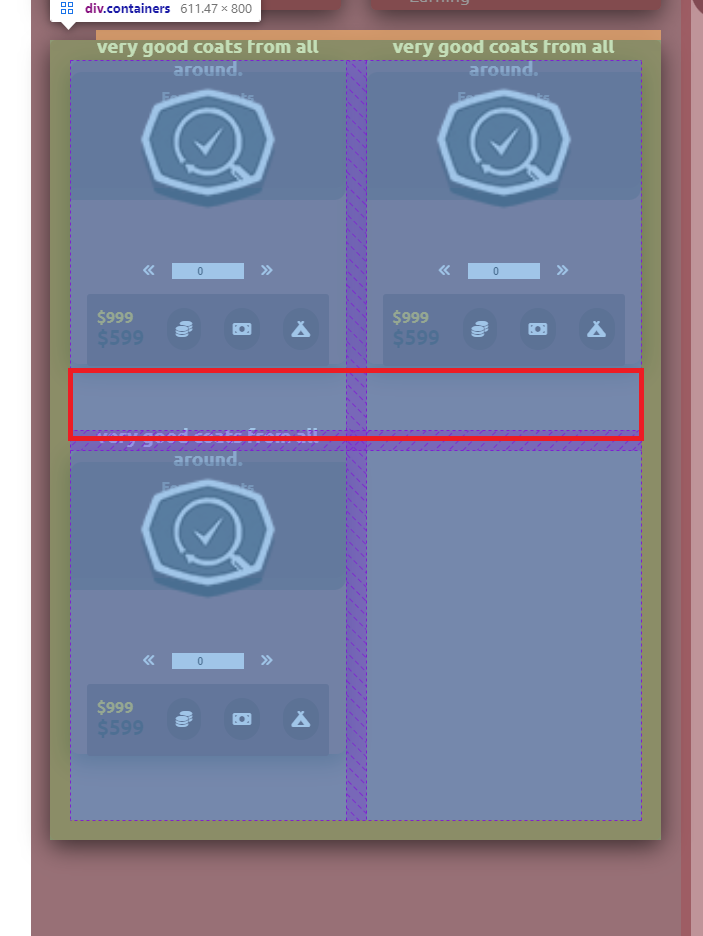
from the pic 3
pic 3 << pic here you can see the gap I marked
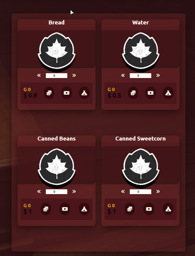
pic 4 is a normal pic of pic 3
pic 4 << pic here
2
Answers
problem solved thanks for all helps
from what I am able to understand the issue you’re facing with the gap between card-div elements expanding when there are fewer card-div elements is likely due to the combination of your CSS styles and the grid layout.
Here is the modified CSS code block:
The changes are in
grid-gapinsidecontainersandmargin-bottominsidecard-div.Hope this helps 🙂