


I can’t seem to display my navigation bar elements in a single line (horizontally) despite setting "display: inline-block;"
I’m trying to create a dropdown menu and want to do so without copy pasting codes from sources, I’m still new to HTML and CSS. I’m a hands-on kind of guy so I learn as I code and haven’t gotten that far in the learning materials at w3shools.
PS. this is my first time posting so I apologize in advance if I didn’t provide enough details or wasn’t able to follow the rules and regulations of this website
Here is my code:
html,
body {
  font-family: Arial, Helvetica, sans-serif;
  margin: 0px;
  padding: 0px;
}

.page-header,
.header-title {
  align-items: center;
  background-color: black;
  color: white;
  justify-content: center;
  text-align: center;
  margin: 0px;
  padding: 2px 5px 2px 5px;
  /* top, right, bottom, left */
}

.nav-bar {
  background-color: lightblue;
  border: none;
  margin: 0px;
  overflow: hidden;
  padding: 0px;
}


/* navigation bar behavior */

.nav-bar,
.nav-home-btn,
.nav-memories-btn,
.nav-family-btn,
.nav-about-btn {
  display: inline-block;
}

.nav-home-btn,
.nav-memories-btn,
.nav-family-btn,
.nav-about-btn {
  background-color: inherit;
  border: none;
  color: white;
  font-size: 16px;
  padding: 14px 16px;
  text-align: center;
  text-decoration: none;
  width: 255px;
}


/* button style */

.nav-home-btn:hover,
.nav-memories-btn:hover,
.nav-family-btn:hover,
.nav-about-btn:hover {
  background-color: aquamarine;
}

.nav-bar a {
  float: left;
  font-family: inherit;
  font-size: 16px;
  color: white;
  text-align: center;
  padding: 14px 16px;
  text-decoration: none;
}


/* link style */

.nav-memories-dropdown,
.nav-family-dropdown {
  float: left;
  overflow: hidden;
}

.nav-memories-dropdown,
.nav-family-dropdown {
  display: none;
  position: absolute;
  background-color: #f9f9f9;
  min-width: 160px;
  box-shadow: 0px 8px 16px 0px rgba(0, 0, 0, 0.2);
  z-index: 1;
}
<!DOCTYPE html>
<html>
<head>
<link rel="stylesheet" href="XMASprojectCSS.css">
<title> Page title </title>
<style>
</style>
</head>
<body>
<header class="page-header">
  <div class="header-title">
    <h1 class="h1-title">AJ Adventures</h1>
  </div>
</header>

<nav class="nav-bar">
  <button class="nav-home-btn">Home </button>
  <div class="nav-memories">
    <button class="nav-memories-btn"> Memories </button>
    <div class="nav-memories-dropdown">
      <a href="#"> 2023 </a>
      <a href="#"> 2022 </a>
      <a href="#"> 2021 </a>
    </div>
  </div>
  <div class="nav-family">
    <button class="nav-family-btn"> Meet the Family </button>
    <div class="nav-family-dropdown">
      <a href="#"> Abby </a>
      <a href="#"> Jc </a>
      <a href="#"> Ana </a>
    </div>
  </div>
  <button class="nav-about-btn"> About Us </button>
</nav>
<footer>
</footer>
</body>
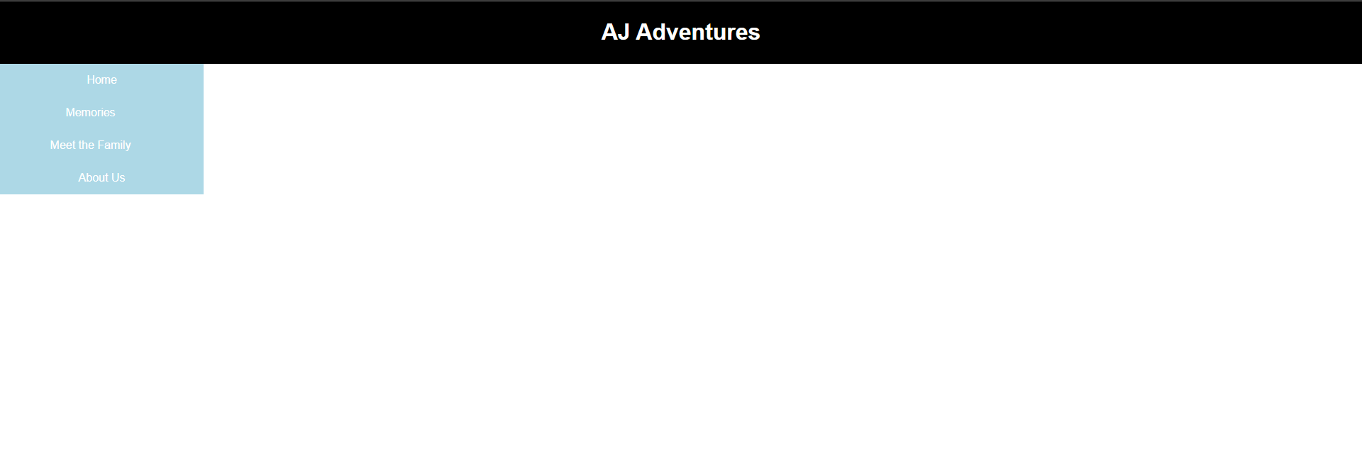
</html>This is what’s showing on my end: enter image description here
5
Answers
I’ve made some adjustments for you below
Add this to the CSS document:
and remove the
.nav-barfrom the navigation bar behavior.It must solve the issue youre facing.
Your best bet and easiest route would be to learn about CSS Flexbox, the display property (block, inline, inline-block etc) is to elements to display as block or inline and not to layout elements on a page. You want to study Flexbox and Grid for that.
Using
floatto align items is an old technique which will place the affected elements outside of the normal document flow.Nowadays using a flexbox is the preferred way to align elements the way you want. I’ve adjusted your CSS and documented the changes.
One approach – of many potential solutions and approaches – is below, with quite a few explanatory comments in the code to explain my adjustments and reasoning:
JS Fiddle demo.
References:
align-items.background-color.block-size.border.box-shadow.box-sizing.clip-path.color.display.flex-grow.float.font-family.font-size.gap.inline-size.isolation.justify-content.margin.padding.padding-block.padding-block-end.padding-block-start.padding-inline.padding-inline-end.padding-inline-start.position.text-align.text-decoration.transition.width.z-index.Bibliography: