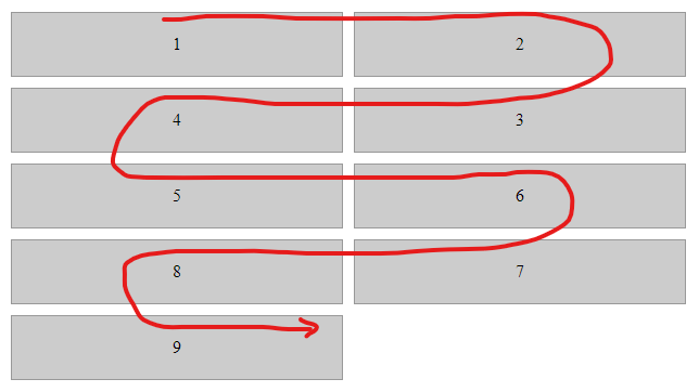
I’m looking for a way to display an ordered list of components in an "S" pattern (where you can trace the start to the end of the list without lifting up your pen, for example).
This is what the end goal looks like:
For the life of me, I can’t come up with a way to do this. If it was a column with a set number of rows, I could do something like :nth-child(even) { flex-direction: row-reverse; } as this post suggests.
Here is the basic markup:
.flex-container {
  display: flex;
  flex-flow: wrap;
  place-content: flex-start;
  align-items: flex-start;
  flex: 1 1 320px;
}

.flex-item {
  flex: 0 0 calc(33.33% - 10px);
  /* Adjust the width as needed */
  margin: 5px;
  text-align: center;
  padding: 20px;
  background-color: #ccc;
  border: 1px solid #999;
}


/* This doesn't work */

.flex-container:nth-child(even) {
  flex-direction: row-reverse;
}
<div class="flex-container">
<div class="flex-item">1</div>
<div class="flex-item">2</div>
<div class="flex-item">3</div>
<div class="flex-item">4</div>
<div class="flex-item">5</div>
<div class="flex-item">6</div>
<div class="flex-item">7</div>
<div class="flex-item">8</div>
<div class="flex-item">9</div>
<!-- this list is dynamic! -->
</div>Here is a jfiddle with the basic setup I have in a production application. One thing to keep in mind is this is coming from a 3rd party application (Inductive Automation’s Ignition Perspective), so I pretty much need to do things this way, as I’ll have a dynamic number of components in the list.


2
Answers
This is a good question with, apparently, no good answers yet. It’s probably not possible to achieve a snake-like flow with CSS alone, without some constraints (such as a fixed number of items).
In any case, here are some references—too many to list in the comments, but also not clear duplicates. Perhaps they will provide useful guidance.
Doable using CSS grid if you know the number of columns. I have a (long) article detailing such techniques that worth reading in case you need more complex configuration: https://css-tricks.com/exploring-css-grids-implicit-grid-and-auto-placement-powers/#grid-patterns
For 2 columns
And for 3 columns: