skip to Main Content

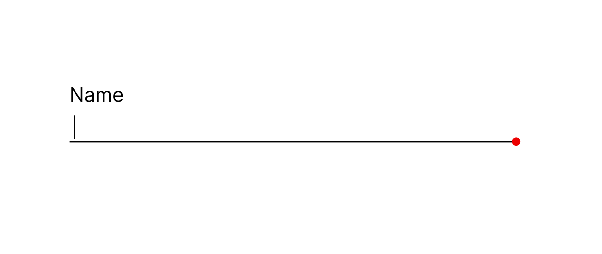
I want to style an input by adding an dot at the end of it. Same As The Image Below

enter image description here

I’ve Tried To add some styling for :before :after but i couldn’t figure it out

.parent {
  max-width: 352px;
  width: 100%;
}

.children {
  display: flex;
  align-items: center;
  width: 100%;
  margin: 10px 0;
}

.line {
  width: 100%;
  height: 1px;
  background-color: red;
}

.the-dot {
  width: 1px;
  height: 1px;
  background-color: red;
  border-radius: 999px;
}

.children input {
  border: none;
  border-bottom: 1px solid;
  margin-right: 5px;
  flex-grow: 1;
}
<div class="parent">
  <div class="children">
    <input type="text" placeholder="Type something...">
    <div class="line"></div>
    <div class="the-dot"></div>
  </div>
</div>

2

Answers


  1. Without using flex and nesting the dot inside the line I ended up to this:

    .parent {
      max-width: 352px;
      width: 100%;
    }
    
    
    .line{
      width: 100%;
      height: 1px;
      background-color: black;
      margin-top:15px;
      display:block;
    }
    
    .the-dot {
      width: 10px;
      height: 10px;
      background-color: red;
      border-radius: 50%;
      display:inline-block;
      float:right;
      margin-top:-5px;
      }
    
    input {
      width:100%;
      display:block;
      border: none;
      border-bottom: 1px solid;
      outline:0;
      border:0;
    }
    <div class="parent">
        <input type="text" placeholder="Type something...">
        <div class="line"><div class="the-dot"></div></div>
    </div>
    Login or Signup to reply.
  2. Simply use position: absolute to position a dot created using border-radius and aspect-ratio:

    .children {
      position: relative;
    }
    
    .the-dot {
      position: absolute;
      /* 100% of .children's height, minus half its size, minus half line width. */
      top: calc(100% - var(--size) / 2 - var(--border) / 2);
      /* 100% of .children's width, minus half its size. */
      left: calc(100% - var(--size) / 2);
      /* Make it round */
      border-radius: 50%;
      height: var(--size);
      /* Ensure that its height is equal to its width */
      aspect-ratio: 1 / 1;
    }
    

    Alternatively, you can use a pseudo-element:

    .children::after {
      content: '';
      /* idem */
    }
    

    Try it:

    /* Play with these */
    :root {
      --size: 5px;
      --color: #f00;
      --border: 1px;
    }
    
    .children {
      position: relative;
    }
    
    .the-dot {
      position: absolute;
      top: calc(100% - var(--size) / 2 - var(--border) / 2);
      left: calc(100% - var(--size) / 2);
      border-radius: 50%;
      height: var(--size);
      aspect-ratio: 1 / 1;
      background: var(--color);
    }
    
    
    /* Demo only */
    
    .parent {
      max-width: 352px;
      width: 100%;
    }
    
    .children {
      display: flex;
      align-items: center;
      width: 100%;
      margin: 10px 0;
    }
    
    .children input {
      border: none;
      border-bottom: var(--border) solid;
      flex-grow: 1;
    }
    <div class="parent">
      <div class="children">
        <input type="text" placeholder="Type something...">
        <div class="the-dot"></div>
      </div>
    </div>
    Login or Signup to reply.
Please signup or login to give your own answer.
Back To Top
Search