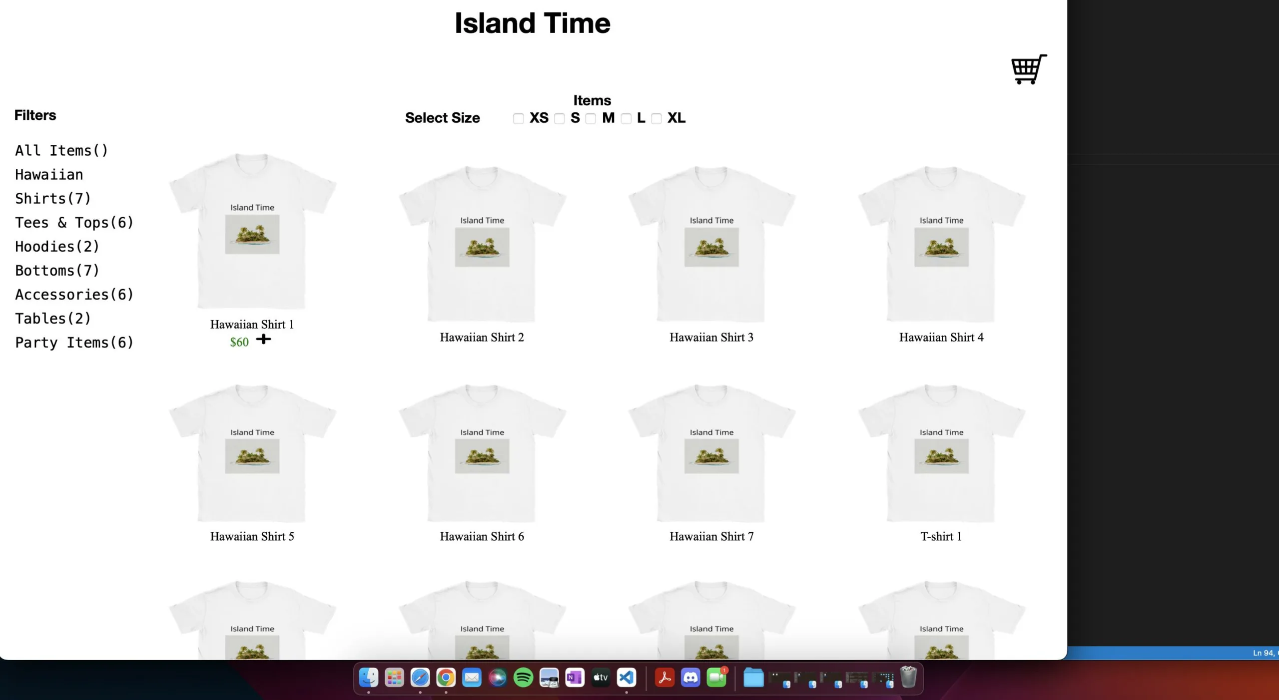
I’m trying to get the link centered in the middle with the shopping cart image in the top right corner. Not sure what I’m doing wrong but I can’t get them on the same line.
Here’s an image of the problem (look at the top):
Here’s a code snippet of the code:
.itemLink {
  text-decoration: none;
  color: black;
}

.cartImg {
  width: 5%;
  height: 5%;
  float: right;
  margin-top: 0%;
}
<div>
<div style="display: inline">
<h1>
<a class="itemLink" href="../index.html"><center>Island Time</center></a>
</h1>
</div>
<div>
<img class="cartImg" src="assestsForProductsPage/shopping-cart-icon.jpeg" alt="ShoppingCart">
</div>
</div>The link is the "Island Time" text at the top of the image and the image with the class cartImg is what holds the shopping cart.
If anyone can help me align the link and image at the top of the page with the link in the middle and the image on the far right corner, that’d be much appreciated. Thank you! Let me know if more code is needed.


2
Answers
Forget about
<center>..</center>andfloatfor making layouts, these are outdated for a long time now. Usedisplay: flexordisplay: gridwhen the first one doesn’t cover your needs.Your particular case:
Live demo: https://codepen.io/JaredSpb/pen/wvQdKeg
Here is what I changed:
Note: You have to put the value of "translateX(50px)" half of the shopping cart width. For example: If the shopping cart width is 50px then change the value to "translateX(25px)".
Here is what you needed: