skip to Main Content

I’m working my way through an online course and run into a problem. We are supposed to create a site that looks like this:
Goal Site

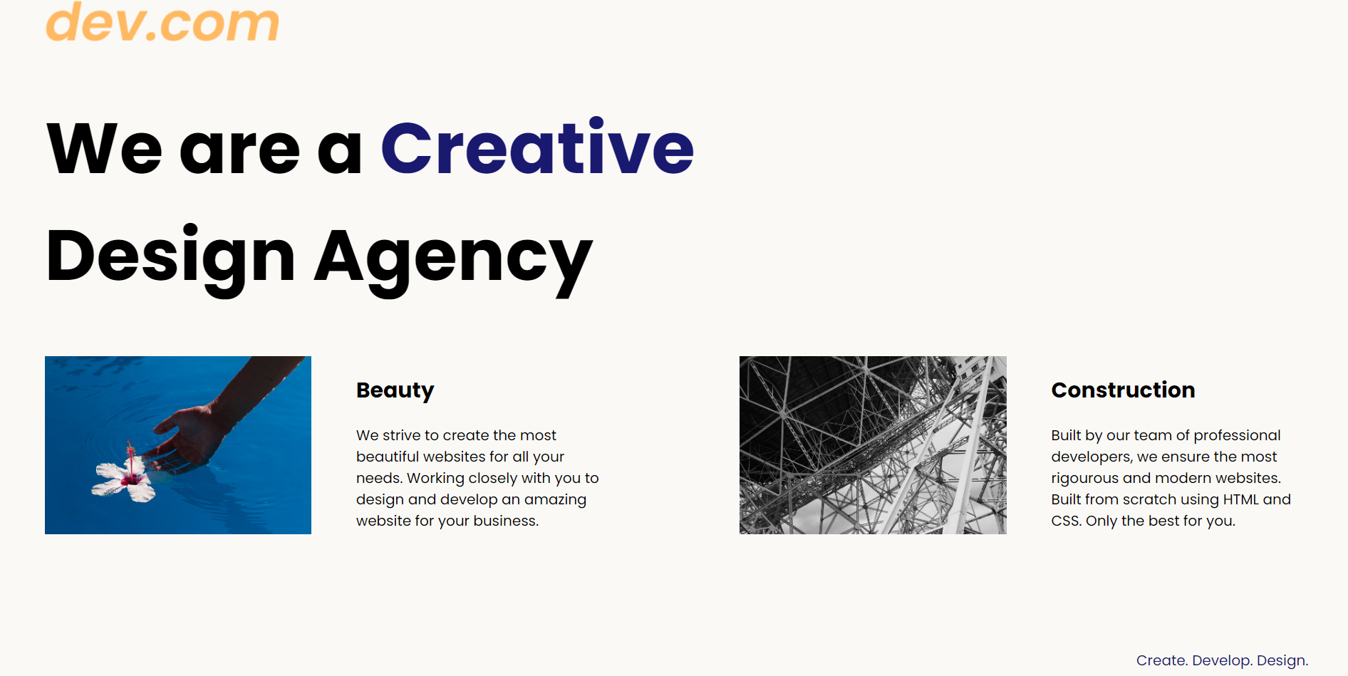
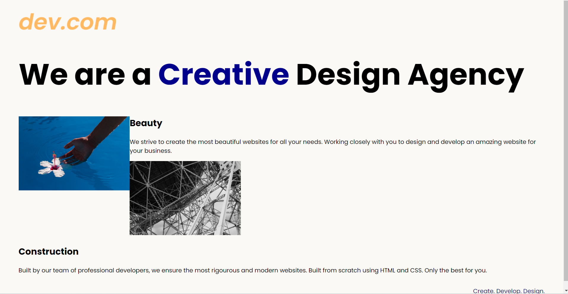
Currently, my website looks like this:
My Website

Here is the HTML and CSS code I am trying to amend:

<body>
  <div class="main">
    <img class="logo" src="./assets/images/logo.png" alt="logo">
    <h1>We are a <span style="color: darkblue;">Creative</span> Design Agency</h1>
    <div class="left card"><img class="tile-image-left tile-image" src="./assets/images/beautiful.jpg" alt="hand and flower in water">
      <h2 class="card-title">Beauty</h2>
      <p class="card-text">We strive to create the most beautiful websites for all your needs. Working closely with you
        to
        design and
        develop an amazing website for your business.</p>
    </div>

    <div class="right card"><img class="tile-image-right tile-image" src="./assets/images/construction.jpg" alt="metal structure">
      <h2 class="card-title-right">Construction</h2>
      <p class="card-text-right">Built by our team of professional developers, we ensure the most rigourous and modern websites. Built from
        scratch using HTML and CSS. Only the best for you.</p>
    </div>

  </div>
  <footer>
    <p>Create. Develop. Design.</p>
  </footer>
</body>
body {
  font-family: "Poppins", sans-serif;
  margin: 50px 50px 0 50px;
  background-color: #faf9f6;
  display: flex;
  flex-direction: column;
  min-height: 95vh;
}
.main {
  flex: 1;
}

h1 {
  font-size: 5rem;
}

footer {
  text-align: right;
  color: midnightblue;
}

.tile-image{
  height: 200px;
}

.tile-image-left{
float: left;
clear: both;
}

I’ve tried to set the div’s, images, and text to ‘inline-block’ but that hasn’t worked.

I’ve also tried to float the text by the images, but found that the 2nd image always seems to move out of place, as seen by the image it is directly below my first image, but I need them to be side to side.

I’m not sure how to tackle this so I’d appreciate the help if you can spare the time.

Regards,
Proton

2

Answers


  1. Wrap your left and right cards inside a parent div (.cards in the below example). Then, wrap your text content inside a parent (aside in the example).

    Then it’s just a case of setting both to flex display.

    You’ll have to add margins/paddings to get it exactly like the design.

    body {
      font-family: "Poppins", sans-serif;
      margin: 50px 50px 0 50px;
      background-color: #faf9f6;
      display: flex;
      flex-direction: column;
      min-height: 95vh;
    }
    .main {
      flex: 1;
    }
    
    h1 {
      font-size: 5rem;
    }
    
    footer {
      text-align: right;
      color: midnightblue;
    }
    
    .tile-image{
      height: 200px;
    }
    
    .tile-image-left{
    float: left;
    clear: both;
    }
    
    .cards {
      display:flex;
    }
    .card {
      display:flex;
      align-items:center;
    }
    <body>
      <div class="main">
    
        <div class="cards">
          <div class="left card">
            <img class="tile-image-left tile-image" src="https://picsum.photos/500/500" alt="hand and flower in water">
            <aside>
              <h2 class="card-title">Beauty</h2>
              <p class="card-text">We strive to create the most beautiful websites for all your needs. Working closely with you
            to
            design and
            develop an amazing website for your business.</p>
            </aside>
        </div>
    
        <div class="right card">
          <img class="tile-image-right tile-image" src="https://picsum.photos/500/500" alt="metal structure">
          <aside>
            <h2 class="card-title-right">Construction</h2>
            <p class="card-text-right">Built by our team of professional developers, we ensure the most rigourous and modern websites. Built from
            scratch using HTML and CSS. Only the best for you.</p>
          </aside>
        </div>
        </div>
        
    
      </div>
    </body>
    Login or Signup to reply.
  2. I have tried this in my project which I have implemented but I am presenting small portion of it.

    /*
    SPACING SYSTEM (px)
    2 / 4 / 8 / 12 / 16 / 24 / 32 / 48 / 64 / 80 / 96 / 128
    
    FONT SIZE SYSTEM (px)
    10 / 12 / 14 / 16 / 18 / 20 / 24 / 30 / 36 / 44 / 52 / 62 / 74 / 86 / 98
    */
    
    /* 
    MAIN COLOR: #087f5b
    GREY COLOR: #343a40
    */
    
    * {
      margin: 0;
      padding: 0;
      box-sizing: border-box;
    }
    
    /* ------------------------ */
    /* GENERAL STYLES */
    /* ------------------------ */
    body {
      font-family: "Inter", sans-serif;
      color: #343a40;
      border-bottom: 8px solid #087f5b;
    }
    
    .container {
      width: 960px;
      margin: 0 auto;
    }
    
    header,
    section {
      margin-bottom: 96px;
    }
    
    h2 {
      margin-bottom: 48px;
      font-size: 36px;
      letter-spacing: -0.5px;
      /* 24 / 30 / 36 */
    }
    
    .grid-3-cols {
      display: grid;
      grid-template-columns: repeat(3, 1fr);
      column-gap: 80px;
    }
    
    .btn:link,
    .btn:visited {
      background-color: #087f5b;
      color: #fff;
      text-decoration: none;
      text-transform: uppercase;
      font-weight: 500;
    
      display: inline-block;
      border-radius: 100px;
    }
    
    .btn:hover,
    .btn:active {
      background-color: #099268;
    }
    
    .btn--big {
      font-size: 18px;
      padding: 16px 32px;
    }
    
    .btn--small {
      font-size: 14px;
      padding: 8px 12px;
    }
    
    img {
      border-radius: 12px;
    }
    
    /* ------------------------ */
    /* COMPONENT STYLES */
    /* ------------------------ */
    
    /* HEADER */
    header {
      display: grid;
      grid-template-columns: repeat(2, 1fr);
      column-gap: 80px;
      margin-top: 64px;
    }
    
    .header-text-box {
      align-self: center;
    }
    
    h1 {
      margin-bottom: 32px;
      font-size: 44px;
      line-height: 1.1;
      letter-spacing: -1px;
      /* 44 / 52 / 62 */
    
      /* text-shadow: 0 5px 5px rgba(0, 0, 0, 0.2); */
    }
    
    .header-text {
      margin-bottom: 24px;
      font-size: 18px;
      line-height: 1.7;
    }
    
    img {
      width: 100%;
    }
    
    /* FEATURES */
    .features-icon {
      stroke: #087f5b;
      width: 32px;
      heigh: 32px;
      margin-bottom: 24px;
    }
    
    .features-title {
      margin-bottom: 16px;
      font-size: 20px;
    }
    
    .features-text {
      font-size: 18px;
      line-height: 1.7;
    }
    
    /* TESTIMONIAL */
    .testimonial-section {
      background-color: #087f5b;
      color: #fff;
      padding: 24px;
      border-radius: 12px;
    }
    
    .testimonial-box {
      grid-column: 2 / -1;
      align-self: center;
    }
    
    .testimonial-box h2 {
      margin-bottom: 24px;
      /* 20 / 24 / 30 */
      font-size: 24px;
    }
    
    .testimonial-text {
      font-style: italic;
      margin-bottom: 24px;
      font-size: 18px;
      line-height: 1.7;
      color: #e6fcf5;
    }
    
    .testimonial-author {
      color: #c3fae8;
    }
    
    /* CHAIRS */
    .chair {
      box-shadow: 0 20px 30px 0 rgba(0, 0, 0, 0.07);
      border-radius: 12px;
    }
    
    .chair img {
      border-bottom-left-radius: 0;
      border-bottom-right-radius: 0;
    }
    
    .chair-box {
      padding: 32px;
    }
    
    h3 {
      margin-bottom: 24px;
      font-size: 20px;
    }
    
    .chair-details {
      list-style: none;
      margin-bottom: 48px;
    }
    
    .chair-details li {
      display: flex;
      align-items: center;
      gap: 12px;
      margin-bottom: 16px;
    }
    
    .chair-details li:last-child {
      margin-bottom: 0;
    }
    
    .chair-icon {
      stroke: #087f5b;
      width: 24px;
      height: 24px;
    }
    
    .chair-price {
      display: flex;
      justify-content: space-between;
      align-items: center;
      font-size: 20px;
    }
    
    footer {
      margin-bottom: 48px;
      font-size: 14px;
      color: #495057;
    }
    <!DOCTYPE html>
    <html lang="en">
      <head>
        <meta charset="UTF-8" />
        <meta http-equiv="X-UA-Compatible" content="IE=edge" />
        <meta name="viewport" content="width=device-width, initial-scale=1.0" />
    
        <link rel="preconnect" href="https://fonts.gstatic.com" />
        <link
          href="https://fonts.googleapis.com/css2?family=Inter:wght@400;500;700&display=swap"
          rel="stylesheet"
        />
    
        <link rel="stylesheet" href="style.css" />
        <title>Lisbon Chair Shop</title>
      </head>
      <body>
        <div class="container">
          <header>
            <div class="header-text-box">
              <h1>We design and build better chairs, for a better life</h1>
              <p class="header-text">
                In a small shop in the heart of Lisbon, we spend our days
                relentlessly perfecting the chair. The result is a perfect blend of
                beauty and comfort, that will have a lasting impact on your health.
              </p>
              <a class="btn btn--big" href="#">Shop chairs</a>
            </div>
            <img src="https://media.wired.com/photos/598e35994ab8482c0d6946e0/master/w_2560%2Cc_limit/phonepicutres-TA.jpg" alt="Photo" />
          </header>
    
         
      </body>
    </html>

    It has HTML and CSS both and is presented as a demo.

    Login or Signup to reply.
Please signup or login to give your own answer.
Back To Top
Search