skip to Main Content

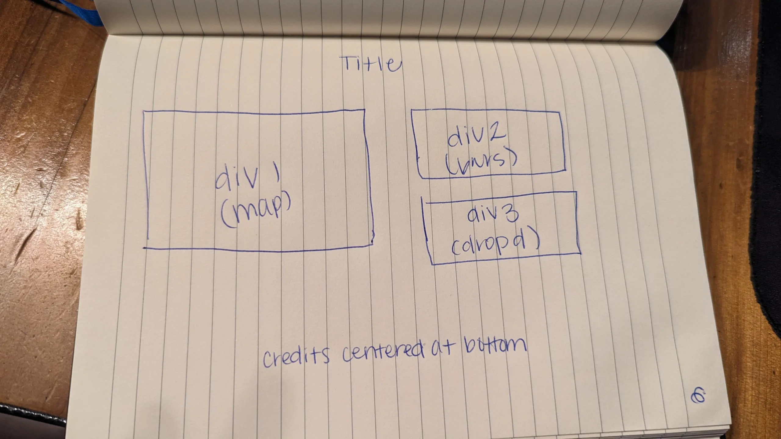
This is a Data Analysis project for school. I have spent 2 days trying to organize my divs (in the drawn pic below). I am about to pull my hair out. Help!

goal layout

It is stacking all the divs on top of each other. How do I get my map container on the left side, with the bar chart and drop down menu on the right side?

/* General resets for consistent styling */
* {
  margin: 0;
  padding: 0;
  box-sizing: border-box;
}

body {
  font-family: Arial;
  color: #555;
  font-size: 16px;
  line-height: 1.7;
  display: flex;
  flex-direction: column;
  align-items: center;
}

.centered-header {
text-align: center;
margin-top: 0;
max-width: 100%;
height: auto;
position: relative;
z-index: 1;
}

footer {
color: #fff;
font-size: 14px;
text-align: center;
position: absolute;
bottom: 0;
}


.content {
  width: 90vw;
  max-width: 1300px;
  background-color: #00000049;
  padding: 40px;
  border-radius: 8px;
  box-shadow: 0 10px 20px rgba(0, 0, 0, 0.1);
}

#map-container {
  width: 100%;
  height: 500px;
  border-radius: 6px;
  overflow: hidden;
}

/* Set Legend Style */
.legend {
  padding: 6px 8px;
  font-size: 14px;
  background: black;
  background: rgba(255, 255, 255, 0.8);
  box-shadow: 0 0 15px rgba(0, 0, 0, 0.2);
}

.legend i {
  width: 20px;
  height: 20px;
  float: left;
  margin-right: 8px;
  opacity: 0.7;
}
<!DOCTYPE html>
<html lang="en">

<head>
    <meta charset="UTF-8">
    <meta name="viewport" content="width=device-width, initial-scale=1.0">
    <meta http-equiv="X-UA-Compatible" content="ie=edge">
    <title>Meteorite Landings</title>
    <link href="images/favicon.ico" rel="icon" type="image/x-icon">

    <header class="centered-header">
      <img src="images/coollogo_com-6123290.png" alt="Header Image">
    </header>

<body>

  <div class="content">
    <div id="map-container">
    <!-- Leaflet map inserted here -->
    </div>
    <div id="bar">
        <!-- Other visualizations go here -->
    </div>
    <div>
      <select id="meteoroidSelect">
        <option value="">Select a Meteoroid</option>
      </select>
    </div>
    <div id="meteoroidDetails">
      <strong>Name: </strong><span id="name"></span><br>
      <strong>Year: </strong><span id="year"></span><br>
      <strong>Mass: </strong><span id="mass"></span> grams<br>
      <strong>Recclass: </strong><span id="type"></span><br>
    </div>

      <footer>
        <p>Created by University of Denver Data Analysis Students: <a href="https://github.com/agostinger">Adam Gostinger</a>, <a href="https://github.com/jgurbb38">Jennifer Grubb</a>, and <a href="https://github.com/Ryguy57">Ryan Himes</a>.<br>
          Data Sourced from <a href="https://catalog.data.gov/dataset/meteorite-landings"> data.nasa.gov </a></p>
    </footer>
    </body>

</html>

4

Answers


  1. I wrapped the elements in the right with a div so they stack, and added display: flex; to the content so they go one next to the other.

    Html:

    /* General resets for consistent styling */
    * {
      margin: 0;
      padding: 0;
      box-sizing: border-box;
    }
    
    body {
      font-family: Arial;
      color: #555;
      font-size: 16px;
      line-height: 1.7;
      display: flex;
      flex-direction: column;
      align-items: center;
    }
    
    .centered-header {
      text-align: center;
      margin-top: 0;
      max-width: 100%;
      height: auto;
      position: relative;
      z-index: 1;
    }
    
    footer {
      font-size: 14px;
      text-align: center;
      position: absolute;
      bottom: 0;
      text-align: center;
    }
    
    .content {
      width: 90vw;
      max-width: 1300px;
      background-color: #00000049;
      padding: 40px;
      border-radius: 8px;
      box-shadow: 0 10px 20px rgba(0, 0, 0, 0.1);
      display: flex;
    }
    
    #map-container {
      width: 100%;
      height: 500px;
      border-radius: 6px;
      overflow: hidden;
    }
    
    /* Set Legend Style */
    .legend {
      padding: 6px 8px;
      font-size: 14px;
      background: black;
      background: rgba(255, 255, 255, 0.8);
      box-shadow: 0 0 15px rgba(0, 0, 0, 0.2);
    }
    
    .legend i {
      width: 20px;
      height: 20px;
      float: left;
      margin-right: 8px;
      opacity: 0.7;
    }
    <!DOCTYPE html>
    <html lang="en">
    
    <head>
        <meta charset="UTF-8">
        <meta name="viewport" content="width=device-width, initial-scale=1.0">
        <meta http-equiv="X-UA-Compatible" content="ie=edge">
        <title>Meteorite Landings</title>
        <link href="images/favicon.ico" rel="icon" type="image/x-icon">
        <link rel="stylesheet" href="style.css">
    
        <header class="centered-header">
          <img src="images/coollogo_com-6123290.png" alt="Header Image">
        </header>
    
    <body>
    
      <div class="content">
        <div id="map-container">
        <!-- Leaflet map inserted here -->
        map
        </div>
        <div>
        <div id="bar">
            <!-- Other visualizations go here -->
            bar
        </div>
        <div>
          <select id="meteoroidSelect">
            <option value="">Select a Meteoroid</option>
          </select>
        </div>
        <div id="meteoroidDetails">
          <strong>Name: </strong><span id="name"></span><br>
          <strong>Year: </strong><span id="year"></span><br>
          <strong>Mass: </strong><span id="mass"></span> grams<br>
          <strong>Recclass: </strong><span id="type"></span><br>
        </div>
    
        </div>
    
          <footer>
            <p>Created by University of Denver Data Analysis Students: <a href="https://github.com/agostinger">Adam Gostinger</a>, <a href="https://github.com/jgurbb38">Jennifer Grubb</a>, and <a href="https://github.com/Ryguy57">Ryan Himes</a>.<br>
              Data Sourced from <a href="https://catalog.data.gov/dataset/meteorite-landings"> data.nasa.gov </a></p>
        </footer>
        </body>
    
    </html>

    Please note that I have to add a link tag for the style.css file.

    Login or Signup to reply.
  2. Oldschool method is > flex

    .main {
      width: 100%;
      max-width: 1000px;
      margin: 0 auto;
      text-align: center;
    }
    .row: after {
        display: table;
        content: '';
        clear: both;
    }
    .col {
        width: 50%;
        float: left;
    }
    .placeholder {
        margin: 10px;
        border: 4px solid #000000;
    }
    .large {
      height: 400px;
    }
    .small {
      height: 200px;
    }
    <div class="main">
      <h1>Some Title</h1>
      <div class="row">
        <div class="col">
          <div class="placeholder large"></div>
        </div>
        <div class="col">
          <div class="placeholder small"></div>
          <div class="placeholder small"></div>
        </div>
      </div>
      <p>Some Text</p>
    </div>
    Login or Signup to reply.
  3. When organizing divs, the default behavior is for them to stack. You can change this for certain divs though to be horizontal instead. When that is done you can then next divs inside other divs to achieve they layout you are going for.

    I’m not going to write your code for you as it is a school assignment, but I hope this can point you in the right direction. I’ve added colored borders to help you visualize these elements.

    header,
    footer,
    .section,
    #main-container {
      padding: 10px;
    }
    
    #main-container {
      /*The combination of these two properties changes the layout to use the flex box model instead of the standard one, and it makes elements stack horizontally instead of the default vertically */
      display: flex;
      flex-direction: row;
    }
    
    #fill-space {
      /*This will make this element take up all remaining space in the flexbox container*/
      flex: 1;
    }
    
    
    /*==============
    All styles beow are just to color & space elements for the demo
    ==============*/
    body * {
      border: 2px solid;
    }
    
    body *:hover {
      background-color: rgba(0,0,0,0.1)
    }
    
    header{ border-color: red; }
    #main-container { border-color: limegreen; }
    #section-map { border-color: blue; }
    #fill-space { border-color: aqua; padding: 10px }
    #section-bar { border-color: orange; }
    #section-dropdown { border-color: purple; }
    footer{ border-color: deeppink; }
    <header>Header</header>
    
    <div id="main-container">
      <div class="section" id="section-map">
        Map
      </div>
      
      <div id="fill-space">
      
        <div class="section" id="section-bar">
          Bar
        </div>
        
        <div class="section" id="section-dropdown">
          Dropdown
        </div>
        
      </div>
    </div>
    
    <footer>Footer</footer>
    Login or Signup to reply.
  4. As this is an for school, I’ll give you the basics and then you can apply them.

    Use the very powerful CSS Grid. You can achieve a lot with not a lot of code.

    #cont {
      /*Set up the grid, basically 2 x 2*/
      display:grid;  
      grid-template-columns: 1fr 1fr;
      grid-template-rows: 1fr 1fr;
      /*Just to makes things obvious - add a gap between rows*/
      row-gap: 5px;
    }
    
    #cont :first-child {
      /*Set the first div to take up two rows*/
      grid-row-start: 1;
      grid-row-end: span 2;
      /*For demo purposes only*/
      background-color:#FEE;
    }
    
    #cont div {
      /*For demo purposes only*/
      background-color: #EEF;  
    }
    <div id="cont">
      <div>Left</div>
      <div>Right top</div>
      <div>Right Bottom</div>
    </div>

    Because we have kept markup to a minimum, we have more flexibility when it comes to responsive behavior.

    Login or Signup to reply.
Please signup or login to give your own answer.
Back To Top
Search