skip to Main Content

Hello all I have a positioning problem. I have a div called circle which contains seven SVG files. The SVG files were created in Illustrator and they form one graphic when they are layered on top of each other.
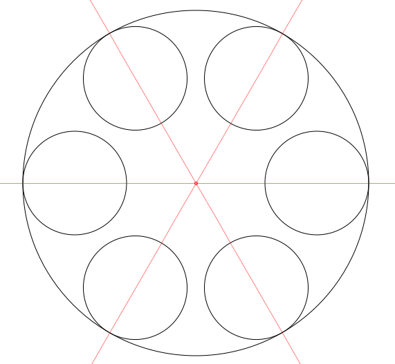
Here is an example of what it looks like all together.
enter image description here

However, my SVG files are displaying linearly. In my CSS I am using position: absolute on the .circle class which should place the SVG files in their proper place, but it doesn’t. Can anyone help me position my SVG files?

* {
    padding: 0;
    margin: 0;
  }
  
  body {
    background-color: pink;
  }
  
  .parent {
    width: 100vw;
    height: 100vh;
    display: flex;
    justify-content: center;
    align-items: center;
  }
  
  .img {
    z-index: 1;
    width: 150px;
    height: 150px;
  }
  
  #container {
    z-index: 2;
    top: 50%;
    left: 50%;
    transform: translate(-50%, -50%);
    cursor: pointer;
    position: absolute;
  }
  

.circle {
  position: absolute;
  }


<!DOCTYPE html>
<html lang="en">

<head>
  <meta charset="UTF-8">
  <meta name="viewport" content="width=device-width, initial-scale=1.0">
  <title> circle </title>
  <link rel="stylesheet" href="styles.css">

</head>

<body>
  <div class="parent">
    <div id="container">
      <div class="circle">  
    <img id="circle_big" src="palette.svg">  
    <img id="samll_1" src="small_1.svg">
    <img id="small_2" src="small_2.svg">
    <img id="small_3" src="small_3.svg">
    <img id="small_4" src="small_4.svg">
    <img id="small_5" src="small_5.svg">
    <img id="small_6" src="small_6.svg"> 
      </div>
      
    </div>
   
  </div>


</body>

</html>

2

Answers


  1. Here is a solution utilizing a series of flex rows:

    HTML:

    <div class="parent">
        <div id="container"> 
            <div class="row small">
              <img id="small_1" src="small_1.svg">
              <img id="small_2" src="small_2.svg">
            </div>
            <div class="row large">
              <img id="small_3" src="small_3.svg">
              <img id="small_4" src="small_4.svg">
            </div>
            <div class="row small">
              <img id="small_5" src="small_5.svg">
              <img id="small_6" src="small_6.svg"> 
            </div>
        </div>
    </div>
    

    CSS:

     .parent {
        width: 100vw;
        height: 100vh;
      }
      
      img{
        z-index: 1;
        width: 150px;
        height: 150px;
        border: 1px solid black;
        border-radius: 50%;
      }
      
      #container {
        z-index: 2;
        width: 450px;
        height: 450px;
        border-radius: 50%;
        cursor: pointer;
        position: absolute;
      }
    
      .row {
        position: relative;
        display: flex;
        flex-flow: row !important;
        justify-content: space-between;
        align-items: center;
        margin-left: auto;
        margin-right: auto;
      }
      .small {
        width: 300px;
      }
      .large {
        width: 450px;
      }
    

    You can adjust the width, height, and spacing.

    Login or Signup to reply.
  2. You can use a combination of cos, sin and radians, and use translate to move the circles into place.

    I simplified your HTML structure.

    * {
      padding: 0;
      margin: 0;
    }
    
    body {
      background-color: pink;
    }
    
    .circle-container {
      --size: 172px;
    
      display: grid;
      place-items: center;
    }
    
    img {
      grid-row: 1;
      grid-column: 1;
    }
    
    img:not(#circle_big) {
       --cos: 0;
       --sin: 0;
       --x: calc(cos(var(--cos)) * var(--size));
       --y: calc(sin(var(--sin)) * var(--size));
       
       transform: translate(var(--x), var(--y));
       width: 155px;
       height: 155px;
       border-radius: 50%;
       background-color: red;
    }
    
    img#circle_big{
      --correction: 2px;
      transform: translateX(var(--correction));
    }
    
    img#small_1 {
      --cos: 120deg;
      --sin: 65deg;
      background-color: blue;
    }
    
    img#small_2 {
      --cos: 60deg;
      --sin: 65deg;
      background-color: red;
    }
    
    img#small_3 {
      --cos: 60deg;
      --sin: 240deg;
      background-color: cyan;
    }
    
    img#small_4 {
      --cos: 120deg;
      --sin: 240deg;
      background-color: magenta;
    }
    
    img#small_5 {
      --cos: 180deg;
      --sin: 0deg;
      background-color: gray;
    }
    
    img#small_6 {
      --cos: 0deg;
      --sin: 0deg;
      background-color: black;
    }
    <body>
      <div class="circle-container">
        <img id="circle_big" src="https://i.stack.imgur.com/btGDp.png">
        <img id="small_1" src="small_1.svg">
        <img id="small_2" src="small_2.svg">
        <img id="small_3" src="small_3.svg">
        <img id="small_4" src="small_4.svg">
        <img id="small_5" src="small_5.svg">
        <img id="small_6" src="small_6.svg">
      </div>
    </body>
    Login or Signup to reply.
Please signup or login to give your own answer.
Back To Top
Search