


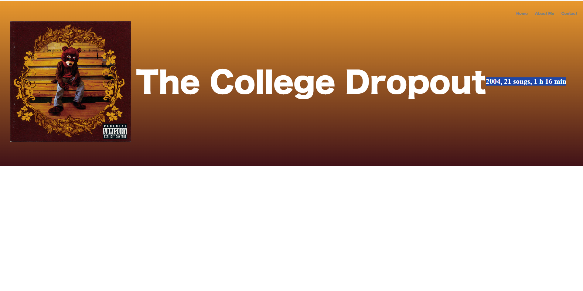
I’m and aspiring web developer, and this is the first challenge that i’m facing, Chat GPT could’nt help me either on this one, everything that i’ve tried so far has failed. So, what i’m trying to do here is make the "2004, 21 songs, 1 h 16 min" to be positioned below the title "The College Dropout" and of course to be aligned, to create a Spotify alike layout when you are searching for an albumwebpage.
This is the html:
<!DOCTYPE html>
<html lang="en">

<head>
    <meta charset="UTF-8">
    <meta name="viewport" content="width=device-width, initial-scale=1.0">
    <title>The College Dropout</title>
    <link rel="stylesheet" href="./main.css">

</head>

<body>


    <div class="container">
        <div class="navbar-default">
            <nav>
                <ul>
                    <li>
                        <a href="../index.html">Home</a>
                        <a href="">About Me</a>
                        <a href="">Contact</a>
                    </li>
                </ul>
            </nav>
        </div>

        <div class="image-container">
            <img class="image-style" src="../assets/images/college-dropout.jpg" alt="the-college-dropout">
            <h1 class="title-style">The College Dropout</h1>
            <h2 class="subtitle-style">2004, 21 songs, 1 h 16 min</h2>

        </div>
    </div>
    </div>

</body>

</html>
and this is the css:
*,
*:before,
*:after {
  box-sizing: border-box;
  padding: 0;
  margin: 0;
}

@font-face {
  font-family: Hiragino;
  src: url(../assets/fonts/hiragino-kaku-gothic.otf);
}

:root {
  --step--2: clamp(0.56rem, calc(0.48rem + 0.41vw), 0.8rem);
  --step--1: clamp(0.68rem, calc(0.56rem + 0.56vw), 1rem);
  --step-0: clamp(0.81rem, calc(0.66rem + 0.76vw), 1.25rem);
  --step-1: clamp(0.98rem, calc(0.77rem + 1.02vw), 1.56rem);
  --step-2: clamp(1.17rem, calc(0.9rem + 1.36vw), 1.95rem);
  --step-3: clamp(1.4rem, calc(1.04rem + 1.8vw), 2.44rem);
  --step-4: clamp(1.69rem, calc(1.21rem + 2.38vw), 3.05rem);
  --step-5: clamp(2.02rem, calc(1.4rem + 3.12vw), 3.82rem);
}

html {
  background-color: white;
}

.container {
  background: rgb(65, 18, 24);
  background: linear-gradient(
    0deg,
    rgba(65, 18, 24, 1) 0%,
    rgba(232, 152, 46, 1) 100%
  );
  padding-top: 2rem;
  padding-bottom: 5rem;
}

ul {
  display: flex;
  justify-content: right;
  list-style: none;
  padding-bottom: 1rem;
}

li {
  margin: 0 10px;
}

a {
  color: grey;
  text-decoration: none;
  padding: 10px;
  font-family: Hiragino;
  font-size: 0.7rem;
}

a:hover {
  color: white;
}

/* Responsive styles */
@media (max-width: 768px) {
  ul {
    flex-wrap: wrap;
  }

  li {
    width: 100%;
    text-align: center;
  }
}

.image-container {
  display: flex;
  margin-left: 2rem;
  align-items: center;
}

.image-style {
  width: clamp(200px, 50%, 400px);
  margin-right: 1rem;
}

.image-container .title-style {
  margin-top: 2rem;
  margin-bottom: 2rem;
  font-size: clamp(1rem, 5vw + 1rem, 6rem);
  color: white;
  font-family: Hiragino;
  display: block;
}
I have tried changing the flex display to block, but it doesnt anything and if i try to change everything else like the flex display it makes the website unresponsive i think. Please, help me.
2
Answers
add a new div containing only the title and subtitle like so in your html:
let me know if this works
Try using Grid