skip to Main Content

I used Bootstrap to make the code I work on (practice wise as a novice..)

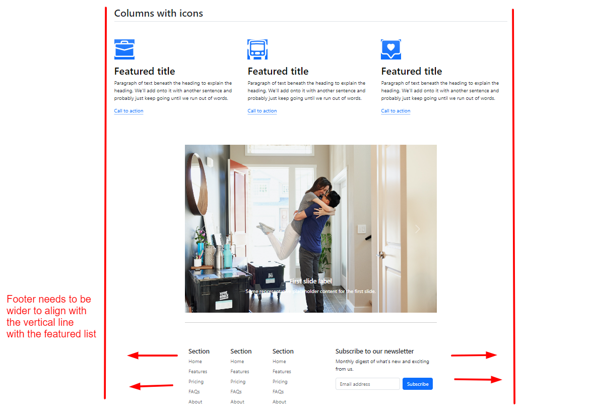
I got some problem with the container size of the footer and I’ve been stuck with this for a couple of hours without finding out the solution on this..

enter image description here
As the photo (in the link), the footer size I initially thought to be is of taking up the full width of the screen and being a much wider size than that.

I think the footer width has been shrunk (although the original footer size right out of the Bootstrap snippet looked proper) just because of the upper Carousel section which was customized in size. So the upper section (Carousel) might affect the container size of footer automatically followed by the size of its upper (customized) container, which I don’t want at all.

Have any idea how to make the footer not influenced by the upper section’s container sizing? I would really apprecaite any help…

The original code:

  <style>
    .brand-logo {

      height: 50px;
      padding: 0;
      margin-bottom: 6px;
    }

    .feature-icon img {
      width: 4rem;
      height: 4rem;
      border-radius: .75rem;
    }

    .divider {
    border-top: 1px solid #ccc;
    margin-top: 30px;
    margin-bottom: 30px;
    }

#carouselExampleCaptions {
  max-width: 800px; /* Set the maximum width of the carousel */
  margin: 0 auto; /* Center the carousel horizontally */
}

.carousel-inner {
  max-height: 700px; /* Set the maximum height of the carousel */
}

img {
  object-fit: cover;
}

  </style>
</head>

<body>
  <div class="container">
    <header class="d-flex flex-wrap justify-content-center py-3 mb-4 border-bottom">
      <a href="#" class="d-flex align-items-center mb-3 mb-md-0 me-md-auto link-body-emphasis text-decoration-none">
        <span class="fs-4"><img class="brand-logo" src="./box-seam.svg"> Move It</span>
      </a>

      <ul class="nav nav-pills">
        <li class="nav-item"><a href="#" class="nav-link active" aria-current="page">Home</a></li>
        <li class="nav-item"><a href="#" class="nav-link">Features</a></li>
        <li class="nav-item"><a href="#" class="nav-link">Pricing</a></li>
        <li class="nav-item"><a href="#" class="nav-link">FAQs</a></li>
        <li class="nav-item"><a href="#" class="nav-link">About</a></li>
      </ul>
    </header>

    <!-- Header Area -->
    <div class="px-4 pt-5 my-5 text-center border-bottom">
      <h1 class="display-4 fw-bold text-body-emphasis">Centered screenshot</h1>
      <div class="col-lg-6 mx-auto">
        <p class="lead mb-4">Quickly design and customize responsive mobile-first sites with Bootstrap, the world’s most popular front-end open source toolkit, featuring Sass variables and mixins, responsive grid system, extensive prebuilt components, and powerful JavaScript plugins.</p>
        <div class="d-grid gap-2 d-sm-flex justify-content-sm-center mb-5">
          <button type="button" class="btn btn-primary btn-lg px-4 me-sm-3">Primary button</button>
          <button type="button" class="btn btn-outline-secondary btn-lg px-4">Secondary</button>
        </div>
      </div>
      <div class="overflow-hidden" style="max-height: 30vh;">
        <div class="container px-5">
          <img src="./moving-van.jpg" class="img-fluid border rounded-3 shadow-lg mb-4" alt="Example image" width="700" height="500" loading="lazy">
        </div>
      </div>
    </div>

    <!-- Featured List -->
    <div class="container px-4 py-5" id="featured-3">
      <h2 class="pb-2 border-bottom">Columns with icons</h2>
      <div class="row g-4 py-5 row-cols-1 row-cols-lg-3">
        <div class="feature col">
          <div class="feature-icon d-inline-flex align-items-center justify-content-center text-bg-primary bg-gradient fs-2 mb-3">
            <img src="./briefcase.svg" alt="briefcase" height="20">          </div>
          <h3 class="fs-2 text-body-emphasis">Featured title</h3>
          <p>Paragraph of text beneath the heading to explain the heading. We'll add onto it with another sentence and probably just keep going until we run out of words.</p>
          <a href="#" class="icon-link">
            Call to action
            <svg class="bi"><use xlink:href="#chevron-right"></use></svg>
          </a>
        </div>

        <div class="feature col">
          <div class="feature-icon d-inline-flex align-items-center justify-content-center text-bg-primary bg-gradient fs-2 mb-3">
            <img src="./bus-front.svg" alt="movng van">
          </div>
          <h3 class="fs-2 text-body-emphasis">Featured title</h3>
          <p>Paragraph of text beneath the heading to explain the heading. We'll add onto it with another sentence and probably just keep going until we run out of words.</p>
          <a href="#" class="icon-link">
            Call to action
            <svg class="bi"><use xlink:href="#chevron-right"></use></svg>
          </a>
        </div>

        <div class="feature col">
          <div class="feature-icon d-inline-flex align-items-center justify-content-center text-bg-primary bg-gradient fs-2 mb-3">
            <img src="./chat-square-heart.svg" alt="heart" height="30px">
          </div>
          <h3 class="fs-2 text-body-emphasis">Featured title</h3>
          <p>Paragraph of text beneath the heading to explain the heading. We'll add onto it with another sentence and probably just keep going until we run out of words.</p>
          <a href="#" class="icon-link">
            Call to action
            <svg class="bi"><use xlink:href="#chevron-right"></use></svg>
          </a>
        </div>
      </div>
    </div>

    <!-- Carousel -->
    <div id="carouselExampleCaptions" class="carousel slide">
      <div class="carousel-indicators">
        <button type="button" data-bs-target="#carouselExampleCaptions" data-bs-slide-to="0" class="active" aria-current="true" aria-label="Slide 1"></button>
        <button type="button" data-bs-target="#carouselExampleCaptions" data-bs-slide-to="1" aria-label="Slide 2"></button>
        <button type="button" data-bs-target="#carouselExampleCaptions" data-bs-slide-to="2" aria-label="Slide 3"></button>
      </div>

      <div class="carousel-inner">
        <div class="carousel-item active">
          <img src="./couple.jpg" class="d-block w-100" alt="couple">
          <div class="carousel-caption d-none d-md-block">
            <h5>First slide label</h5>
            <p>Some representative placeholder content for the first slide.</p>
          </div>
        </div>
        <div class="carousel-item">
          <img src="./dog.jpg" class="d-block w-100" alt="dog">
          <div class="carousel-caption d-none d-md-block">
            <h5>Second slide label</h5>
            <p>Some representative placeholder content for the second slide.</p>
          </div>
        </div>
        <div class="carousel-item">
          <img src="./family.jpg" class="d-block w-100" alt="family">
          <div class="carousel-caption d-none d-md-block">
            <h5>Third slide label</h5>
            <p>Some representative placeholder content for the third slide.</p>
          </div>
      </div>

      <button class="carousel-control-prev" type="button" data-bs-target="#carouselExampleCaptions" data-bs-slide="prev">
        <span class="carousel-control-prev-icon" aria-hidden="true"></span>
        <span class="visually-hidden">Previous</span>
      </button>
      <button class="carousel-control-next" type="button" data-bs-target="#carouselExampleCaptions" data-bs-slide="next">
        <span class="carousel-control-next-icon" aria-hidden="true"></span>
        <span class="visually-hidden">Next</span>
      </button>
    </div>

    <!-- Space Divider -->
    <div class="divider"></div>

    <!-- Footer Section -->
    <div class="container">
      <footer class="py-5">
        <div class="row">
          <div class="col-6 col-md-2 mb-3">
            <h5>Section</h5>
            <ul class="nav flex-column">
              <li class="nav-item mb-2"><a href="#" class="nav-link p-0 text-body-secondary">Home</a></li>
              <li class="nav-item mb-2"><a href="#" class="nav-link p-0 text-body-secondary">Features</a></li>
              <li class="nav-item mb-2"><a href="#" class="nav-link p-0 text-body-secondary">Pricing</a></li>
              <li class="nav-item mb-2"><a href="#" class="nav-link p-0 text-body-secondary">FAQs</a></li>
              <li class="nav-item mb-2"><a href="#" class="nav-link p-0 text-body-secondary">About</a></li>
            </ul>
          </div>
    
          <div class="col-md-5 offset-md-1 mb-3">
            <form>
              <h5>Subscribe to our newsletter</h5>
              <p>Monthly digest of what's new and exciting from us.</p>
              <div class="d-flex flex-column flex-sm-row w-100 gap-2">
                <label for="newsletter1" class="visually-hidden">Email address</label>
                <input id="newsletter1" type="text" class="form-control" placeholder="Email address">
                <button class="btn btn-primary" type="button">Subscribe</button>
              </div>
            </form>
          </div>
        </div>
    
        <div class="d-flex flex-column flex-sm-row justify-content-between py-4 my-4 border-top">
          <p>© 2023 Company, Inc. All rights reserved.</p>
          <ul class="list-unstyled d-flex">
            <li class="ms-3"><a class="link-body-emphasis" href="#"><svg class="bi" width="24" height="24"><use xlink:href="#twitter"></use></svg></a></li>
            <li class="ms-3"><a class="link-body-emphasis" href="#"><svg class="bi" width="24" height="24"><use xlink:href="#instagram"></use></svg></a></li>
            <li class="ms-3"><a class="link-body-emphasis" href="#"><svg class="bi" width="24" height="24"><use xlink:href="#facebook"></use></svg></a></li>
          </ul>
        </div>
      </footer>
    </div>


  </div>


  <script src="https://cdn.jsdelivr.net/npm/[email protected]/dist/js/bootstrap.bundle.min.js" integrity="sha384-geWF76RCwLtnZ8qwWowPQNguL3RmwHVBC9FhGdlKrxdiJJigb/j/68SIy3Te4Bkz" crossorigin="anonymous"></script>
</body>
</html>

I tried to put a lot of syntax like max-width, container-fluid and more. Sadly, nothing worked out..

3

Answers


  1. It seems your footer is inside a Bootstrap .container class, designed to be a fixed-width container. That’s why it’s not taking up the entire width of the screen.

    A quick fix would be to change the .container class to .container-fluid for your footer. This class provides a full-width container, spanning the entire width of the viewport. Here’s how you can do it:

    <!-- Footer Section -->
    <div class="container-fluid"> <!-- Change here -->
      <footer class="py-5">
       ....
    
    Login or Signup to reply.
  2.   <style>
      /* CSS code */
      footer {
         height: 100px; /* Adjust the height as  your requirements */
         width: 100%; /* Adjust the width as per your requirements */
         background-color: #f1f1f1;
        }
       </style>
    
    <footer>
    <!-- Footer content -->
    

    `In the above code, I’d defined a CSS rule for the footer element.
    By setting the height property to 100px, you can adjust the height
    of the footer. Similarly, the width property has been set to 100%,
    making the footer span the entire width of its container.

    Login or Signup to reply.
  3. Since you want to be a programmer, learn two critical things: debugging and indentation.

    First, your code is extremely messy that’s why typos and small mistakes may happen and that’s where indentation matters. Second, debugging, if there’s anything wrong with your code, open Developer Tools and debug the problem.

    If you did that, you would see the following:

    bug can be debugged from devtools

    The container named carouselExampleCaptions is taking all elements in it (the carousel, the divider, and the footer) and you have set max-width: 800px; to that container and that’s simply the problem. Any element within it will shrink to 800px at max.

    The solution would be to move the divider and the footer from carouselExampleCaptions like below:

    .brand-logo {
        height: 50px;
        padding: 0;
        margin-bottom: 6px;
    }
    
    .feature-icon img {
        width: 4rem;
        height: 4rem;
        border-radius: 0.75rem;
    }
    
    .divider {
        border-top: 1px solid #ccc;
        margin-top: 30px;
        margin-bottom: 30px;
    }
    
    #carouselExampleCaptions {
        max-width: 800px; /* Set the maximum width of the carousel */
        margin: 0 auto; /* Center the carousel horizontally */
    }
    
    .carousel-inner {
        max-height: 700px; /* Set the maximum height of the carousel */
    }
    
    img {
        object-fit: cover;
    }
    <script src="https://cdnjs.cloudflare.com/ajax/libs/bootstrap/5.3.0/js/bootstrap.min.js"></script>
    <link href="https://cdnjs.cloudflare.com/ajax/libs/bootstrap/5.3.0/css/bootstrap.min.css" rel="stylesheet" />
    
    <div class="container">
        <header class="d-flex flex-wrap justify-content-center py-3 mb-4 border-bottom">
            <a href="#" class="d-flex align-items-center mb-3 mb-md-0 me-md-auto link-body-emphasis text-decoration-none">
                <span class="fs-4"><img class="brand-logo" src="./box-seam.svg" /> Move It</span>
            </a>
    
            <ul class="nav nav-pills">
                <li class="nav-item"><a href="#" class="nav-link active" aria-current="page">Home</a></li>
                <li class="nav-item"><a href="#" class="nav-link">Features</a></li>
                <li class="nav-item"><a href="#" class="nav-link">Pricing</a></li>
                <li class="nav-item"><a href="#" class="nav-link">FAQs</a></li>
                <li class="nav-item"><a href="#" class="nav-link">About</a></li>
            </ul>
        </header>
    
        <!-- Header Area -->
        <div class="px-4 pt-5 my-5 text-center border-bottom">
            <h1 class="display-4 fw-bold text-body-emphasis">Centered screenshot</h1>
            <div class="col-lg-6 mx-auto">
                <p class="lead mb-4">
                    Quickly design and customize responsive mobile-first sites with Bootstrap, the world’s most popular front-end open source toolkit, featuring Sass variables and mixins, responsive grid system, extensive prebuilt components,
                    and powerful JavaScript plugins.
                </p>
                <div class="d-grid gap-2 d-sm-flex justify-content-sm-center mb-5">
                    <button type="button" class="btn btn-primary btn-lg px-4 me-sm-3">Primary button</button>
                    <button type="button" class="btn btn-outline-secondary btn-lg px-4">Secondary</button>
                </div>
            </div>
            <div class="overflow-hidden" style="max-height: 30vh;">
                <div class="container px-5">
                    <img src="./moving-van.jpg" class="img-fluid border rounded-3 shadow-lg mb-4" alt="Example image" width="700" height="500" loading="lazy" />
                </div>
            </div>
        </div>
    
        <!-- Featured List -->
        <div class="container px-4 py-5" id="featured-3">
            <h2 class="pb-2 border-bottom">Columns with icons</h2>
            <div class="row g-4 py-5 row-cols-1 row-cols-lg-3">
                <div class="feature col">
                    <div class="feature-icon d-inline-flex align-items-center justify-content-center text-bg-primary bg-gradient fs-2 mb-3">
                        <img src="./briefcase.svg" alt="briefcase" height="20" />
                    </div>
                    <h3 class="fs-2 text-body-emphasis">Featured title</h3>
                    <p>Paragraph of text beneath the heading to explain the heading. We'll add onto it with another sentence and probably just keep going until we run out of words.</p>
                    <a href="#" class="icon-link">
                        Call to action
                        <svg class="bi"><use xlink:href="#chevron-right"></use></svg>
                    </a>
                </div>
    
                <div class="feature col">
                    <div class="feature-icon d-inline-flex align-items-center justify-content-center text-bg-primary bg-gradient fs-2 mb-3">
                        <img src="./bus-front.svg" alt="movng van" />
                    </div>
                    <h3 class="fs-2 text-body-emphasis">Featured title</h3>
                    <p>Paragraph of text beneath the heading to explain the heading. We'll add onto it with another sentence and probably just keep going until we run out of words.</p>
                    <a href="#" class="icon-link">
                        Call to action
                        <svg class="bi"><use xlink:href="#chevron-right"></use></svg>
                    </a>
                </div>
    
                <div class="feature col">
                    <div class="feature-icon d-inline-flex align-items-center justify-content-center text-bg-primary bg-gradient fs-2 mb-3">
                        <img src="./chat-square-heart.svg" alt="heart" height="30px" />
                    </div>
                    <h3 class="fs-2 text-body-emphasis">Featured title</h3>
                    <p>Paragraph of text beneath the heading to explain the heading. We'll add onto it with another sentence and probably just keep going until we run out of words.</p>
                    <a href="#" class="icon-link">
                        Call to action
                        <svg class="bi"><use xlink:href="#chevron-right"></use></svg>
                    </a>
                </div>
            </div>
        </div>
    
        <!-- Carousel -->
        <div id="carouselExampleCaptions" class="carousel slide">
            <div class="carousel-indicators">
                <button type="button" data-bs-target="#carouselExampleCaptions" data-bs-slide-to="0" class="active" aria-current="true" aria-label="Slide 1"></button>
                <button type="button" data-bs-target="#carouselExampleCaptions" data-bs-slide-to="1" aria-label="Slide 2"></button>
                <button type="button" data-bs-target="#carouselExampleCaptions" data-bs-slide-to="2" aria-label="Slide 3"></button>
            </div>
    
            <div class="carousel-inner">
                <div class="carousel-item active">
                    <img src="https://via.placeholder.com/600x400.png" class="d-block w-100" alt="couple" />
                    <div class="carousel-caption d-none d-md-block">
                        <h5>First slide label</h5>
                        <p>Some representative placeholder content for the first slide.</p>
                    </div>
                </div>
                <div class="carousel-item">
                    <img src="https://via.placeholder.com/600x400.png" class="d-block w-100" alt="dog" />
                    <div class="carousel-caption d-none d-md-block">
                        <h5>Second slide label</h5>
                        <p>Some representative placeholder content for the second slide.</p>
                    </div>
                </div>
                <div class="carousel-item">
                    <img src="https://via.placeholder.com/600x400.png" class="d-block w-100" alt="family" />
                    <div class="carousel-caption d-none d-md-block">
                        <h5>Third slide label</h5>
                        <p>Some representative placeholder content for the third slide.</p>
                    </div>
                </div>
    
                <button class="carousel-control-prev" type="button" data-bs-target="#carouselExampleCaptions" data-bs-slide="prev">
                    <span class="carousel-control-prev-icon" aria-hidden="true"></span>
                    <span class="visually-hidden">Previous</span>
                </button>
                <button class="carousel-control-next" type="button" data-bs-target="#carouselExampleCaptions" data-bs-slide="next">
                    <span class="carousel-control-next-icon" aria-hidden="true"></span>
                    <span class="visually-hidden">Next</span>
                </button>
            </div>
        </div>
        <!-- Space Divider -->
        <div class="divider"></div>
    
        <!-- Footer Section -->
        <div class="container">
            <footer class="py-5">
                <div class="row">
                    <div class="col-6 col-md-2 mb-3">
                        <h5>Section</h5>
                        <ul class="nav flex-column">
                            <li class="nav-item mb-2"><a href="#" class="nav-link p-0 text-body-secondary">Home</a></li>
                            <li class="nav-item mb-2"><a href="#" class="nav-link p-0 text-body-secondary">Features</a></li>
                            <li class="nav-item mb-2"><a href="#" class="nav-link p-0 text-body-secondary">Pricing</a></li>
                            <li class="nav-item mb-2"><a href="#" class="nav-link p-0 text-body-secondary">FAQs</a></li>
                            <li class="nav-item mb-2"><a href="#" class="nav-link p-0 text-body-secondary">About</a></li>
                        </ul>
                    </div>
    
                    <div class="col-md-5 offset-md-1 mb-3">
                        <form>
                            <h5>Subscribe to our newsletter</h5>
                            <p>Monthly digest of what's new and exciting from us.</p>
                            <div class="d-flex flex-column flex-sm-row w-100 gap-2">
                                <label for="newsletter1" class="visually-hidden">Email address</label>
                                <input id="newsletter1" type="text" class="form-control" placeholder="Email address" />
                                <button class="btn btn-primary" type="button">Subscribe</button>
                            </div>
                        </form>
                    </div>
                </div>
    
                <div class="d-flex flex-column flex-sm-row justify-content-between py-4 my-4 border-top">
                    <p>© 2023 Company, Inc. All rights reserved.</p>
                    <ul class="list-unstyled d-flex">
                        <li class="ms-3">
                            <a class="link-body-emphasis" href="#">
                                <svg class="bi" width="24" height="24"><use xlink:href="#twitter"></use></svg>
                            </a>
                        </li>
                        <li class="ms-3">
                            <a class="link-body-emphasis" href="#">
                                <svg class="bi" width="24" height="24"><use xlink:href="#instagram"></use></svg>
                            </a>
                        </li>
                        <li class="ms-3">
                            <a class="link-body-emphasis" href="#">
                                <svg class="bi" width="24" height="24"><use xlink:href="#facebook"></use></svg>
                            </a>
                        </li>
                    </ul>
                </div>
            </footer>
        </div>
    </div>

    See? Just a small problem created a huge issue that you have been debugging for a couple of hours. Learn to ident your code and debug it.

    Login or Signup to reply.
Please signup or login to give your own answer.
Back To Top
Search