skip to Main Content

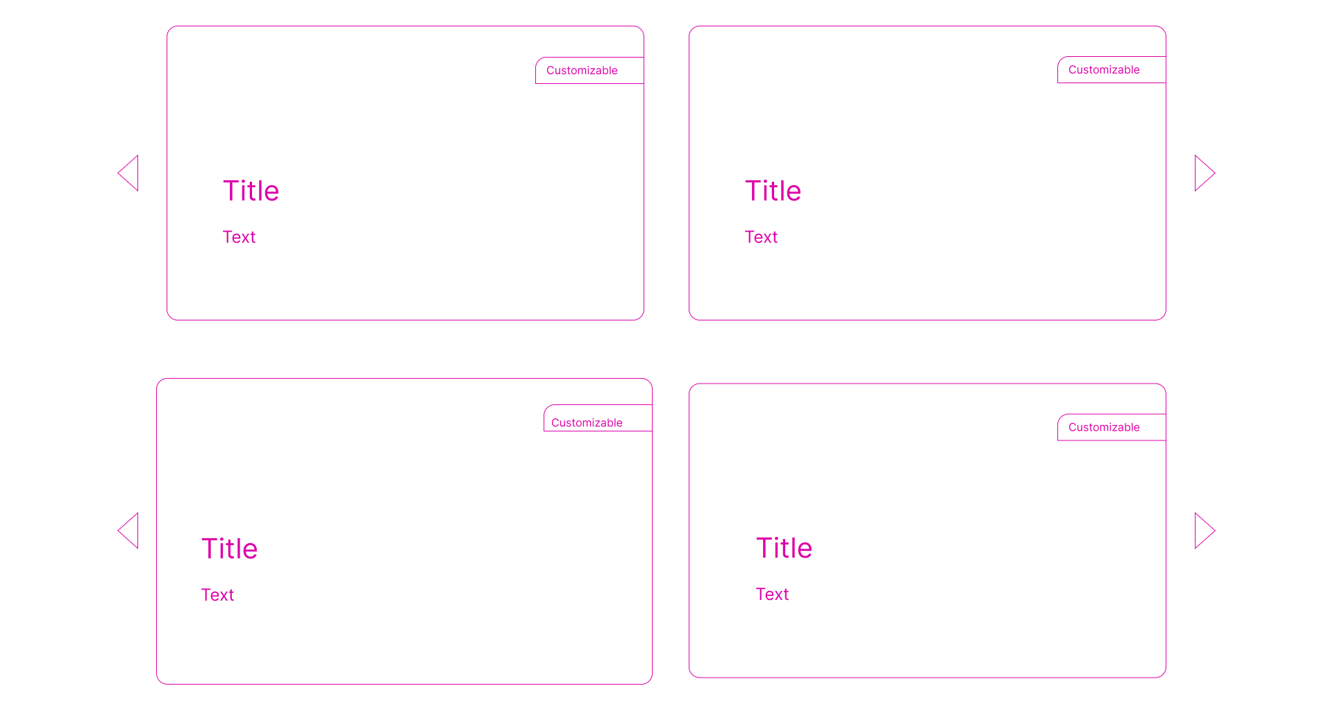
I am beginner in css. I am trying to create a static website. I want to create a list of cards like below.

Wireframe

Things it should do:

  1. On hovering the card, it should get slightly larger like shown in the 2nd wireframe (But it should not affect the other cards) — This is where I am facing problem.
  2. Also list can be dragged to the either side/clicking on arrow/automatically in 10secs) to show other cards (if available)
  3. Also the list should be highly responsive. If the size of screen is below 1000px the cards can be shown in the column.

(Also please suggest a good animation for the list)

2

Answers


  1. To make an element appear larger, apply a scale transform:

    transform: scale(1.1);
    
    body {
      margin: 1em;
    }
    .cards {
      display: flex;
      gap: 1em;
    }
    .cards>* {
      border: 1px solid black;
      padding: 2em;
      border-radius: 1em; 
      transition: 300ms;
    }
    .cards>*:hover {
      transform: scale(1.1);
    }
    <div class="cards">
      <div>Card</div>
      <div>Card</div>
    </div>
    Login or Signup to reply.
  2. This should get you started. You’re creating a 2×2 grid, so the first step is to set up the HTML in the most minimalistic way possible. This is worthwhile, because a simple structure is easier to maintain.

    <div class="container">
      <div></div>
      <div></div>
      <div></div>
      <div></div>
    </div>
    

    We have a container (the grid parent) and four children. First we set up some basic rules for the parent.

    .container {
      min-height: 100dvh;
      padding: 1rem;
      display: grid;
      grid-template-columns: repeat(2, 1fr);
      grid-template-rows: repeat(2, 1fr);
      gap: 1rem;
      max-width: 1000px;
      margin: auto;
    }
    

    The most important parts are the grid-template-columns and grid-template-rows, which establish the 2×2 grid. An fr is a unit of measurement used in CSS Grid. The rest of the CSS here is for setting up the demo (shown later).

    Now we need to deal with the arrows. Each arrow is associated with the box it’s in, yet appears outside each box. This makes these arrows great candidates for pseudo elements.

    The first block sets up all the shared code between right and left arrows. The second and third blocks define the odd (top left/bottom left) and even (top right/bottom right box arrows.

    .container > *::before {
      content: '';
      display: inline-block;
      width: 0;
      height: 0;    
      border-style: solid;
      position: absolute;
      top: 50%;
      transform: translateY(-50%);  
    }
    
    .container *:nth-child(odd)::before {
      border-width: 25px 50px 25px 0;
      border-color: transparent red transparent transparent;
      left: -5rem;
    }
    
    .container *:nth-child(even)::before {
      border-width: 25px 0 25px 50px;
      border-color: transparent transparent transparent red;
      right: -5rem;
    }
    

    If we put it all together, we arrive at something that you can start with and modify to your liking. I’ll leave the inner box styling as an exercise for you. Good luck!

    html,
    body {
      margin: 0;
      padding: 0;
    }
    * {
      box-sizing: border-box;
    }
    
    body {
      background: rgba(0, 0, 0, 0.5);
    }
    
    .container {
      min-height: 100dvh;
      padding: 1rem;
      display: grid;
      grid-template-columns: repeat(2, 1fr);
      grid-template-rows: repeat(2, 1fr);
      gap: 1rem;
      max-width: 1000px;
      margin: auto;
    }
    
    .container > * {
      border: 1px solid white;
      border-radius: 0.5rem;
      position: relative;
    }
    
    .container > *::before {
      content: '';
      display: inline-block;
      width: 0;
      height: 0;    
      border-style: solid;
      position: absolute;
      top: 50%;
      transform: translateY(-50%);  
    }
    
    .container *:nth-child(odd)::before {
      border-width: 25px 50px 25px 0;
      border-color: transparent red transparent transparent;
      left: -5rem;
    }
    
    .container *:nth-child(even)::before {
      border-width: 25px 0 25px 50px;
      border-color: transparent transparent transparent red;
      right: -5rem;
    }
    <div class="container">
      <div></div>
      <div></div>
      <div></div>
      <div></div>
    </div>
    Login or Signup to reply.
Please signup or login to give your own answer.
Back To Top
Search