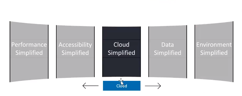
I’m working on creating a panoramic 3D swiper carousel similar to the following design:
However, my current implementation does not achieve the same effect, and the carousel looks like this instead:
I want to achieve that carousel in CSS
Here’s the CSS code that I’ve tried so far:
.coverflow-container {
  perspective: 1000px;
  width: 100%;
  height: 250px;
  position: relative;
  overflow: hidden;
}

.coverflow-item {
  position: absolute;
  width: 200px; /* Width of each slide */
  height: 250px; /* Height of non-active slides */
  left: 50%;
  transform-origin: center;
  transition: transform 0.5s ease, z-index 0s linear, height 0.5s ease;
  display: flex;
  justify-content: center;
  align-items: center;
  background: #b5b4b6;
  color: white;
  border: 1px solid black;
  box-sizing: border-box;
  opacity: 0.7;
}

.coverflow-item.active {
  background: #272a36;
  z-index: 3;
  opacity: 1;
  height: 90%; /* Larger height for the active slide */
}

.coverflow-controls {
  position: absolute;
  width: 100%;
  bottom: 10px;
  text-align: center;
  padding-top: 100px;
}

button {
  padding: 10px;
  margin: 0 10px;
  font-size: 16px;
  cursor: pointer;
}
And here’s a link to my CodeSandbox: https://codesandbox.io/s/coverflow-swiper-5kywvv?file=/src/App.css
I tried tweaking CSS to achieve that effect. But I am unable to get the same like that in the UI.
I want my carousel to be like this
Could anyone help me on how to adjust my CSS to achieve the desired effect?


2
Answers
I will correct your initial solution, to continue work on your direction.
position: absolute. Make.coverflow-containeras a flex. Then, you don’t have to apply horisontal transition to each element. Instead, you can do the shift to the whole container when active tile changes.transformZon each tile. Since you are usingperspectiveon the tiles container, we could use its advantage here on tiles, to shift them back from the front. The closer a tile to the center, the far it by Z axis.rotateYon each element progressively – the far a tile from the center, the bigger rotation on Y axis. Also, the more a tile rotated, the more it «shrinks», so we need to move it close to the center. For that we usetranslateX.Here are the main changes I made.
The full solution is here
The solution will look like that:

Duplicate of: How to get this curve effect using css with reactjs?
Snipped is fully from @imhvost code in link above