skip to Main Content

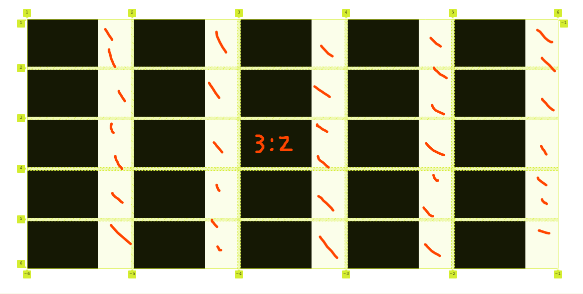
How to remove the spaces dashed in red (see image below)? The grid would just resize while keeping children aspect ratio.

The lines of code provided are part of another complex code, I would like to keep the #container element agnostic, main css properties should not be changed.

I think it can be impossible, maybe there is another way with flebox.

image

#container {
  padding: 50px 80px;
  height: 70vh;
  display: flex;
  justify-content: center;
  background: grey;
}

#wrapper {
  background: red;
  height: inherit;
  display: flex;
  align-items: center;
  justify-content: center;
  width: 100%;
}

#board {
  display: grid;
  grid-template-columns: repeat(5, 1fr);
  grid-auto-rows: auto;
  grid-gap: 6px;
  min-width: 0;
  height: 100%;
  width: 100%;
  background: white;
}

.cell {
  background: black;
  width: fit-content;
  min-width: 0;
  overflow: hidden;
  background-color: black;
  border: black;
  aspect-ratio: 3/2;
  display: flex;
  position: relative;
  box-sizing: border-box;
}
<body>
  <div id="before-container"></div>
  <div id="container">
    <div id="wrapper">
      <div id="board">
        <div class="cell"></div>
        <div class="cell"></div>
        <div class="cell"></div>
        <div class="cell"></div>
        <div class="cell"></div>
        <div class="cell"></div>
        <div class="cell"></div>
        <div class="cell"></div>
        <div class="cell"></div>
        <div class="cell"></div>
        <div class="cell"></div>
        <div class="cell"></div>
        <div class="cell"></div>
        <div class="cell"></div>
        <div class="cell"></div>
        <div class="cell"></div>
        <div class="cell"></div>
        <div class="cell"></div>
        <div class="cell"></div>
        <div class="cell"></div>
        <div class="cell"></div>
        <div class="cell"></div>
        <div class="cell"></div>
        <div class="cell"></div>
        <div class="cell"></div>
      </div>
    </div>
  </div>
  <div id="after-container"></div>
</body>

2

Answers


  1. try this css

      #container {
        padding: 50px 80px;
        display: flex;
        justify-content: center;
        overflow: hidden; /* Hide any overflowing content */
      }
    
      #wrapper {
        height: inherit;
        display: flex;
        align-items: center;
        justify-content: center;
        width: 100%;
      }
    
      #board {
        display: flex; /* Use Flexbox */
        flex-wrap: wrap;
        gap: 6px;
        width: 100%;
      }
    
      .cell {
        background: black;
        flex: 0 0 calc(20% - 12px); /* Each cell takes 20% width with 6px gap */
        max-width: calc(20% - 12px); /* Set a maximum width for each cell */
        aspect-ratio: 3/2;
      }
    
    Login or Signup to reply.
  2. You yourself set the height for the container, and reset the width for the elements. What do you expect after that? In the answer, I simply commented out everything unnecessary in your css:

    #container {
      padding: 50px 80px;
      /* height: 70vh; */
      /* display: flex; */
      /* justify-content: center; */
      background: grey;
    }
    
    #wrapper {
      background: red;
      /* height: inherit; */
      /* display: flex; */
      /* align-items: center; */
      /* justify-content: center; */
      /* width: 100%; */
    }
    
    #board {
      display: grid;
      grid-template-columns: repeat(5, 1fr);
      /* grid-auto-rows: auto; */
      grid-gap: 6px;
      /* min-width: 0; */
      /* height: 100%; */
      /* width: 100%; */
      background: white;
    }
    
    .cell {
      background: black;
      /* width: fit-content; */
      /* min-width: 0; */
      /* overflow: hidden; */
      background-color: black;
      /* border: black; */
      aspect-ratio: 3/2;
      /* display: flex; */
      /* position: relative; */
      /* box-sizing: border-box; */
    }
    <div id="container">
     <div id="wrapper">
        <div id="board">
          <div class="cell"></div>
          <div class="cell"></div>
          <div class="cell"></div>
          <div class="cell"></div>
          <div class="cell"></div>
          <div class="cell"></div>
          <div class="cell"></div>
          <div class="cell"></div>
          <div class="cell"></div>
          <div class="cell"></div>
          <div class="cell"></div>
          <div class="cell"></div>
          <div class="cell"></div>
          <div class="cell"></div>
          <div class="cell"></div>
          <div class="cell"></div>
          <div class="cell"></div>
          <div class="cell"></div>
          <div class="cell"></div>
          <div class="cell"></div>
          <div class="cell"></div>
          <div class="cell"></div>
          <div class="cell"></div>
          <div class="cell"></div>
          <div class="cell"></div>
        </div>
     </div>
    </div>
    Login or Signup to reply.
Please signup or login to give your own answer.
Back To Top
Search