skip to Main Content

As you can see, i have three panels (left, center, right) that scale/resize correctly horizontally. Now i would like to insert a new panel inside the central panel.

enter image description here

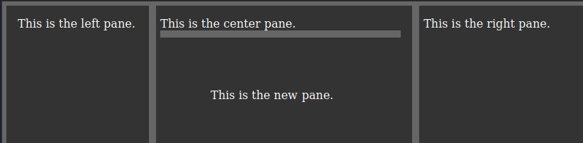
The new panel will have to resize vertically (rising above and below). I would like to achieve this in pure Javascript (without jQuery or other libraries) as per my Javascript code. I’m new to Javascript and i’m having trouble.

I would like to get this:

enter image description here

P.S: Naturally the 3 vertical panels (left, center, right) must continue to move left and right horizontally, as they already move correctly with my code. I don’t want the new addition of the panel to break the already functioning movement of the other panels.

This is my code:

const gutters = document.querySelectorAll(".gutter");
const gutter_orizontal = document.querySelectorAll(".gutter_new");

const panes = document.querySelectorAll(".pane");
const minWidth = 200;

function resizer(e) {
  window.addEventListener("mousemove", mousemove);
  window.addEventListener("mouseup", mouseup);

  let prevX = e.x;
  const currentPane = e.currentTarget.parentNode;
  const currentPanel = currentPane.getBoundingClientRect();
  const prevPane = currentPane.previousElementSibling;
  const prevPanel = prevPane.getBoundingClientRect();

  function mousemove(e) {
    let newX = prevX - e.x;
    let newCurrentWidth = currentPanel.width + newX;
    let newPrevWidth = prevPanel.width - newX;
    if (newCurrentWidth < minWidth || newPrevWidth < minWidth) return;
    currentPane.style.width = newCurrentWidth + "px";
    prevPane.style.width = newPrevWidth + "px";
  }

  function mouseup() {
    window.removeEventListener("mousemove", mousemove);
    window.removeEventListener("mouseup", mouseup);
  }
}
gutters.forEach((gutter) => gutter.addEventListener("mousedown", resizer));
*,
*::before,
*::after {
  box-sizing: border-box;
}

body {
  margin: 0;
}

.wrapper {
  height: 100vh;
  width: 100vw;
  background: #333;
  border: 6px solid #666;
  display: flex;
}

.pane {
  padding: 1em;
  color: #fff;
  min-width: 200px;
}

.center {
  position: relative;
}

.right {
  position: relative;
  flex-grow: 1;
}

.new {
  position: relative;
}

.gutter {
  width: 10px;
  height: 100%;
  background: #666;
  position: absolute;
  top: 0;
  left: 0;
  cursor: col-resize;
}

.gutter_new {
  height: 10px;
  width: 100%;
  background: #666;
  position: absolute;
  top: 0;
  left: 0;
  cursor: row-resize;
}
<div class="wrapper">
  <div class="pane left">
    This is the left pane.
  </div>
  <div class="pane center">
    This is the center pane.
    <div class="gutter"></div>
    <div class="pane new">
      This is the new pane.
      <div class="gutter_new"></div>
    </div>
  </div>
  <div class="pane right">
    This is the right pane.
    <div class="gutter"></div>
  </div>
</div>

2

Answers


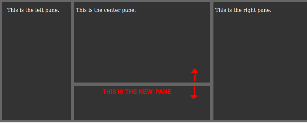
  1. You could either reuse your resizer function and give it a second parameter (such as "direction" for example).
    Then in the function handle if you want to resize vertically or horizontally. Depending on the direction, you could modify either the width or the height of your element.

    Then you add a new forEach loop for your handlers like this:

    // before
    gutters.forEach((gutter) => gutter.addEventListener("mousedown", resizer));
    
    // after
    gutters.forEach((gutter) => gutter.addEventListener("mousedown", (e) => resizer(e, 'vertical')));
    gutter_horizontal.forEach((gutter) => gutter.addEventListener("mousedown", (e) => resizer(e, 'horizontal')))
    

    Your function would change to something like this:

    function resizer(e, direction) {...}
    

    Within it you can then check on the direction parameter like this:

    if (direction === 'vertical') {...}
    

    Alternatively, you could also create a second resizer function for your horizontal changes. But this would create duplicated code, so I would prefer to go with the parameter in the function.

    Login or Signup to reply.
    1. Add two classes .gutter-v & .gutter-h, resizer() will change .pane‘s width or height depend on .gutter‘s class.

    2. Use has() selector to change .pane which become parent of other .pane to flexbox. has() already supported by latest firefox.

    3. minHeight and minWidth is now in .wrapper inline style, so you can get them by js.

    const gutters = document.querySelectorAll(".gutter");
    const panes = document.querySelectorAll(".pane");
    const minWidth = document.querySelector(".wrapper").style.getPropertyValue("--min-width");
    const minHeight = document.querySelector(".wrapper").style.getPropertyValue("--min-height");
    
    function resizer(e) {
      window.addEventListener("mousemove", mousemove);
      window.addEventListener("mouseup", mouseup);
    
      const is_vertical = e.currentTarget.classList.contains("gutter-v");
      const prev = is_vertical ? e.x : e.y;
      const currentPane = e.currentTarget.parentNode;
      const currentPanel = currentPane.getBoundingClientRect();
      const prevPane = currentPane.previousElementSibling;
      const prevPanel = prevPane.getBoundingClientRect();
    
      function mousemove(e) {
        const min = parseInt(is_vertical ? minWidth : minHeight);
        const distance = prev - (is_vertical ? e.x : e.y);
        const newCurrentSize = (is_vertical ? currentPanel.width : currentPanel.height) + distance;
        const newPrevSize = (is_vertical ? prevPanel.width : prevPanel.height) - distance;
        if (newCurrentSize < min || newPrevSize < min) return;
        if (is_vertical) {
          currentPane.style.width = newCurrentSize + "px";
          prevPane.style.width = newPrevSize + "px";
        } else {
          currentPane.style.height = newCurrentSize + "px";
          prevPane.style.height = newPrevSize + "px";
        }
      }
    
      function mouseup() {
        window.removeEventListener("mousemove", mousemove);
        window.removeEventListener("mouseup", mouseup);
      }
    }
    gutters.forEach((gutter) => gutter.addEventListener("mousedown", resizer));
    *,
    *::before,
    *::after {
      box-sizing: border-box;
    }
    
    body {
      margin: 0;
    }
    
    .wrapper {
      height: 100vh;
      width: 100vw;
      background: #333;
      border: 6px solid #666;
      display: flex;
    }
    
    .pane {
      position: relative;
      padding: 1em;
      color: #fff;
      min-width: var(--min-width);
    }
    
    .pane:last-child {
      flex-grow: 1;
    }
    
    .pane:has(.pane) {
      padding: 0;
      display: flex;
      flex-direction: column;
    }
    
    .pane>.pane {
      min-height: var(--min-height);
    }
    
    .gutter {
      --l: 100%;
      --s: 10px;
      background: #666;
      position: absolute;
      z-index: 1;
      top: 0;
      left: 0;
    }
    
    .gutter-v {
      width: var(--s);
      height: var(--l);
      cursor: col-resize;
    }
    
    .gutter-h {
      height: var(--s);
      width: var(--l);
      cursor: row-resize;
    }
    <div class="wrapper" style="--min-width: 200px;--min-height: 100px;">
      <div class="pane">
        This is the left pane.
      </div>
      <div class="pane">
        <div class="gutter gutter-v"></div>
        <div class="pane">
          This is the center pane1.
        </div>
        <div class="pane">
          <div class="gutter gutter-h"></div>
          This is the center pane2.
        </div>
        <div class="pane">
          <div class="gutter gutter-h"></div>
          This is the center pane3.
        </div>
      </div>
      <div class="pane">
        <div class="gutter gutter-v"></div>
        This is the right pane.
      </div>
    </div>
    Login or Signup to reply.
Please signup or login to give your own answer.
Back To Top
Search