skip to Main Content

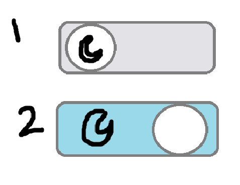
I want to put an icon inside of the white circle that signifies what the toggle is, but I can’t get the icon to show up in the right place, let alone follow where the circle goes. I’ve been trying to use Font Awesome icons.

What I want

Either one of these is my end goal, but I still have a hard time figuring out how to make it work.
toggle with icons

My Existing Code

If it helps, this is the site I’m working on.

Here is the CSS

/* Toggle Styles */
.toggle-container {
  text-align: center;
  margin-top: 20px;
  margin-bottom: 20px
}

.toggle {
  position: relative;
  display: inline-block;
  width: 60px;
  height: 34px;
}

.toggle input {
  opacity: 0;
  width: 0;
  height: 0;
}

.slider {
  position: absolute;
  cursor: pointer;
  border-radius: 34px;
  top: 0;
  left: 0;
  right: 0;
  bottom: 0;
  background-color: #ccc;
  transition: 0.4s;
}

.slider:before {
  position: absolute;
  content: "";
  height: 26px;
  width: 26px;
  left: 4px;
  bottom: 4px;
  background-color: white;
  border-radius: 50%;
  transition: 0.4s;
}

input:checked + .slider {
  background-color: #2FA28D; /* Color for dark mode background */
}

input:checked + .slider:before {
  transform: translateX(26px);
}

I don’t know if the JavaScript script is important, but here it is:

const modeToggle = document.getElementById('modeToggle');
const body = document.body;

modeToggle.addEventListener('change', () => {
  if (modeToggle.checked) {
    body.classList.add('dark-mode');
    body.classList.remove('light-mode');
    localStorage.setItem('mode', 'dark');
  } else {
    body.classList.add('light-mode');
    body.classList.remove('dark-mode');
    localStorage.setItem('mode', 'light');
  }
});

// Check localStorage for saved mode preference
const savedMode = localStorage.getItem('mode');
if (savedMode === 'dark') {
  body.classList.add('dark-mode');
  modeToggle.checked = true;
} else {
  body.classList.add('light-mode');
  modeToggle.checked = false;
}

I’ve tried placing an i element inside the toggle, which looked like this:

<label class="toggle">
  <input type="checkbox" id="modeToggle">
  <span class="slider round"></span>
  <i class="fas-fa-moon"></i>
</label>

vs without it:

<label class="toggle">
  <input type="checkbox" id="modeToggle">
  <span class="slider round"></span>
</label>

I’ve also tried updating the CSS in various other ways that I don’t have the remnants of. I’m very new to CSS, so anything will help at this point.

2

Answers


  1. Here is a solution with the CSS content property and pseudo ::after element. Necessary comments are added inside the codes.

    /* Toggle Styles */
    .toggle-container {
      text-align: center;
      margin-top: 20px;
      margin-bottom: 20px
    }
    
    .toggle {
      position: relative;
      display: inline-block;
      width: 60px;
      height: 34px;
    }
    
    .toggle input {
      opacity: 0;
      width: 0;
      height: 0;
    }
    
    .slider {
      position: absolute;
      cursor: pointer;
      border-radius: 34px;
      top: 0;
      left: 0;
      right: 0;
      bottom: 0;
      background-color: #ccc;
      transition: 0.4s;
    }
    
    .slider:before {
      position: absolute;
      content: "";
      height: 26px;
      width: 26px;
      left: 4px;
      bottom: 4px;
      background-color: white;
      border-radius: 50%;
      transition: 0.4s;
    }
    
    /* added codes */
    .slider::after{
      /* You can change the below icon with yours preferable one */
      content: "✹";
      font-size: 20px;
      position: absolute;
      z-index: 2;
      left: 8px;
      top: 3px;
      transition: 0.4s;
    }
    
    input:checked + .slider {
      background-color: #2FA28D; /* Color for dark mode background */
    }
    
    input:checked + .slider:before {
      transform: translateX(26px);
    }
    
    /* added codes */
    input:checked + .slider::after{
      transform: translateX(26px);
      content: "☾";
      left: 10px;
    }
    <label class="toggle">
      <input type="checkbox" id="modeToggle">
      <span class="slider round"></span>
    </label>
    Login or Signup to reply.
    • You could use some icons or Unicode emoji as child elements, and also CSS-animate them as well.
    • Regarding the dark mode toggling the best is to use data-* attribute like data-mode="light" in the <html> element. Then inside JS you can toggle it on the document.documentElement (see example)
    • To remember the user-desired mode see this related answer
    document.querySelector(".toggle input").addEventListener("change", (evt) => {
      document.documentElement.dataset.mode = evt.currentTarget.checked ? "dark" : "light";
    });
    .toggle {
      position: relative;
      overflow: hidden;
      display: inline-flex;
      gap: 0.75rem;
      align-items: center;
      padding: 0.5rem;
      background-color: #444;
      border-radius: 2rem;
      user-select: none;
      cursor: pointer;
      transition: translate 0.3s, background-color 0.8s;
      
      &::before {
        position: absolute;
        top: 1px;
        left: 1px;
        content: "";
        height: calc(100% - 2px);
        aspect-ratio: 1;
        border-radius: 50%;
        transition: translate 0.3s, background-color 0.8s;
        background: #fff;
      }
      
      & input {
        position: absolute;
        appearance: none;
      }
      
      & span {
        position: relative;
        transition: translate 0.6s ease 0.2s;
        
        &:nth-of-type(1) {
          translate: 0 150%;
        }
        
        &:nth-of-type(2) {
          translate: 0 0%;
        }
      }
      
      &:has(input:checked) {
        background-color: #ddd;
        
        & span:nth-of-type(1) {
          translate: 0 0%;
        }
        
        & span:nth-of-type(2) {
          translate: 0 -150%;
        }
      }
      
      &:has(input:checked)::before {
        translate: 100% 0;
        background-color: #444;
      }
    }
    
    /* Use like: */
    
    [data-mode="dark"] {
      & body {
        background: #444;
        color: #eee;
      }
      & #someSpecificElement {
        /* Some dark mode styles here */
      }
    }
    <label class="toggle" arial-label="Toggle dark mode" tabindex=0>
      <input type="checkbox">
        <span>☀️</span>
        <span>🌙</span>
    </label>
    Login or Signup to reply.
Please signup or login to give your own answer.
Back To Top
Search