skip to Main Content

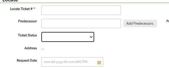
Basically, I want all my fields to be aligned like in this first image, even if the label for the input is shorter. You can see that all the input boxes are aligned on the right hand side in the image you’re looking at. I don’t want to specify margins for each input as there will be 88 input fields by the end of this.

Desired UI:

desired UI

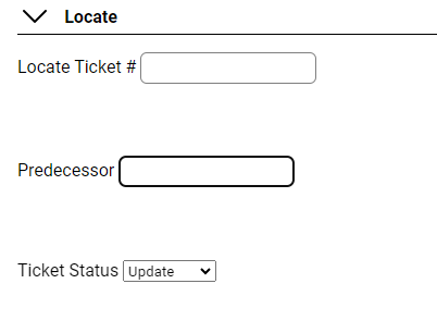
How mine is appearing:

my UI

@import url("https://fonts.googleapis.com/css2?family=Roboto:wght@400;700&display=swap");
* {
  margin: 0;
  padding: 0;
  font-family: "Roboto", sans-serif;
}

body {
  background-color: white;
}

.locate__dropdown {
  margin-top: 3em;
  margin-left: 1em;
  display: flex;
  align-items: center;
  gap: 0.7em;
  font-weight: 700;
  border-bottom: 1px solid black;
  margin-bottom: 1em;
}

.locate__open {
  margin-bottom: 5em;
  margin-left: 1em;
}

#locateForm {
  display: flex;
  flex-direction: column;
  justify-content: center;
}

input {
  height: 2em;
  width: 12em;
  border: 1px solid gray;
  border-radius: 6px;
  margin-bottom: 5em;
}
<section id="locate">
  <div class="locate__dropdown">
    <img src="down-arrow.png" alt="">Locate
  </div>

  <div class="locate__open">
    <form action="#" id="locateForm">
      <label>
          Locate Ticket #
          <input type="text" name="ticketNum" id="ticketNum">
        </label>

      <label>Predecessor
          <input type="text" name="predecessor" id="predecessor">
        </label>

      <label>
          Ticket Status
          <select id="ticketStatus" name="ticketStatus">
            <option value=""></option>
            <option value="correction">Correction</option>
            <option value="original">Original</option>
            <option value="relocate">Relocate</option>
            <option value="update">Update</option>
          </select>
        </label>

    </form>
  </div>
</section>

2

Answers


  1. This may be accomplished in a variety of ways. The "best" way to do this now would likely be to use CSS grids.

    .grid-container{
    box-sizing: border-box;
    border: 1px solid black;
    display: grid;
    grid-template-columns: auto auto; /* two columns auto defined width */
    }
    
    .grid-container > div:nth-child(even) { 
    background-color: yellow;
    }
    
    .grid-container > div:nth-child(odd) { 
    background-color: blue;
    text-align: right;
    color: white;
    }
    
    .grid-container div.weird-one{
    width: 400px; 
    background-color: red;
    }
    <div class="grid-container">
    <div>label</div>
    <div>input</div>
    <div>label</div>
    <div class="weird-one">input</div>
    <div>label</div>
    <div>input</div>
    </div>

    For more information see:

    Login or Signup to reply.
  2. here you go.
    You will have to update your HTML and CSS according to the snipped I created below.

    Styles go directly on the label and on the input and select, so the amount of fields doesn’t bother at all. I made some more adjustments to the CSS maked with new or changed

    In the HTML The label does not contain the form element, instead, it’s placed above the form element and references the ´id´ of the respective form element with the for attribute. So they are siblings now, not decendants.

    PS: there is no "best" way. If it’s resilient and works, it’s good. no matter if you use flexbox, grid or float.

    * {
      margin: 0;
      padding: 0;
      font-family: "Roboto", sans-serif;
    }
    body {
      background-color: white;
    }
    
    .locate__dropdown {
      margin-top: 3em;
      margin-left: 1em;
      display: flex;
      align-items: center;
      gap: 0.7em;
      font-weight: 700;
      border-bottom: 1px solid black;
      margin-bottom: 1em;
    }
    
    .locate__open {
      margin-bottom: 5em;
      margin-left: 1em;
    }
    
    #locateForm {
      display: flex;
      flex-direction: row; /* <-- changed */
      flex-wrap: wrap; /* <-- new */
      justify-content: center;
      width: 70%; /* <-- new */
    }
    
    label { /* <-- new */
        box-sizing: border-box;
        padding-right: 30px;
        text-align: right;
        width: 35%;
    }
    
    input, select { /* <-- new */
        box-sizing: border-box;
        border: 1px solid gray;
        border-radius: 6px;
        height: 2em;
        margin-bottom: 1em;
        width: 65%;
    }
    <section id="locate">
        <div class="locate__dropdown">
          <img src="down-arrow.png" alt="">Locate
        </div>
    
        <div class="locate__open">
          <form action="#" id="locateForm">
            <label for="ticketNum">Locate Ticket #</label>
            <input type="text" name="ticketNum" id="ticketNum">
    
            <label for="predecessor">Predecessor</label>
            <input type="text" name="predecessor" id="predecessor">
    
            <label for="ticketStatus">Ticket Status</label>
            <select id="ticketStatus" name="ticketStatus">
              <option value=""></option>
              <option value="correction">Correction</option>
              <option value="original">Original</option>
              <option value="relocate">Relocate</option>
              <option value="update">Update</option>
            </select>
    
          </form>
        </div>
     </section>
    Login or Signup to reply.
Please signup or login to give your own answer.
Back To Top
Search