


I have a problem using TailwindCSS to align center some elements in a flex-row as soon as the text in the row item starts to get longer and wrap.
Here is my current implementation:
<div class="border-1 p-2 flex w-[250px] flex-col items-center rounded border border-solid border-gray-300">
  <div class="flex flex-row">
    <div>UUID</div>
    <div class="ml-2">
      Text
    </div>
  </div>
  <div class="mt-2">
    2023-10-23
  </div>
</div>
It displays as I want if the text does not wrap:
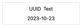
https://play.tailwindcss.com/UEGaldW7eo
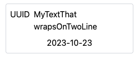
However when the text get’s bigger and starts to wrap, then the row (UUID + text) is no longer center aligned.
What I’d like is that:
But I can’t make it work somehow.
Any idea?
2
Answers
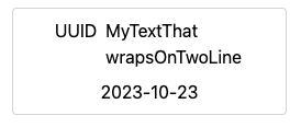
The solution was to set "w-min" to the div that contains the text so that wenn the text starts wrapping its div width shrinks to a minimum width.
Which produces:
The probable issue is due to the line-break that in utrn breaks
flex-alignment. I useditems-centerandtext-startclasses to try to achieve the layout that you’re expecting. Something like:CODE DEMO