skip to Main Content

I’m trying to create a image slider with name and description but when I add another image it added vertically I tried changing the display but nothing happens can you help me with this im only new to css and html

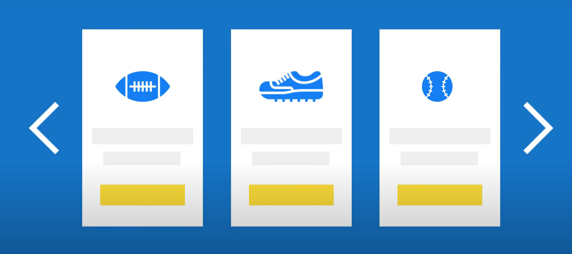
I want to create this kind of image slider
enter image description here
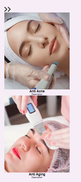
but instead this one occurs
enter image description here

What I have now:

.services {
  position: relative;
  overflow: hidden;
  padding: 20px;
}

.services-container {
  padding: 0 10vw;
  display: flex;
  overflow-x: auto;
  scroll-behavior: smooth;
}

.services-container::-webkit-scrollbar {
  display: none;
}

.service-card {
  flex: auto;
  display: inline-block;
  width: 300px;
  height: 450px;
  text-align: center;
  margin-right: 40px;
}

.service-image {
  position: relative;
  overflow: hidden;
  height: 350px;
  width: 100%;
}

.service-thumb {
  width: 100%;
  height: 100%;
  object-fit: cover;
}
<section class="services">
  <button class="pre-btn"> <img src="image/arrow.png" alt=""></button>
  <button class="next-btn"> <img src="image/arrow.png" alt=""></button>
  <div class="service-container">
    <div class="service-card">
      <div class="service-image">
        <img src="image/antiacne.jpg" class="service-thumb" alt="">
      </div>
      <div class="service-info">
        <h2 class="service-name">Anti Acne</h2>
        <p class="service-desc">Description</p>
      </div>
      <div class="service-container">
        <div class="service-card">
          <div class="service-image">
            <img src="image/antiageing.jpg" class="service-thumb" alt="">
          </div>
          <div class="service-info">
            <h2 class="service-name">Anti Aging</h2>
            <p class="service-desc">Description</p>
          </div>
        </div>
      </div>
    </div>
  </div>
</section>

I’ve tried different display but nothing happens it just crops the image and it doesn’t fit the container

2

Answers


  1. The html should be something like this

    .services {
      width: 100%;
      display: flex;
      align-items: center;
      justify-content: space-between;
    }
    
    .service-container {
      width: 100%;
      display: flex;
      justify-content: space-evenly;
    }
    
    .service-card {
      display: flex;
      flex-direction: column;
      align-items: center;
    }
    <section class="services">
      <button class="pre-btn"> <img src="image/arrow.png" alt=""></button>
      <div class="service-container">
        <div class="service-card">
          <div class="service-image">
            <img src="image/antiacne.jpg" class="service-thumb" alt="">
          </div>
          <div class="service-info">
            <h2 class="service-name">Anti Acne</h2>
            <p class="service-desc">Description</p>
          </div>
        </div>
      </div>
      <button class="next-btn"> <img src="image/arrow.png" alt=""></button>
    </section>

    After that, you can play with your elements and adjust dimensions, colors etc the way you want.

    Login or Signup to reply.
  2. This is a small and super quick but detailed answer. I updated the CSS to show how to lay out the visual parts.

    What you describe is commonly called a "carousel" where you have move and focus – in this case on your "cards" or often a set of images or pictures.

    Two primary navigation techniques are used. The left/right button navigation and the "thumbnail" or as I set up here a simple set of "titles" to click on to go directly to that "card".

    This is not "production ready" with some ugly borders and other elements just to show what is where and make things somewhat more clear.

    You can click either the < or > buttons (I used a bootstrap SVG for these so I could resize it and color it on hover, things like that) OR click the "titles" at the bottom – all styled with a combination of grid and flex – not fancy but more to illustrate.

    Borrowed some code from https://stackoverflow.com/a/63773123/125981 for the scroll parts.

    As for the index parts there are some useful nuggets of information here: Is it possible to get element's numerical index in its parent node without looping?

    (function() {
      function getElementIndex(element) {
        return [...element.parentNode.children].indexOf(element);
      }
    
      function scrollTo(el) {
        const left = el.offsetLeft + el.offsetWidth;
        const parentLeft = el.parentNode.offsetLeft + el.parentNode.offsetWidth;
    
        //if element in view
        if (left >= parentLeft + el.parentNode.scrollLeft) {
          el.parentNode.scrollLeft = left - parentLeft;
        } else if (left <= el.parentNode.offsetLeft + el.parentNode.scrollLeft) {
          el.parentNode.scrollLeft = el.offsetLeft - el.parentNode.offsetLeft;
        }
      }
    
      const carousel = document.querySelector('.carousel');
      const left = document.querySelector('.pre-btn');
      const right = document.querySelector('.next-btn');
      const cards = [...document.querySelectorAll('.service-card')];
      const navNames = document.querySelectorAll('.service-name-nav');
      carousel.dataset.currentIndex = 0;
    
      right.addEventListener('click', function(e) {
        const idx = carousel.dataset.currentIndex * 1;
        let nextIndex = idx < (cards.length - 1) ? idx + 1 : 0;
        carousel.dataset.currentIndex = nextIndex;
        scrollTo(cards[nextIndex]);
      });
      left.addEventListener('click', function(e) {
        const idx = carousel.dataset.currentIndex;
        let nextIndex = idx <= 0 ? cards.length - 1 : idx - 1;
        carousel.dataset.currentIndex = nextIndex;
        scrollTo(cards[nextIndex]);
      });
      navNames.forEach(elem => elem.addEventListener("click", function(event) {
        const idx = getElementIndex(this);
        carousel.dataset.currentIndex = idx;
        scrollTo(cards[idx]);
      }));
    })();
    :root {
      --carousel-background: #FF000011;
      --nav-button-size: 5em;
    }
    
    body {
      margin: 0;
      padding: 0;
      box-sizing: border-box;
      font-size: 16px;
    }
    
    .services {
      overflow: hidden;
      height: 100vh;
      display: grid;
      grid-template-rows: auto 1fr;
      grid-template-columns: var(--nav-button-size) auto var(--nav-button-size);
      grid-template-areas: "leftnav cards rightnav" "mynav mynav mynav";
      align-items: center;
      justify-content: center;
      gap: 1.25em;
      border: solid 1px #00ff00;
      background-color: var(--carousel-background);
    }
    
    .services .scroll-button,
    .services .scroll-button svg {
      width: var(--nav-button-size);
      height: var(--nav-button-size);
      color: #FFFFFF;
      border: none;
      /* background-color: var(--carousel-background);*/
    }
    
    .services .scroll-button:hover,
    .services .scroll-button svg:hover {
      transform: scale(1.2);
      color: #FFFF00;
    }
    
    .services .scroll-button.prev-btn {
      grid-area: leftnav;
    }
    
    .service-container.carousel {
      grid-area: cards;
    }
    
    .services .scroll-button.next-btn {
      grid-area: rightnav;
    }
    
    .service-container {
      overflow: scroll;
      scroll-snap-type: x mandatory;
      scroll-behavior: smooth;
      display: flex;
      flex-direction: row;
      gap: 1.25em;
      border: solid 1px #ff4444;
      align-items: center;
      padding: .5em;
    }
    
    .service-container::-webkit-scrollbar {
      display: none;
    }
    
    .service-card {
      border: solid 1px #FF00FF;
      display: grid;
      place-items: center;
    }
    
    .service-image {
      display: grid;
      place-items: center;
      border: solid green 1px;
      padding: 0.25em;
      background-color: #0000FF11;
    }
    
    .service-thumb {
      /* em of 300 X 350 px */
      /*width: 18.75em;
      height: 21.875em;*/
      width: 15em;
      height: 12em;
      border: double #FF0000 3px;
    }
    
    .service-container-nav {
      grid-area: mynav;
      /* overflow-x: scroll;
      overflow-y: hidden;*/
      display: grid;
      grid-template-columns: repeat(auto-fill, minmax(5em, 1fr));
      grid-auto-rows: 1fr;
      gap: 1em;
      text-align: center;
      border: solid yellow 2px;
    }
    
    .service-name-nav {
      border: solid green 2px;
    }
    <section class="services">
      <div class="pre-btn scroll-button"><svg xmlns="http://www.w3.org/2000/svg" width="16" height="16" fill="currentColor" class="bi bi-chevron-left" viewBox="0 0 16 16">
      <path fill-rule="evenodd" d="M11.354 1.646a.5.5 0 0 1 0 .708L5.707 8l5.647 5.646a.5.5 0 0 1-.708.708l-6-6a.5.5 0 0 1 0-.708l6-6a.5.5 0 0 1 .708 0z"/>
    </svg></div>
      <div class="next-btn scroll-button"><svg xmlns="http://www.w3.org/2000/svg" width="16" height="16" fill="currentColor" class="bi bi-chevron-right" viewBox="0 0 16 16">
      <path fill-rule="evenodd" d="M4.646 1.646a.5.5 0 0 1 .708 0l6 6a.5.5 0 0 1 0 .708l-6 6a.5.5 0 0 1-.708-.708L10.293 8 4.646 2.354a.5.5 0 0 1 0-.708z"/>
    </svg></div>
      <div class="service-container carousel">
        <div class="service-card">
          <div class="service-image">
            <img src="image/antiacne.jpg" class="service-thumb" alt="I am first acne">
          </div>
          <div class="service-info">
            <h2 class="service-name">Anti Acne</h2>
            <p class="service-desc">Description</p>
          </div>
        </div>
        <div class="service-card">
          <div class="service-image">
            <img src="image/antiageing.jpg" class="service-thumb" alt="I am aging">
          </div>
          <div class="service-info">
            <h2 class="service-name">Anti Aging</h2>
            <p class="service-desc">Description</p>
          </div>
        </div>
        <div class="service-card">
          <div class="service-image">
            <img src="image/antiageing.jpg" class="service-thumb" alt="I am not fun">
          </div>
          <div class="service-info">
            <h2 class="service-name">Anti fun</h2>
            <p class="service-desc">Description</p>
          </div>
        </div>
        <div class="service-card">
          <div class="service-image">
            <img src="image/antiageing.jpg" class="service-thumb" alt="I am gun">
          </div>
          <div class="service-info">
            <h2 class="service-name">Fun Guys</h2>
            <p class="service-desc">Description</p>
          </div>
        </div>
        <div class="service-card">
          <div class="service-image">
            <img src="image/antiageing.jpg" class="service-thumb" alt="I am grape">
          </div>
          <div class="service-info">
            <h2 class="service-name">Tester Out</h2>
            <p class="service-desc">Description</p>
          </div>
        </div>
      </div>
      <nav class="service-container-nav">
        <div class="service-name-nav">Anti Acne</div>
        <div class="service-name-nav">Anti Aging</div>
        <div class="service-name-nav">Anti fun</div>
        <div class="service-name-nav">Fun Guys</div>
        <div class="service-name-nav">Tester Out</div>
      </nav>
    </section>
    Login or Signup to reply.
Please signup or login to give your own answer.
Back To Top
Search