


I want to create a 3 parent div : A B C, every parent have a grid system as a child, and when I get A1 from server I must put it into A column, B1 into B and so on, but when I get more than 3 children in same column I should create another column inside parent, I’m trying with css grid but I don’t know how to achive this mechanism.
this is what I’ve tried :
.children {
    display: grid;
    grid-template-columns: repeat(2, 1fr);
  }
<div class="parent">
<div>
<span style="background: orange;">A</span>
<div class="children">
<div>A1</div>
<div>A2</div>
<div>A3</div>
</div>
</div>
<div>
<span style="background: red;">B</span>
<div class="children">
<div>B1</div>
<div>B2</div>
<div>B3</div>
</div>
</div>
<div>
<span style="background: green;">C</span>
<div class="children">
<div>C1</div>
<div>C2</div>
<div>C3</div>
</div>
</div>
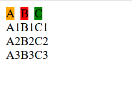
</div>And the result is this :
enter image description here
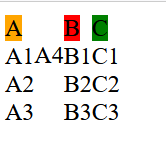
And when I add A4 for example, it should be like this :
enter image description here
As you can see, the width of A column has changed since we get 4 elements, I want the same mechanism in all columns A B C.
Have you an idea how can I achieve this ?
2
Answers
Updated answer:
Add any additional column inside the
additional-colsdiv, here is an example:Stackblitz Example
Another solution is to repeat children with 2 columns by 1 frame:
Here is another example on Stackblitz
Some grids within grids; how another div (D) would appear is controlled by the first grid – so like I have it here it would wrap below these three for example as does the A4 when added – just change the first grid column width to get it to NOT do so;