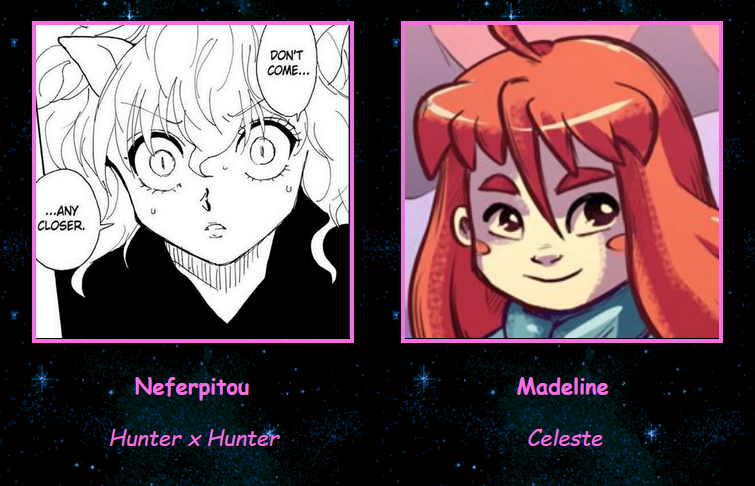
skip to Main Content

So I made this

But the code looks like this

<img src="images/kinz/pitou.png" style="width:230px;margin-left:30px;border-style:solid; border-color:rgb(246, 111, 225);" alt="">
<img src="images/kinz/madeline.png" style="width:230px;margin-left:30px;border-style:solid; border-color:rgb(246, 111, 225);" alt="">
    <p>&nbsp&nbsp&nbsp&nbsp&nbsp&nbsp&nbsp&nbsp&nbsp&nbsp&nbsp&nbsp&nbsp&nbsp&nbsp&nbsp&nbsp&nbsp&nbsp&nbsp&nbsp&nbsp<b>Neferpitou</b>&nbsp&nbsp&nbsp&nbsp&nbsp&nbsp&nbsp&nbsp&nbsp&nbsp&nbsp&nbsp&nbsp&nbsp&nbsp&nbsp&nbsp&nbsp&nbsp&nbsp&nbsp&nbsp&nbsp&nbsp&nbsp&nbsp&nbsp&nbsp&nbsp&nbsp&nbsp&nbsp&nbsp&nbsp&nbsp&nbsp&nbsp&nbsp&nbsp&nbsp&nbsp<b>Madeline</b>
    <p>&nbsp&nbsp&nbsp&nbsp&nbsp&nbsp&nbsp&nbsp&nbsp&nbsp&nbsp&nbsp&nbsp&nbsp&nbsp&nbsp&nbsp&nbsp<i>Hunter x Hunter</i>&nbsp&nbsp&nbsp&nbsp&nbsp&nbsp&nbsp&nbsp&nbsp&nbsp&nbsp&nbsp&nbsp&nbsp&nbsp&nbsp&nbsp&nbsp&nbsp&nbsp&nbsp&nbsp&nbsp&nbsp&nbsp&nbsp&nbsp&nbsp&nbsp&nbsp&nbsp&nbsp&nbsp&nbsp&nbsp&nbsp&nbsp&nbsp<i>Celeste</i>

I need to figure out to have the same result as above but in a way that isn’t awful.

I tried using a table but I couldn’t get the text to line up nicely under each image, and if I was able to get it lined up under one, the second table would be below the first and not next to it. I’m sorry if that doesn’t make sense. I also tried doing<table> <tr><td>Neferpitou</td><td>Madeline</td></tr></table> but using border-spacing to try and line them up didn’t work very well. How should I go about this?

2

Answers


  1. Put each image and text in a div, then wrap those divs in a grid or flex container.

    Login or Signup to reply.
  2. This example demonstrates using Flexbox on a parent container with the images and text in separate containers, and styling the text with the :nth-child() pseudo-class.

    div.container {
      display: flex;
      justify-content: center;
      gap: 30px;
      text-align: center;
    }
    
    div.container img {
      width: 230px;
      /* margin-left: 30px; */
      border-style: solid;
      border-color: rgb(246, 111, 225);
    }
    
    div.container p:nth-of-type(1) {
      font-weight: bold;
    }
    
    div.container p:nth-of-type(2) {
      font-style: italic;
    }
    <div class="container">
      <div>
        <img src="https://placehold.co/230?text=pitou.png" alt="">
        <p>Neferpitou</p>
        <p>Hunter x Hunter</p>
      </div>
      <div>
        <img src="https://placehold.co/230?text=madeline.png" alt="">
        <p>Madeline</p>
        <p>Celeste</p>
      </div>
    </div>

    This example demonstrates using Grids on a parent container and styling the text with the adjacent sibling combinator +

    div.container {
      display: grid;
      grid-template-rows: auto auto auto;
      grid-auto-flow: column;
      justify-content: center;
      gap: 30px;
      text-align: center;
    }
    
    div.container img {
      width: 230px;
      /* margin-left: 30px; */
      border-style: solid;
      border-color: rgb(246, 111, 225);
    }
    
    div.container img + p {
      font-weight: bold;
    }
    
    div.container img + p + p {
      font-style: italic;
    }
    <div class="container">
      <img src="https://placehold.co/230?text=pitou.png" alt="">
      <p>Neferpitou</p>
      <p>Hunter x Hunter</p>
    
      <img src="https://placehold.co/230?text=madeline.png" alt="">
      <p>Madeline</p>
      <p>Celeste</p>
    </div>
    Login or Signup to reply.
Please signup or login to give your own answer.
Back To Top
Search