skip to Main Content

I am trying to build a "card" within a ul li list. This cards should be responsive. Therefore my core idea was to use CSS Flexbox. I have started a pen at codepen.io but struggling now for days to achieve this. Why cant i align easily these divs with flexbox?

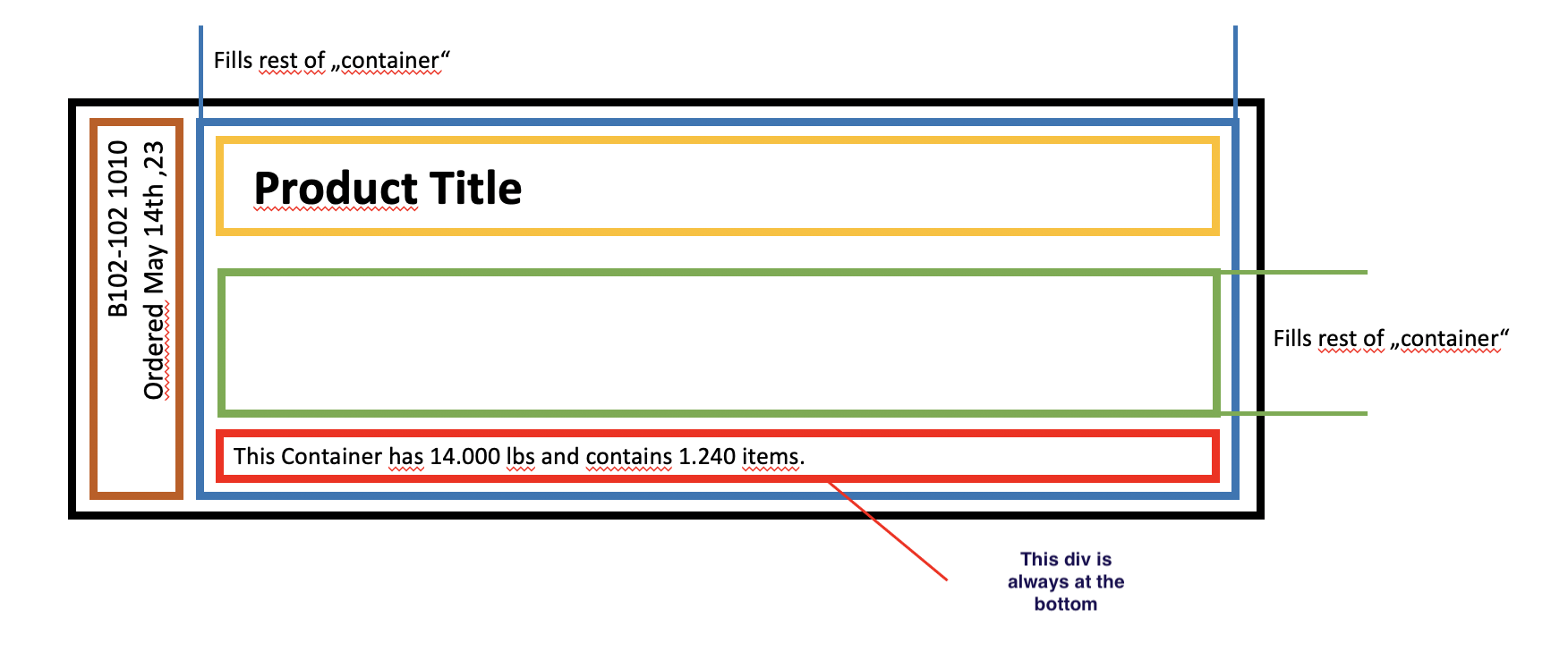
This is how it should look like:
enter image description here

This is the pen:
https://codepen.io/bogazci/pen/WNayNXb?editors=1100

HTML

<ul class="packs-list">
  <a href="#">
    <li class="pack">
      <div class="pack-sku">B01-102 102<br>ordered on 14th may 23</div>
      <div class="pack-card">
        <h2 class="pack-title">Customer Engagement</h2>
        <div class="pack-description">This is the descriptin for the.</div>
        <div class="pack-information">This item contains <b>2123</b> elements in <b>231</b> containers.</div>
      </div>
    </li>
  </a>
</ul>

CSS

.pack-sku {
  background-color: red;
  white-space: nowrap;
  transform: rotate(-90deg);
} 

.pack-card {
  background-color: brown;
} 

.pack {
  background-color: green;
  width: 100%;
} 

.packs-list {
  background-color: yellow;
} 

ul {
  display: flex;
  list-style-type: none;
  list-style-position: inside;
  margin:0;
  padding:0;
}

li {
  display: flex;
margin:0;
  padding:0;
}

.pack-card {
  display: flex;
}

2

Answers


  1. still align based on the height of that element

    You can use aspect-ratio: 1 / 1; and negative margin

    Example :

    .pack-sku{
      ...
      aspect-ratio: 1 / 1
      ...
    }
    .pack-card {
      background-color: brown;
      margin: -150px; /* example */
    }
    

    But i suggest you to use javascript

    somthing like this:

    HTML

    <ul class="packs-list">
      <a href="#">
        <li class="pack">
          <div class="pack-sku">
            <!-- NEW -->
            <span>B01-102 102<br>ordered on 14th may 23</span>
          </div>
          <div class="pack-card">
            <h2 class="pack-title">Customer Engagement</h2>
            <div class="pack-description">This is the descriptin for the.</div>
            <div class="pack-information">This item contains <b>2123</b> elements in <b>231</b> containers.</div>
          </div>
        </li>
      </a>
    </ul>
    

    CSS

    .pack-sku {
      position: relative;
      background-color: red;
    }
    .pack-sku > span{
      position: absolute;
      display: block;
      white-space: nowrap;
      transform: rotate(-90deg);
      left: 0;
      bottom: 0;
      right: 0;
    } 
    

    JAVASCRIPT

    document.querySelector('.pack-sku').style.width = document.querySelector('.pack-sku span').offsetHeight + 'px';
    
    document.querySelector('.pack-sku').style.height = document.querySelector('.pack-sku span').offsetWidth + 'px';
    
    Login or Signup to reply.
  2. Syntactically an ul element can only contain li elements, while a li can contain anything. I corrected the HTML to reflect that.

    It is not clear what you were aiming for using Flexbox Layout like you did, so I recreated your CSS starting from scratch.

    The CSS is commented, so I will not repeat it here, but the trick with Flexbox Layout is to distinguish between the various column and row parent containers and which child items should be allowed/forced to grow/shrink or not.

    As a bonus I added a few ‘responsiveness’ solutions and some hover effects you can fiddle with: body { font-size }, @media and pack:hover/pack:hover>a.

    A Codepen you can fork…

    /* makes padding+border part of total element size */
    * { box-sizing: border-box }
    
    :root {
        /* Define a few values for general use */
        --pad: 0.5rem; /* generic padding */
        --bd : 3px;    /* border size */
    }
    
    body {
        margin: 0; /* Remove HTML default spacing */
    
        padding: calc(2 * var(--pad));
        font-size: calc(0.625vmin + 0.75rem); /* Responsive font */
    
        background-color: #efefef;
    }
    
    .list {
        /* Remove HTML defaults */
        list-style-type: none;
        margin: 0; padding: 0;
    }
    
    /******************/
    /* Flexbox Layout */
    /******************/
    /* Flexbox parent containers */
    .list, .pack>a, .pack-card { display: flex }
    .list, .pack>a             { flex-flow: row wrap }
    .pack-card                 { flex-flow: column wrap; justify-content: space-between }
    .list                      { justify-content: center }
    
    /* Flexbox child items */
    .pack-sku, .pack-card,
    .pack-description          { flex: 1 } /* allow to stretch to fill parent */
    
    /* Flexbox spacing */
    .list                      { gap: calc(2 * var(--pad)) }
    .pack>a, .pack-card        { gap: var(--pad) }
    
    /**********************/
    /* Sizing and Styling */
    /**********************/
    /* All classes containing ... */
    [class*="pack"] { padding: var(--pad) }
    
    .pack {
    /*    max-width: min(24rem, 100%); /* toy with this */
    
        background-color: White;
        border: var(--bd) solid #aaa;
        color: #444;
    }
    .pack:hover {
        border-color: Black;
        color: Black;
    }
    
    .pack>a {
        text-decoration-style: wavy;
        text-decoration-color: #e8e8e8;
        color: currentColor;
    }
    .pack:hover>a {
        text-decoration-style: solid;
        text-decoration-color: Black;
    }
    
    .pack-sku {
        white-space: nowrap;
        border: var(--bd) solid #c4590f;
    }
    
    /* Make vertical textbox when space allows */
    @media all and (min-width: 360px) {
        .pack-sku {
            flex: 0; /* disable fill parent size */
    
            /* Rotate writing direction and element */
            -webkit-writing-mode: vertical-lr;
            writing-mode: vertical-lr;
            transform: rotate(180deg);
    
            text-align: right;
        }
    }
    
    .pack-card        { border: var(--bd) solid #2c74b4 }
    .pack-title       { border: var(--bd) solid #febf01; font-size: 1.5em; font-weight: bold }
    .pack-description { border: var(--bd) solid #6fac45 }
    .pack-information { border: var(--bd) solid #fe0000 }
    <ul class="list">
        <li class="pack">
            <a href="javascript:void(0)">
                <div class="pack-sku">B01-102 102<br>ordered on 14th may 23</div>
                <div class="pack-card">
                    <div class="pack-title">Customer Engagement</div>
                    <div class="pack-description">This is the description for the...</div>
                    <div class="pack-information">This item contains <b>2123</b> elements in <b>231</b> containers.</div>
                </div>
            </a>
        </li>
    </ul>
    Login or Signup to reply.
Please signup or login to give your own answer.
Back To Top
Search