 Question posted in


I faced a problem when styling the select tag. The thing is that by default, the arrow is in the right corner of the field, which takes the size of the largest option tag. That’s why, when a small option is selected, everything looks not in a proper way. Is there any possibility to adjust the width of the select tag to the current option or somehow attach the arrow to it? Thanks in advance!
Show screen
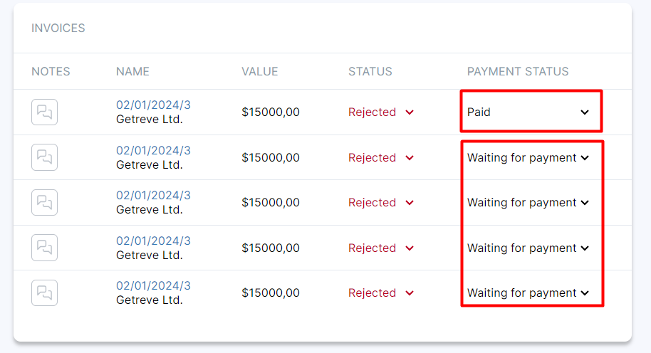
<table class="module-table">
    <tr>
        ...
    </tr>
    ...

    <tr>
        ...
        <td>
            <select class="module-status-dropdown module-status-dropdown-rejected">
                <option value="rejected">Rejected</option>
                <option value="pending">Pending</option>
                <option value="approved">Approved</option>
            </select>
        </td>
        <td>
            <select class="module-status-dropdown">
                <option value="rejected">Waiting for payment</option>
                <option value="pending">Paid</option>
            </select>
        </td>
    </tr>
    ...
</table>
.module-table {
    min-width: 100%;
    margin-bottom: 30px;
}
.module-status-dropdown {
    position: relative;
    padding: 0;
    margin: 0;
    border: none;
    background: transparent;
    margin-left: -4px;
}
option {
    padding: 0;
    background: transparent;
    color: #000;
}
I tried applying the appearance: none property and adding an arrow using the after pseudo element, but nothing worked.
2
Answers
You can achieve it by using
-webkit-apperaranceand thebackground-imageproperty:Workaround for padding in the dropdown image:
As far as I searched, I didn’t find any straightforward solution to provide some space to make the custom arrow icon padded, but I found a workaround for the same, that is using
background-position-xto move it away from edges. Here is an implementation:View:
A slightly different option is to place the arrow to the left of the text to give the user a consistent experience, regardless of the text width.
This can be achieved by using the CSS direction property.