I’m working on a responsive layout using Bootstrap 5.3 that includes a NavBar, SideBar, ContentPanel, and StatusBar. The app should be always 100% view-height and view-width and contain all information without getting page scrollbars!
The ContentPanel contains an element on the top, a table with dynamic values, and an element at the bottom. I want the table to be as tall as possible without pushing the element below it and the StatusBar outside the viewport!
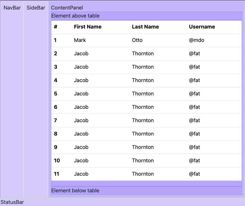
When I have only a few rows it looks good, here an example:
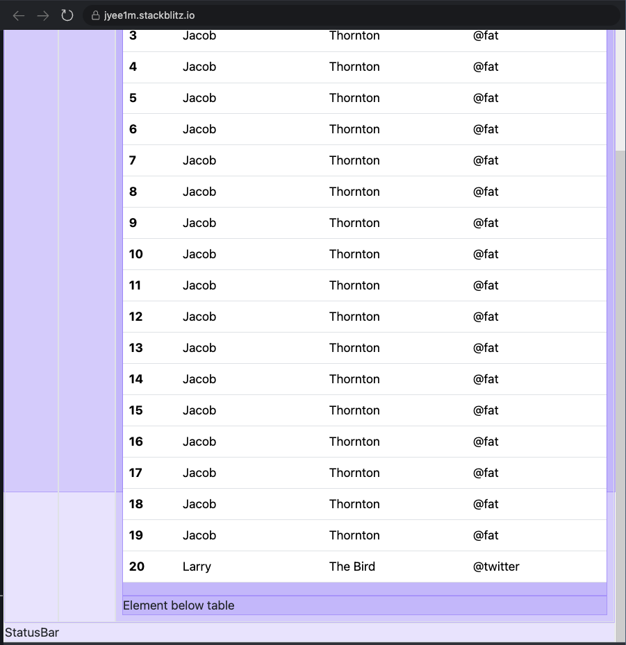
My problems arises when the table get’s many rows: the table pushes the element below and the StatusBar out of the viewport and the whole page get’s a vertical scrollbar! Here an example:
When the table’s content exceeds the ContentPanel’s size, I want a scrollbar to appear within the table inside the ContentPanel, so you can scroll through the table rows without loosing sight of the StatusBar. The table should take up the remaining height of the ContentPanel after the other elements have been rendered.
So far, I was able to make this work only when I set a maximum height on the table, however then it becomes not as responsive, see here:
[
Can somebody help me out? Here my StackBlitz example: https://stackblitz.com/edit/jyee1m?file=index.html

 Question posted in


2
Answers
You can achieve this if you set a fixed
heightto the status bar, which I guess will not vary in contact as much as the content panel. Then you addmax-height: calc(100vh - 27px);to the content wrapper and Bootstrap classoverflow-autoto the scrollable table so that the scrollbar appears inside the table and not for the whole page. Also, used-flex flex-columnon the content wrapper.See the snippet below.
Apply
height: 100vhto the<div>element that wraps the whole webpage via thevh-100class. With its vertical flex layout and this class, this can be used to limit the sizing of elements within.We apply
min-height: 0to various inner elements to override themin-height: min-contentthat would otherwise apply by default due to the vertical flex layouts.We apply
max-height: 100%viamh-100, and invoke a vertical flex layout to give the ContentPanel<div>a height constraint of its parent element, so that the inner.scrollable-tableelement will have a constraint to shrink to.