 Question posted in


How to create multiple css blocks of different size with several sub-blocks inside of each?
Is there maybe a tool such as css grid generator or some good tutorial?
I am very new in the front-end dev, so I am struggling to understand how to create the following web-page. The web-page is without scrolling down or side. As far as I understood the I could have done it with the grid or flexbox, but my tiles are organized differently and some tiles have sub-tiles.
Here is a snippet I am trying to do:
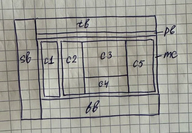
Description:
- sb – side bar (it will have several items inline)
- tb – top bar (it will have several items which also have several sub-items)
- pb – progress bar (later I need to add moving progress bar inside div)
- mc – main content has 5 fixed boxes, namely c1 to c5
- also in c2 I would like to make a scroll bar (but this I investigate later)
I created several <div></div> elements for each sections and assigned classes. For c1-c5 I tried to create sub-<div></div> elements, though they elements were in a column, I couldn’t position them well.
Here is what I have tried:
@import url("https://fonts.googleapis.com/css2?family=Roboto&display=swap");
*,
*::before,
*::after {
box-sizing: border-box;
}
body {
margin: 0;
padding: 0;
font-family: "Roboto", sans-serif;
font-size: 25px;
text-align: center;
}
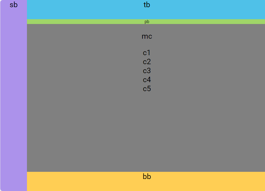
.sidebar {
background-color: #AC92EB;
width: 10vw;
position: absolute;
top: 0;
bottom: 0;
left: 0;
}
.topbar {
background-color: #4FC1E8;
width: 90vw;
height: 10vh;
left: 10%;
position: absolute;
top: 0;
}
.progressbar {
background-color: #A0D568;
width: 90vw;
height: 2.5vh;
left: 10%;
position: absolute;
top: 10%;
font-size: 14px;
}
.bottombar {
background-color: #FFCE54;
width: 90vw;
height: 10vh;
margin-left: 10%;
position: absolute;
bottom: 0;
}
.main-content {
background-color: grey;
width: 90vw;
height: 80vh-2.5vh;
position: absolute;
top: 12.5%;
right: 0;
bottom: 10%;
left: 10%;
}
.centerpar .mode-control {
position: relative;
width: 14vw;
height: 75.5vh;
top: 1vh;
left: 1vh;
background-color: aqua;
}
and html:
<!DOCTYPE html>
<html lang="en">
<head>
    <meta charset="UTF-8">
    <meta http-equiv="X-UA-Compatible" content="IE=edge">
    <meta name="viewport" content="width=device-width, initial-scale=1.0">
    <title>Demo-version</title>
    <!-- STYLESHEET -->
    <link rel="stylesheet" href="./styles.css">
</head>
<body>
    <div class="sidebar">
        sb
    </div>
    <div class="topbar">
        tb
    </div>
    <div class="progressbar">
        pb
    </div>
    <div class="bottombar">
        bb
    </div>
    <div class="main-content">
        <p>mc</p>
        <div class="c1">
            c1
        </div>
        <div class="c2">
            c2
        </div>
        <div class="c3">
            c3
        </div>
        <div class="c4">
            c4
        </div>
        <div class="c5">
            c5
        </div>
    </div>
</body>
</html>
Here is what I have done:
I saw several tutorial where they put in a container all these blocks, some create instead a div directly the name of the block, e.g. <sidebar></sidebar>.
2
Answers
make MC
find grids here
create element as parent for C3, C4
and style it like this
find flex here
maybe you can use the css grid layout. Below is the start of what you may need. You can follow this logic, you start with 2 columns in container, then 4 rows in the right contents grid… Please also check as David said css grid-layout