skip to Main Content

I am trying to create master card and i currently working on its back side but i don’t know how to create multiple linear gradient like this.

The part behind the 1234567 numbers.

enter image description here

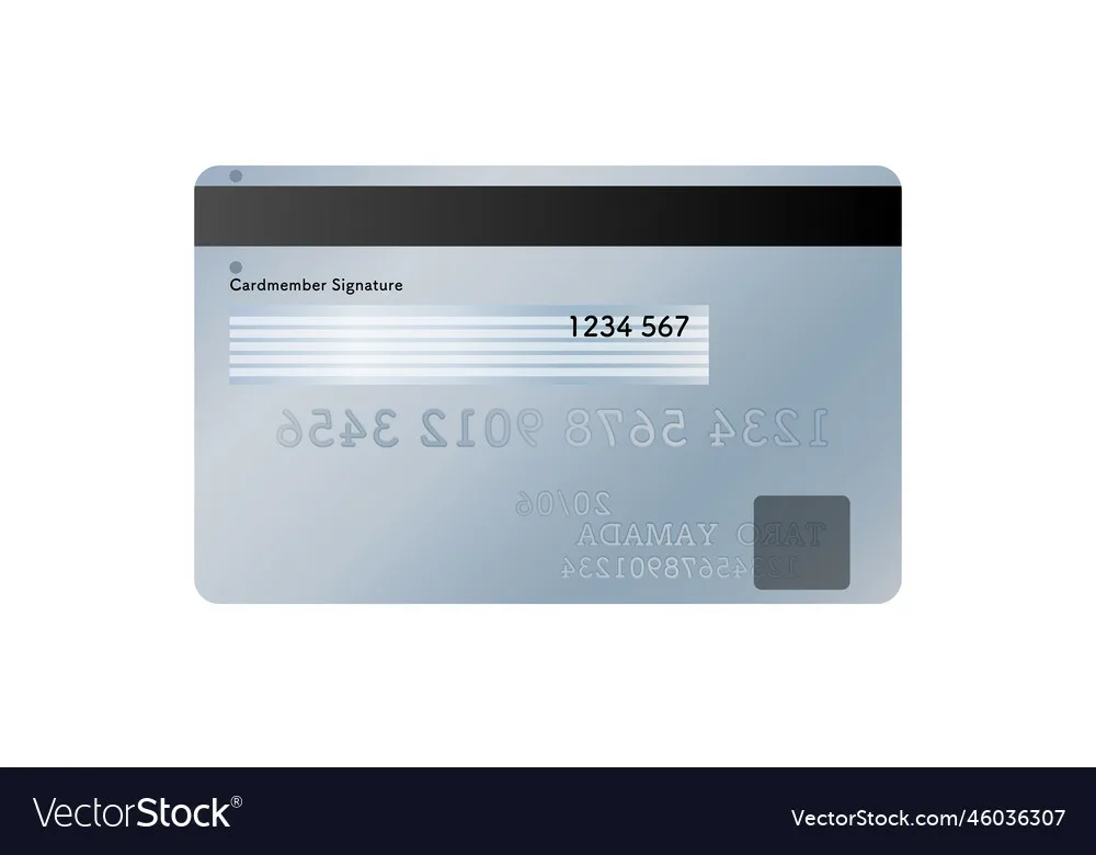
In my case i want to recreate those grayish to white to grayish into linear-gradient(to right ,orange, lightblue, orange).

After seeing this question and i try to help me out with chat gpt but he doesn’t understand what i was trying to say.

In this question there a site. when i try to change it’s code things got little bit easier but i can’t understand to how to change those gray line into right.

this is a code wrote to explain myself better.

div{
width:100%;
height:300px;
background:#fff;
border: 3px solid #000;
display:flex;
justify-content:center;
align-items:center;
flex-direction:column;
gap: 10px;
}

span{
width:100%;
height: 10px;
background: linear-gradient(to right, orange, lightblue,orange);
display:block;
}
<div>
<span></span>
<span></span>
<span></span>
<span></span>
<span></span>
<span></span>
<span></span>
<span></span>
<span></span>
<span></span>
<span></span>
<span></span>
<span></span>
<span></span>
<span></span>
<span></span>
<span></span>
<span></span>
</div>

2

Answers


  1. You can use a tool like this to create your own gradient: https://cssgradient.io/

    Instead of using multiple span tags you probably want to use multiple background rules, combined with child selectors, something in this direction:

    div{
      width:100%;
      height:300px;
      background:#fff;
      border: 3px solid #000;
      display:flex;
      justify-content:center;
      align-items:center;
      flex-direction:column;
    }
    
    div.card{
      width:100%;
      height: 300px;
      background: linear-gradient(-45deg, rgba(159,175,192,1) 0%, rgba(199,208,208,1) 33%, rgba(155,174,190,1) 67%, rgba(199,208,208,1) 100%);
      display:flex;
      justify-content:center;
      align-items:flex-start;
    }
    
    span {
      width: 50%;
      height: 10px;
      background: black;
    }
    
    span:nth-child(2n) {
      background: linear-gradient(45deg, rgba(159,175,192,1) 0%, rgba(199,208,208,1) 50%, rgba(159,175,192,1) 100%);
    }
    
    span:nth-child(2n - 1) {
      background: #dbe4eb;
    }
    <div>
      <div class="card">
        <span></span>
        <span></span>
        <span></span>
        <span></span>
        <span></span>
        <span></span>
        <span></span>
        <span></span>
        <span></span>
      </div>
    </div>
    Login or Signup to reply.
  2. Use two gradients:

    div {
      height: 300px;
      background: #fff;
      border: 3px solid #000;
      background: 
        repeating-linear-gradient(#0000 0 10px,#fff 0 20px),
        linear-gradient(to right, orange, lightblue, orange);
    }
    <div>
    </div>
    Login or Signup to reply.
Please signup or login to give your own answer.
Back To Top
Search