skip to Main Content

I’m trying to create a UI effect where a specific area of a webpage is highlighted and the rest of the page is covered with a semi-transparent black overlay, using only CSS. What is the standard practice for achieving this effect? I’d like the highlighted area to be fully clear and interactive, while the rest of the page dimmed.

Note: I’m looking for a solution that avoids JavaScript and complex HTML structures if possible but should also be supported by the latest browser versions.

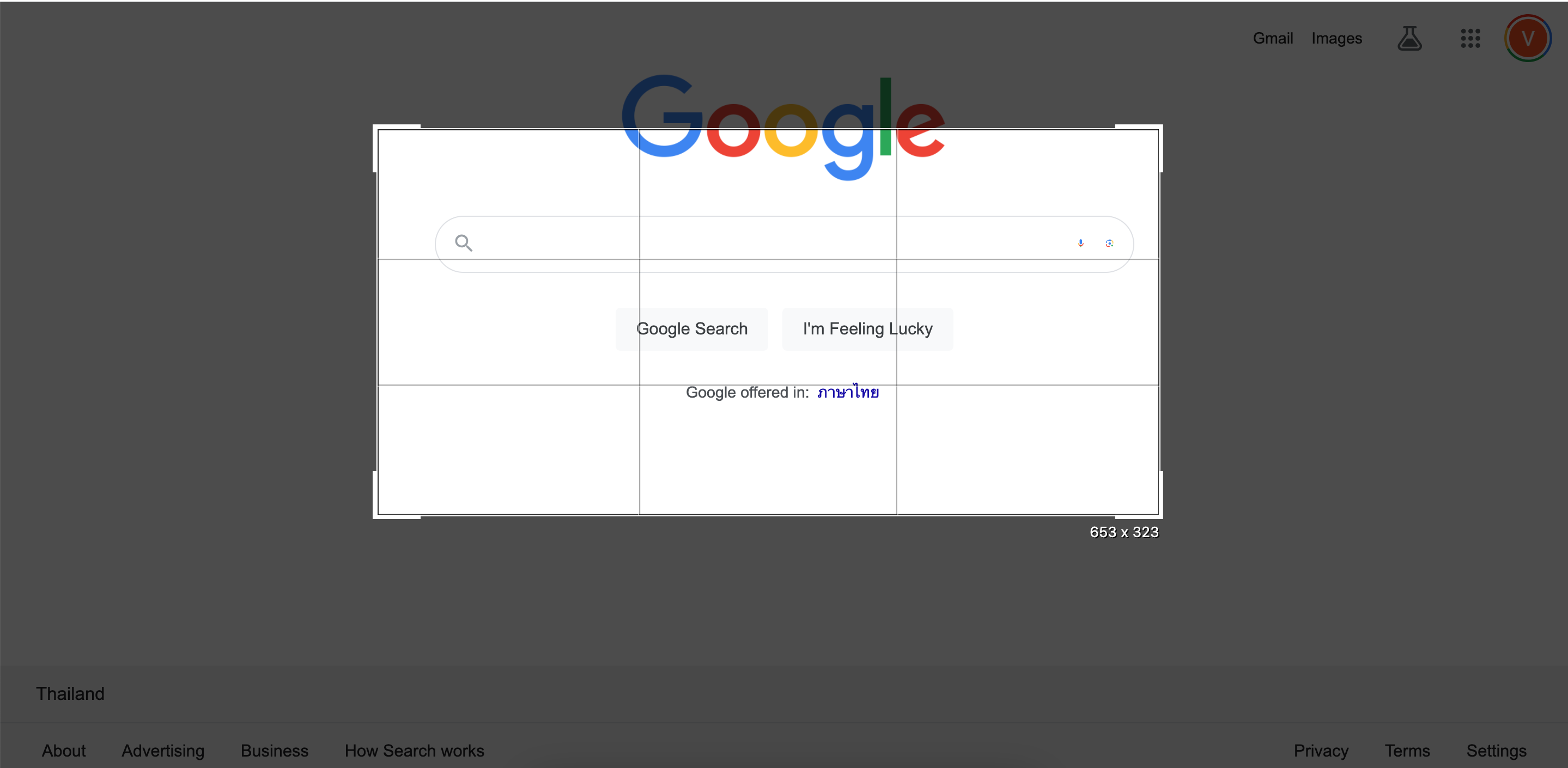
Something like this:

enter image description here

Could it be done with CSS for example:

/* Overlay that covers the entire viewport */
.overlay {
  position: fixed;
  top: 0;
  left: 0;
  width: 100%;
  height: 100%;
  background: rgba(0, 0, 0, 0.7); /* Semi-transparent black */
}

Then I tried using mask CSS properties for the selection area but I do not know if this is best practice.

Note: the rectangle will is meant to be interactive (moving, resizing)

2

Answers


  1. Simply use an element or pseudo-element with a transparent background-color. Then add a semi-transparent border or box-shadow to it:

    body {
      margin: 0;
    }
    
    body::after {
      content: "";
      display: block;
      background-color: transparent;
      position: fixed;
      inset: 0;
      border: 20vh solid rgba(0, 0, 0, 0.7);
    }
    Lorem ipsum dolor sit amet, consetetur sadipscing elitr, sed diam nonumy eirmod tempor invidunt ut labore et dolore magna aliquyam erat, sed diam voluptua. At vero eos et accusam et justo duo dolores et ea rebum. Stet clita kasd gubergren, no sea takimata sanctus est Lorem ipsum dolor sit amet. Lorem ipsum dolor sit amet, consetetur sadipscing elitr, sed diam nonumy eirmod tempor invidunt ut labore et dolore magna aliquyam erat, sed diam voluptua. At vero eos et accusam et justo duo dolores et ea rebum. Stet clita kasd gubergren, no sea takimata sanctus est Lorem ipsum dolor sit amet. Lorem ipsum dolor sit amet, consetetur sadipscing elitr, sed diam nonumy eirmod tempor invidunt ut labore et dolore magna aliquyam erat, sed diam voluptua. At vero eos et accusam et justo duo dolores et ea rebum. Stet clita kasd gubergren, no sea takimata sanctus est Lorem ipsum dolor sit amet.
    Login or Signup to reply.
  2. [

    enter image description here

    ]1

    .box {
        z-index: 23;
        width: 500px;
        height: 200px;
        background: transparent;
        position: fixed;
        left: 50%;
        top: 50%;
        transform: translate(-50%,-50%);
        border: 10000px solid rgba(45, 37, 37, 0.322);
    }
    <div class="box"></div>
    Login or Signup to reply.
Please signup or login to give your own answer.
Back To Top
Search