


I would try to design the similar kind of curved triangle design using css.

But I only able to got this kind of design.
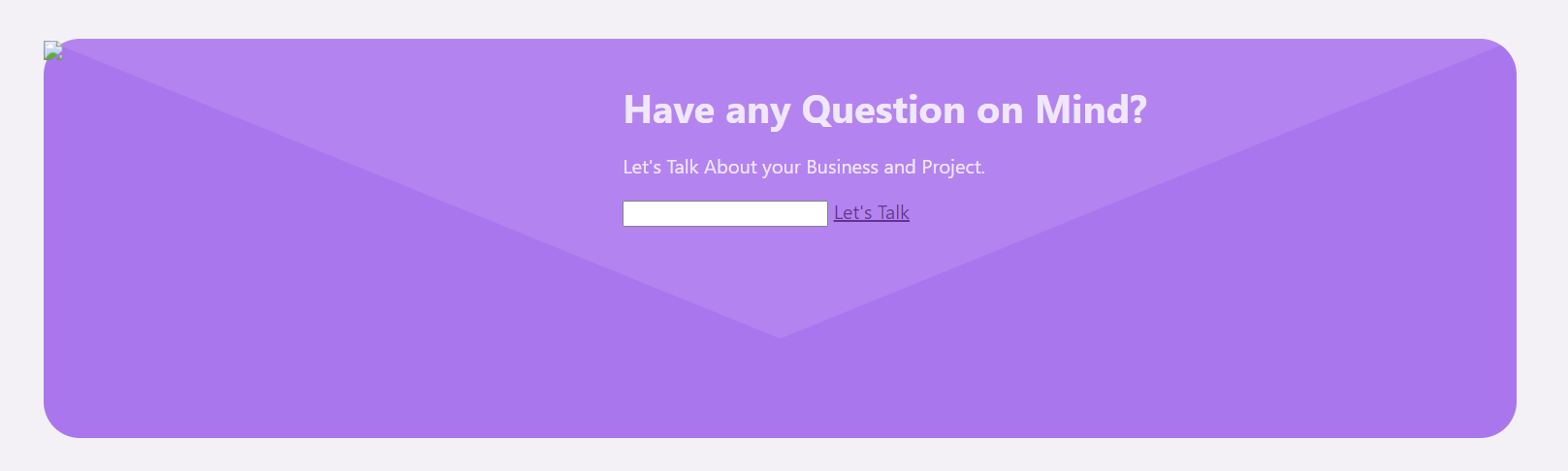
Those are the css I used for
.contact {
  display: flex;
  position: relative;
  background-color: #aa76ed;
  height: 330px;
  border-radius: 30px;
  z-index: 1;
}

.triangle {
  position: absolute;
  display: block;
  top: 0;
  width: 100%;
  height: 150%;
  background: rgba(255, 255, 255, 0.1);
  z-index: 0;
  clip-path: polygon(0% 100%, 50% 50%, 100% 100%, 0% 100%);
  transform: rotate(180deg);
  border: inherit;
  border-radius: 0 0 0 0.25em;
}

.contact .left-aside {
  width: 33%;
  height: 100%;
}
.contact .right-aside {
  width: 66%;
  color: #ffffffcc;
  vertical-align: middle;
}

.contact .right-aside h3 {
  font-size: 200%;
}
<div class="contact">
<div class="triangle"></div>
<div class="left-aside">
<img src="#" />
</div>
<div class="right-aside">
<h3 class="question">Have any Question on Mind?</h3>
<p class="business-project">
Let's Talk About your Business and Project.
</p>
<input type="input" />
<a href="#" class="lets-talk">Let's Talk</a>
</div>
</div>I tried below stackoverflow answer and codepen but i can’t achieve it, if someone can explain it with an answer would be very helpful.
2
Answers
Hide half on the top…
… and
border radius top left on triangle using CSS
A clip-path based on a polygon won’t give you a curved corner. I think the simplest solution is to use an SVG background image.