 Question posted in


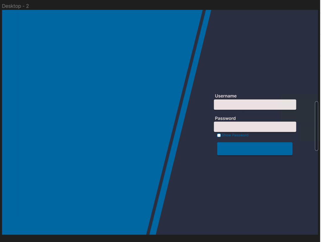
I’ve started a new position and have been assigned to create the CSS for a login page based on the following Figma diagram.
I only have prior experience in backend development. I don’t have any prior experience with CSS, and after hours of toying with ChatGPT and JFiddle, I’m about ready to give up. Could someone help me out with this? Here’s the code I’ve written so far:
/* html, body {
  margin: 0;
  height: 100%;
}

body {
  background-color: #292E41;
  display: flex;
  align-items: center;
  justify-content: center;
}

.light-blue-rotated-line {
  margin-left: 0;
  min-width: 8px;
  min-height: 10000px;
  background-color: #0066A1;
  transform: rotate(10deg);
}

.left-side-light-blue {
   position: relative;
   margin-left: -75vw;
   margin-right: 0;
  min-width: 50vw;
  min-height: 10000px;
  background-color: #0066A1;
  transform: rotate(10deg);
} */

/*
html, body {
  margin: 0;
  height: 100%;
}

body {
  background-color: #292E41;
  display: flex;
  align-items: center;
  justify-content: center;
  overflow: hidden;
}

.light-blue-rotated-line {
  min-width: 8px;
  min-height: 105vh;
  background-color: #0066A1;
  transform: rotate(10deg);
  z-index: 2;
}

.left-side-light-blue {
  position: absolute;
  left: 0;
  top: 0;
  margin-left: -400px;
  margin-top: -50vh;
  width: 100vw;
  height: 200vh;
  background-color: #0066A1;
  transform: rotate(10deg);
  z-index: 1;
}
*/

body {
  background-color: #292E41;
  /*
  align-items: center;
  justify-content: center;*/
  overflow: hidden; /* Prevent horizontal scrollbar due to large min-width */
}

.container {
  display: grid;
}

.light-blue-rotated-line {
  min-width: 8px;
  min-height: 105vh; /* Use viewport height for the rotated line */
  background-color: #0066A1;
  transform: rotate(10deg);
  z-index: 2; /* Set a higher z-index to ensure it's on top */
}

.left-side-light-blue {
  width: 100vw; /* Adjust the percentage of the screen width */
  height: 400vh; /* Full height of the viewport */
  transform: translateY(100px);
  margin-left: -50vw;
  background-color: #0066A1;
  transform: rotate(10deg);
  z-index: 1; /* Set a lower z-index to ensure it's behind the rotated line */
}
<!DOCTYPE html>
<html lang="en">
<head>
<meta charset="UTF-8">
<meta name="viewport" content="width=device-width, initial-scale=1.0">
<title>Rotated Blue Line</title>
<link rel="stylesheet" href="styles.css">
</head>
<body>
<div class="container">
<div class="left-side-light-blue"></div>
<div class="light-blue-rotated-line"></div>
</div>
</body>
</html>Any help at all would be greatly appreciated!
2
Answers
its preferable to get this as image and give this to the background keep things simple and easy other wise you can use css clip path as other option use css clip path generator from the web and copy paste the code simple and easy
hopefully you like this