skip to Main Content

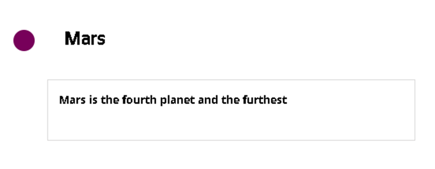
I have this HTML that has a title, icon and content. Here is a picture of how it looks:

present implementation

My question is, only on 766px window size, how can I display the title next to icon and move the content below the title?

Something Like this

I am not able to move the title even if I remove display: flex; from the CSS.

.article {
    display: flex;
    position: relative;
    overflow: hidden;
    padding: 0px 8px 0px 8px;
}

.title {
    width: 100px;
    float: left;
}

.title h3 {
    padding-right: 24px;
}

.icon,
.content {
    margin: 18px 0px 0px 18px;
}

.icon {
    border-radius: 14px;
    height: 28px;
    width: 28px;
    color: #fff;
    background-color: #770000;
    padding: 4px;
    margin-left: -28px;
    box-sizing: border-box;
}

.content {
    padding: 13px 13px 13px 13px;
    max-width: 585px;
    background: #f4efef;
    border: 1px solid #e2e2e2;
    color: #000;

}


.content::before {
    content: '';
    position: absolute;
    height: calc(100% + 28px);
    width: 2px;
    background: #2dd293;
    margin-top: 30px;
    margin-left: -48px;
}

.article:last-child .content::before {
    display: none;
}

@media (max-width: 766px) {
    .article .content {
        width: 75%;
    }
}
<div class="myList">
    <div class="article">
        <div class="title">
            <h3>Mars</h3>
        </div>
        <div class="icon">
            <i class="fas fa-mars"></i>
        </div>
        <div class="content">
            <p>Mars is the fourth planet and the furthest terrestrial planet from the Sun.:</p>
        </div>
    </div>
</div>

2

Answers


  1. Each flex refers to its immediate children, so if you want the content below the title+icon, you should seperate them into 2 children rather than 3.

    btn.onclick = function() {
      document.querySelector(".article").classList.toggle("small-width")
    }
    .as-one-unit {
      display: flex;
    }
    
    .article {
      display: flex;
    }
    
    div {
      padding: 10px;
    }
    
    .article.small-width {
      flex-wrap: wrap;
    }
    
    .article.small-width .content {
      width: 100%
    }
    
    .article.small-width .as-one-unit {
      flex-direction: row-reverse;
    }
    <link rel="stylesheet" href="https://cdnjs.cloudflare.com/ajax/libs/font-awesome/5.9.0/css/all.min.css" />
    
    <div class="myList">
      <div class="article">
        <div class="as-one-unit">
          <div class="title">
            <h3>Mars</h3>
          </div>
          <div class="icon">
            <h3><i class="fas fa-mars"></i></h3>
          </div>
        </div>
        <div class="content">
          <p>Mars is the fourth planet and the furthest terrestrial planet from the Sun.:</p>
        </div>
      </div>
    </div>
    
    <button id="btn">toggle media-query</button>
    Login or Signup to reply.
  2. Have made a few changes to your snippet.

    You can use the other properties of flexbox to achieve this in an easy way.

    Find the proper way to handle the condition below:

    PS: You can reduce the lines of CSS codes if you have no other purpose of the same class.

    .article {
        display: flex;
        position: relative;
        overflow: hidden;
        padding: 0px 8px 0px 8px;
    }
    
    .title {
        width: 100px;
        float: left;
        display: flex;
        margin-right: 20px;
    }
    
    .title h3 {
        padding-right: 24px;
    }
    
    .icon {
        margin-top: 15px;
        border-radius: 14px;
        height: 28px;
        width: 28px;
        color: #fff;
        background-color: #770000;
        padding: 4px;
        box-sizing: border-box;
    }
    
    .content {
        padding: 13px 13px 13px 13px;
        max-width: 585px;
        background: #f4efef;
        border: 1px solid #e2e2e2;
        color: #000;
    }
    
    .content::before {
        content: '';
        position: absolute;
        height: calc(100% + 28px);
        width: 2px;
        background: #2dd293;
        margin-top: 30px;
        margin-left: -48px;
    }
    
    .article:last-child .content::before {
        display: none;
    }
    
    @media (max-width: 766px) {
        .article {
            flex-direction: column;
        }
        .article .content {
            width: 75%;
            align-self: end;
        }
        .title {
            flex-direction: row-reverse;
        }
        .title h3 {
            padding: 0 0 0 24px;
        }
    }
    <div class="myList">
        <div class="article">
            <div class="title">
                <h3>Mars</h3>
                <div class='icon'></div>
            </div>
            
            <div class="content">
                <p>Mars is the fourth planet and the furthest terrestrial planet from the Sun.:</p>
            </div>
        </div>
    </div>
    Login or Signup to reply.
Please signup or login to give your own answer.
Back To Top
Search