skip to Main Content

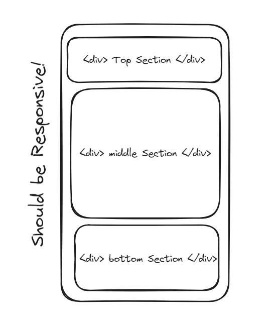
I want to make a mobile first responsive layout using flex where three sections are divided vertically in 20:50:30 ratio with full height of screen.

This the HTML part:

<body>
  <main>
    <div class="parent">
      <div class="topSection">
        This is Top Section
      </div>
      <div class="middleSection">
        This is Middle Section
      </div>
      <div class="bottomSection">
        This is Bottom Section
      </div>
    </div>
  </main>
</body>

Expected Layout:

Vertically divided sections using flexbox

4

Answers


  1. html,body {
      margin: 0;
    }
    
    main {
      height: 100vh;
    }
    
    .parent {
      height: 100%;
      display: flex;
      flex-direction: column;
    }
    
    .topSection {
      flex: 0 0 20%;
    }
    
    .middleSection {
      flex: 1 1 50%;
      background-color: yellow;
    }
    
    .bottomSection {
      flex: 0 0 30%;
    }
    Login or Signup to reply.
  2. i’m new here, hope this answer can helps you 😀

    • display: flex|Set the layout into flex
    • flex-direction: column|Set the direction of flex into column
    • height: 100vh|Set the height of outter div into 100% of page height
    • flex: <value>|Set the proportion of div
    <div style="display: flex; flex-direction: column; height: 100vh">
      <div style="flex:20%">
        This is Top Section
      </div>
      <div style="flex:50%">
        This is Middle Section
      </div>
      <div style="flex:30%">
        This is Bottom Section
      </div>
    </div>
    
    Login or Signup to reply.
  3. Use height: 100vh to make the parent 100% of the "view height". Set display: flex on your parent and set the flex-direction: column.

    Then you can use the flex option on the children to give them the relative size you want.

    The whole css should look something like this:

    .parent {
        height: 100vh;
        display: flex;
        flex-direction: column;
    }
    
    .topSection {
        flex: 2;
    }
    
    .middleSection {
        flex: 5;
    }
    
    .bottomSection {
        flex:3;
    }
    

    I hope this is what you are looking for. Have a great day 🖖

    Login or Signup to reply.
  4. You can try below code:

    body,
    html {
      height: 100%;
      margin: 0;
    }
    
    main {
      display: flex;
      flex-direction: column;
      height: 100%;
    }
    
    .parent {
      display: flex;
      flex: 1;
      flex-direction: column;
    }
    
    .topSection {
      flex: 20%;
      background-color: #f2f2f2;
    }
    
    .middleSection {
      flex: 50%;
      background-color: #d9d9d9;
    }
    
    .bottomSection {
      flex: 30%;
      background-color: #bfbfbf;
    }
    <body>
      <main>
        <div class="parent">
          <div class="topSection">
            This is Top Section
          </div>
          <div class="middleSection">
            This is Middle Section
          </div>
          <div class="bottomSection">
            This is Bottom Section
          </div>
        </div>
      </main>
    </body>
    Login or Signup to reply.
Please signup or login to give your own answer.
Back To Top
Search