skip to Main Content

I am trying to make notes webpage like google keep.I tried setting height to auto but it still doesn’t works

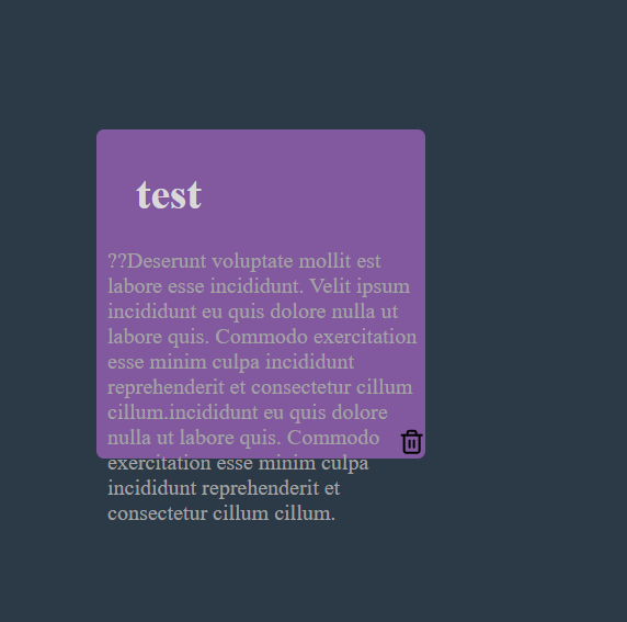
i want the div container to expand height with the increase in the content.this is the result when i set height to auto

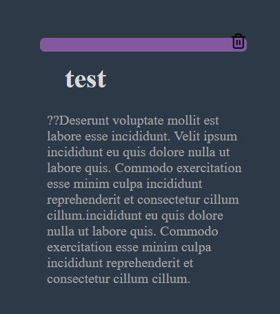
i want to get result like this

.note {
    position: relative;
    display: inline-block;
    background: #82589F;
    border-radius: 7px;
    padding: 10px;
    width: 300px;
    height: auto;
    overflow: visible;
    height: fit-content;
    margin: 16px;
    top: 2rem;
    left: 2rem;
  }
  .note h1 {
    font-size: 1.1em;
    margin-bottom: 6px;
  }
  .note p {
    position: absolute;
    top: 3rem;
    font-size: 20px;
    white-space: pre-wrap;
    word-wrap: break-word;
    color: #A3A3A3;
  }


  .note button {
    position: absolute;
    border: none;
    height: 0px;
    bottom: 1rem;
    right: 0;
    cursor: pointer;
    outline: none;
  }

2

Answers


  1. You just need to remove the height property

    The height CSS property specifies the height of an element. By default, the property defines the height of the content area.

    Read more about the height property Here

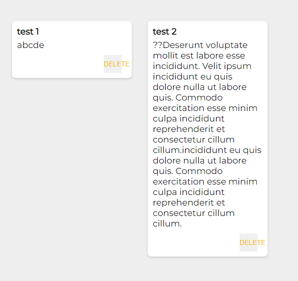
    I did a litle example

    Login or Signup to reply.
  2. <div class="container">
      <div class="note">
    <h1>Note Title</h1>
    <p>Lorem ipsum dolor sit amet, consectetur adipiscing elit. Curabitur auctor purus sed aliquet ultrices. Aliquam finibus congue lobortis. Duis consectetur mi sed lectus euismod, a congue ligula tincidunt.</p>
    <button>Button</button>
    </div>
     <div class="sidebar">
    <h2>Sidebar Title</h2>
    <p>Lorem ipsum dolor sit amet, consectetur adipiscing elit. Curabitur auctor purus sed aliquet ultrices. Aliquam finibus congue lobortis. Duis consectetur mi sed lectus euismod, a congue ligula tincidunt.</p>
    </div>
    </div>
    
    <style>
      .container {
    display: flex;
    justify-content: center;
    align-items: center;
    background-color: grey;
    padding: 0 20px; /* Add horizontal padding for left and right spacing */
    gap: 20px; /* Add a gap between the boxes */
    height: 100vh;
    box-sizing: border-box;
    }
    .note {
      display: flex;
    flex-direction: column;
    justify-content: center;
    align-items: center;
    background-color: white;
    padding: 20px;
    border-radius: 10px;
    color: black;
    text-align: center;
    max-width: 300px; /* Adjust the width as desired */
     }
      .sidebar {
    display: flex;
    flex-direction: column;
    justify-content: center;
    align-items: center;
    background-color: white;
    padding: 20px;
    border-radius: 10px;
    color: black;
    text-align: center;
    max-width: 300px; /* Adjust the width as desired */
    }
    </style>
          
    
    Login or Signup to reply.
Please signup or login to give your own answer.
Back To Top
Search