skip to Main Content

I am writing a section of a webpage, and want to flex contents inside the same div horizontally, with equal width. Somehow my CSS code is not working.

const Reasons = ()=>{
    return (
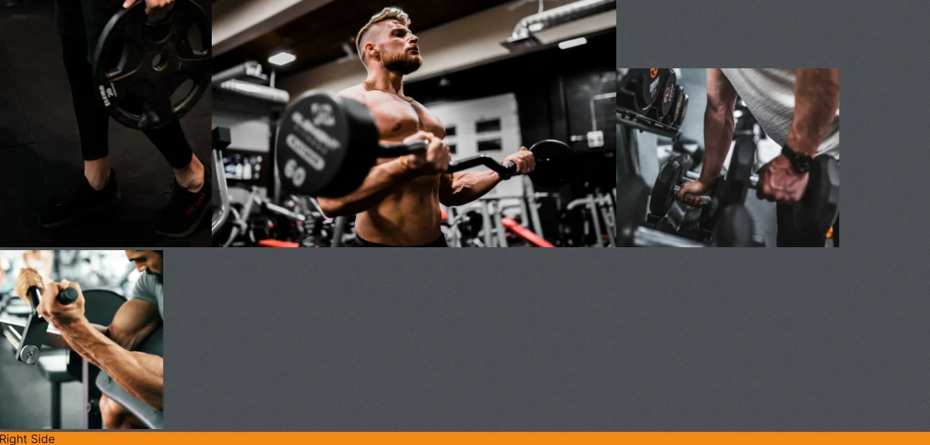
        <div className="reasons" id='reasons'>
            <div className="left-r">
                <img src={image1} alt="" />
                <img src={image2} alt="" />
                <img src={image3} alt="" />
                <img src={image4} alt="" />

            </div>
            <div className="right-r">
                Right Side
            </div>
        </div>
    )
}

The CSS code:

.Reasons{
    padding: 0 2rem;
    display: flex;
}

.left-r{
    flex: 1 1;
    flex-direction: column;
}
.right-r{
    flex: 1 1;
    flex-direction: column;
    background-color: var(--orange);
}

I expect it to be flexing horrizontally. But somehow it displays vertically.

The webpage screenshot

2

Answers


  1. Try this in the CSS file because I think the problem lies within the classname’s syntax being wrong. You do not need to add any flex styles to the two divs inside the main div:

    .reasons{
        padding: 0 2rem;
        display: flex;
        justify-content: center;
    }
    .right-r{
        background-color: var(--orange);
    }
    
    Login or Signup to reply.
  2. I corrected the className (.reasons instead of .Reasons), set a width for the images so that they remain in the horizontal direction, and also added some codes to crop the height if your images have different aspect ratio.

    *{
        margin: 0;
        padding: 0;
    }
    
    .reasons{
        padding: 0 2rem;
        display: flex;
        align-items: center;
    }
    
    .left-r{
        flex: 1 1;
    
        /* Use the below codes if your images have different heights. If the images have identical heights then remove these codes */
        height: 100px;
        overflow-y: hidden;
        display: flex;
        align-items: flex-start;
    }
    
    /* Setting the image width to keep them in horizontal direction */
    .left-r img{
        width: 25%;
        height: auto;
    }
    
    .right-r{
        flex: 1 1;
        background-color: var(--orange);            
    }
    <div class="reasons" id='reasons'>
        <div class="left-r">
            <img src="https://picsum.photos/200/400?random=1" alt="" />
            <img src="https://picsum.photos/100/300?random=2" alt="" />
            <img src="https://picsum.photos/250/350?random=3" alt="" />
            <img src="https://picsum.photos/220/380?random=4" alt="" />
        </div>
    
        <div class="right-r">
            Right Side
        </div>
    </div>
    Login or Signup to reply.
Please signup or login to give your own answer.
Back To Top
Search